Learn how to visualise and present data with a short course
- Written byCarys Thomas
- Published date 15 July 2022
Share story
Did you know that 90% of the information transmitted to the brain is visual?
The practice of translating information into a visual context is known as ‘data visualisation’ and is an important means of communicating patterns, trends and outliers in data sets.
Students on our Information Design and Data Visualisation Online Short Course learn the fundamentals of information design and data visualisation, as well as how to apply these skills to their own personal and professional projects.
To find out more about the course, we caught up with Chiara Marradi, an inspiring former student, to hear about her recent short course experience. Chiara recently published an insightful article about her time on the course on LinkedIn and tells us more about her passion for information design.
Chiara Marradi currently works as a Service and UX Design Consultant at IBM. “I started my journey in the field of communication and visual design during my bachelor’s degree at the New Academy of Fine Arts (NABA) in Milan,” she tells us. “It was there that I had the opportunity to develop my visual and creative skills and apply them to challenging projects.”
After finishing her degree, Chiara went on to work for a real estate company as a visual and brand designer, where she was required to create social media content and develop brand guidelines, materials and strategies through effective storytelling. Keen to expand her design skills, Chiara later moved to the Netherlands to study for a master’s degree in Strategic Product Design.
During her master’s degree, Chiara learnt how to use design methods and processes to combine user research insights with market and technology trends in order to develop effective solutions for clients. She also became interested in sustainability and social innovation and worked on a number of exciting projects.
Bringing data to life
Chiara’s interest in sustainable innovation is a big part of her approach to data visualisation. She is passionate about finding sustainable solutions and enjoys supporting organisations as they experiment with new approaches to sustainability.
“I am passionate about sustainability,” she says, “and my goal as a designer is to bring data to life, make sense of it and deploy it in a way that can lead to sustainable transformations.”
Chiara is currently working on a unique sustainability project and uses her design skills to support her professional work. “I co-lead the Sustainability Hub and help domain leads shape the storytelling around sustainability offerings,” she tells us.
Chiara also recently worked on a project in collaboration with energy company, 'Shell', in which she was required to develop digital solutions that would enable mining companies to track and visualise their emissions data. Chiara designed a series of accessible dashboards to help clients easily monitor their emissions and operations.
“By understanding data and translating it into insights, mining companies can make informed decisions that should help them achieve their ambitious ‘net-zero’ goals,” she explains.
The art of data storytelling
While on the course, Chiara enjoyed learning about the art of data storytelling. This knowledge ultimately helped Chiara achieve her professional goals and develop her skills.
“Data is at the core of my work,” she tells us, “so I wanted to improve my capacity to visualise data and create strong storytelling that I could apply to my client projects. The course has helped me achieve my career goals.”
Chiara also found course tutor, Jola Piesakowska, to be particularly inspiring. “Jola made the learning easy to follow and enjoyable,” she says. “I really appreciated her support and availability supporting us with project struggles and answering all our questions on the topic.”
“The content of the course and the pace in which was delivered, organised and structured is what I enjoyed the most about it,” says Chiara. “I really recommend the course to anyone who’s fascinated by data and wants to learn more about how to visualise it and make it tangible through storytelling.”
Find out more about Chiara's work through her online portfolio.
-
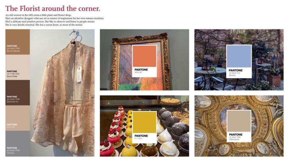
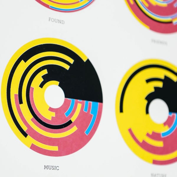
Student work by Chiara Marradi
-
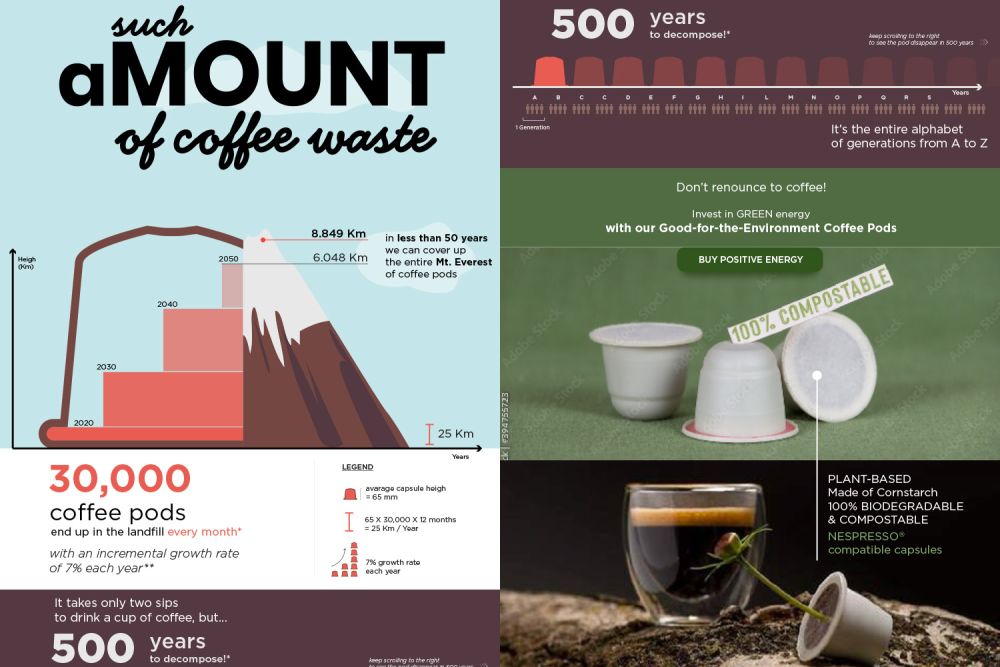
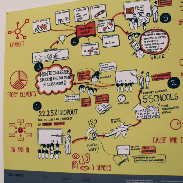
Student work by Chiara Marradi
-
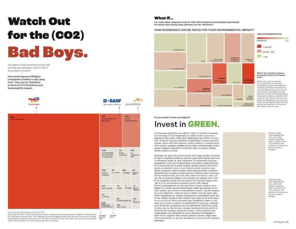
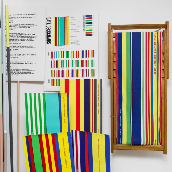
Student work by Chiara Marradi
Are you interested in visual communication and design? Read more about how to communicate with data.
We offer a range of short courses on information design from graphic design and communication to infographic storytelling and data visualisation. Explore our full range of information design short courses for more information.
Ready to try something new? Take a look at our schedule of courses starting soon.