
Laying strong foundations: how Allies & Morrison designed LCF East Bank
- Written byMimi Francis-Mearns
- Published date 30 October 2023
Share story
For the very first time, our students and staff – along with curious passers-by – are exploring the grand concrete spiral staircases, vast lecture halls, and high-rise roof terraces of London College of Fashion, UAL's new home in East Bank. It might take you a while to uncover all the clever details hidden within the 14 floors, but we’re sure you already have some burning questions about the building. Luckily, we sat down with Bruno Marcelino from Allies & Morrison, the architects behind the colossal project, to get the rundown on how they created a campus perfect for LCF.
With a portfolio that spans urban universities across the capital, and ‘tall-ish buildings’ that consider the surrounding streetscape, it’s no surprise that Allies & Morrison were selected to bring LCF’s campuses together in East Bank. Heritage is always valued at the firm, and both the legacy of the surrounding area of Stratford and LCF’s historic past have been carefully incorporated into the design. With lecture halls, cafes, archives, social spaces, and display galleries that also had to be considered, Allies & Morrison had no small task ahead of them. Now our students can finally enjoy every thoughtful design choice, Bruno looks back on the long process that led to our new campus.
Are there any aspects of the design that were included to marry the history of London College of Fashion with the industrial history of Stratford?
When we are asked to describe the LCF building in one sentence, we often say that it is a 19th-century mill building brought into the 21st century. Traditional mill buildings were robust constructions, spatially generous, flexible, and generally well-lit due to their large windows. It's useful to recall that not far from the current LCF site along Carpenters Road, stood the Yardley Factory. We came across incredible early 20th-century photos of workers wrapping soaps in spaces that share many characteristics with LCF workshop rooms: large, flexible spaces with high ceilings, abundant natural light, and even exposed services on the ceiling. The entire architecture team visited all the different buildings that were hosting LCF before it moved to Stratford, and we fell in love with several of the workshop spaces we discovered, each with a distinct atmosphere that arises from spaces where things are actually made.
I remember one photo I took of a two-window bay in Lime Grove – there were large crittall windows, with trapezoidal columns and a heavily used sill zone packed with tools and objects. You’ll be able to verify that this description of the Lime Grove window bays can be directly applied to the LCF Stratford typical windows! It’s worth mentioning one last curious detail – if you examine the pattern on the external metal screens found on both the Ground Level Colonnade and the top of the building, you might recognize the same geometric motif present in the coloured windows of John Prince’s Street.
It seems that the exterior of the building is aesthetically distinctive from the interior. Did you approach the design of the exterior, which will make up part of East Bank, differently from the interior, which is designed for the use of LCF students?
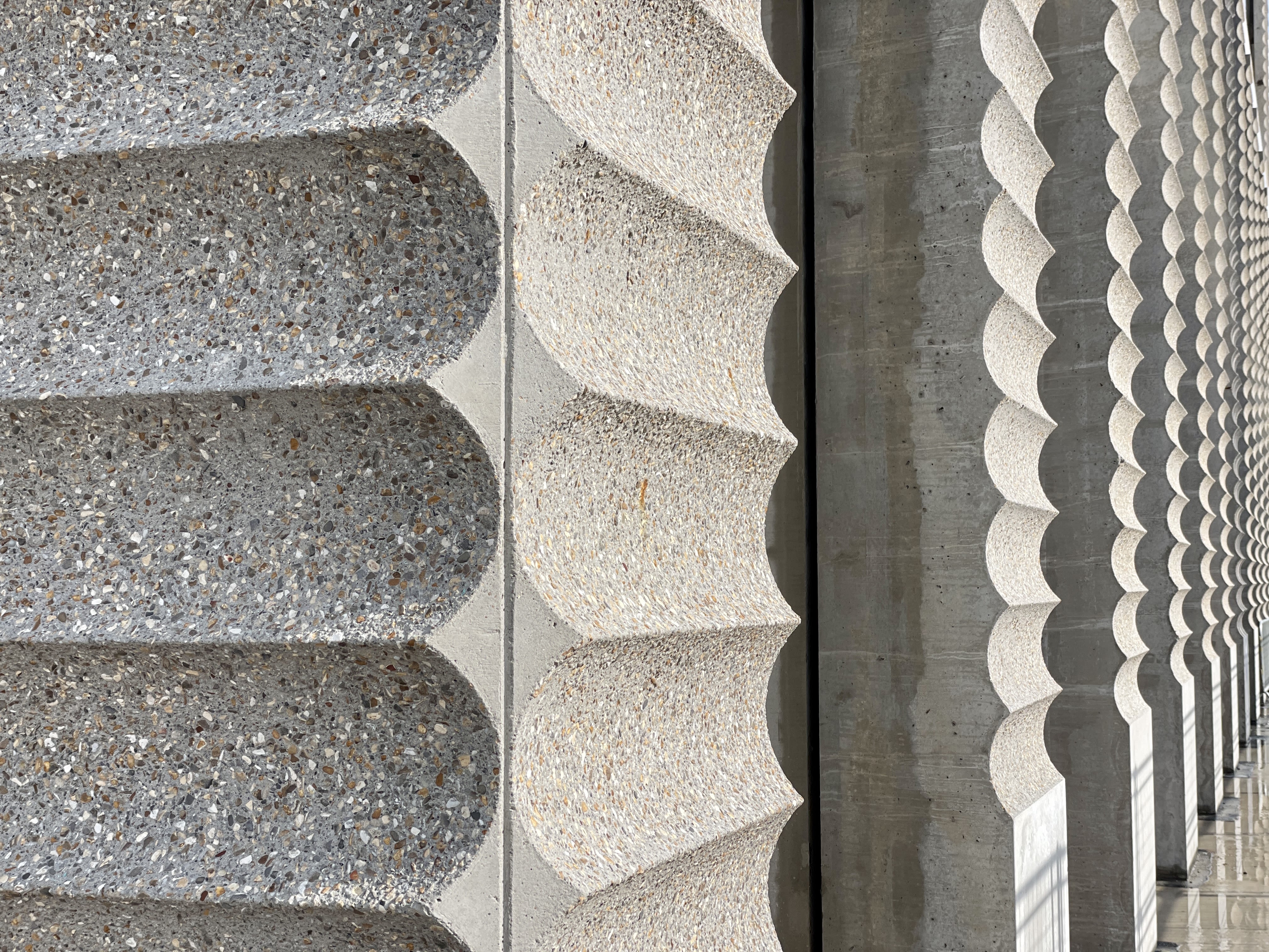
Traditionally, a building’s exterior and interior tend to be distinct because they need to respond to different conditions: to keep away the rain, heat, and cold while the interior can establish a closer and more tactile relationship with the user. Perhaps one of the building features that prompted this question is the “scalloped texture” on the exterior concrete columns – which does not extend to its interior – and is used as a playful device to take advantage of the sculptural possibility of cast elements.
However, I’d argue that in the case of the LCF there's a stronger continuity between the outside and inside than in most other buildings I know. There’s the use of concrete which is the dominating material – if you look through any typical window you will see the external concrete becoming an internal column. One of the key principles shared between the buildings that form the East Bank is that each one feels as though it has been ‘cast’ from a single material, so this continuity helps to convey that. Back to the tactile notion I mentioned for the interior: we tried to bring a sense of warmth and comfort to the internal spaces. This is why we used timber for the components that users touch; most doors, internal screens, balustrades, fixed furniture, and handrails all share the same maple finish.

Some of the ground levels will be open to the public: how did you create a space that attracts and accommodates the public while ensuring the student experience is prioritised?
The building at ground level is remarkably transparent, so passers-by will be able to see into the entire reception area, gallery, and even down to the Lecture Theatre Foyer. And not forgetting the main sculptural staircase that will surely capture people's attention. Bringing the public into the building relies both on a design that is inviting to people but also in the functions the College can offer to the public: with Drapers Cafe (on the ground floor), the Gallery Space, and the corridor with the display vitrines at Waterfront level are accessible to the public.
We do believe that this interface between the students and the public can be beneficial for both parties. Just imagine local children becoming enthusiastic about studying in the world of fashion after seeing a particular exhibition in the Gallery. Or how a student might get attention from someone in the industry who happened to be enjoying coffee at the reception and noticed their displayed work.
The key to maintaining harmony between these two flows is the spacious generosity of these areas – there’s enough room for different activities to occur without conflicts. Most importantly, students will always have the choices of how to use the building: they can enter the LCF, have a coffee at the reception, and stroll up the open spiral staircases enjoying the bustle; but equally, they can promptly enter the lift lobby, which is secured, and go up to their preferred area in the library, hubs or refectory, where only students and staff are allowed.
Creative universities are fundamentally social places, brimming with collaboration and cooperation. How did you allow for organic social interactions in your design?
One aspect of this project that filled us with excitement is the realisation that different departments that make the LCF will come together under one roof, and it is amazing to imagine the potential that can emerge from the resulting interactions! This is why, in the centre of the building, we placed this interconnected sequence of open spaces, flowing through all levels, that we called ‘The Heart’. You can also think of it as a ‘vertical courtyard’ that connects the different parts of the building.
The Heart becomes the connective tissue of the building and the place for both planned and chance encounters and collaborations. If one day you wish to find out about what your colleagues are doing, the best thing to do is to take a walk throughout the Heart Space, meandering through the different levels and departments.
While the Heart Space serves as a centerpiece for social interaction, the building also features a rich collection of other social spaces including the Garden Rooms and respective terraces, the Library, the ground floor Cafe and reception, the Dining Hall and Canteen, and the interconnected terraces from Level 10, 11 and 12 with wonderful views.

Sustainability is at the core of LCF, and there are a variety of ways to make a building sustainable. What was the approach that you took with this project?
Sustainability was a really important part of the process, and I believe it is so neatly integrated into the final solution that it becomes almost invisible to the building’s regular user. All design choices were heavily driven by the sustainability agenda; so much so that the building’s design achieved BREEAM Outstanding - the highest category in the BREEAM assessment system.
We could spend hours talking about all the details that contributed to achieving such high standards, such as material origin, energy management, structural efficiency, and ecology, but ultimately, I think it is really important to remember that the most sustainable building is the one that lasts. Just think of all those Renaissance Italian palaces that keep changing functions from palaces to hospitals, hotels, and universities. However, as buildings they persist over centuries; they become urban artefacts, which can be upgraded and transformed but are ultimately still in use.
I like to think about what made these buildings persist over time, and I keep arriving at the conclusion that they all share three key features. They’re made of durable and robust materials, they’re generous in terms of their spaces, and they are memorable. If you consider, I would hope you agree that it ticks all these boxes and therefore it should stay with us for at least a couple centuries – hopefully more!
The spiral, brutalist stairs are a favourite within our student cohorts. As LCF’s East Bank campus is now one of the largest education buildings in the world; one of the questions we’ve been asked by students is: will there be lifts?
The LCF is a fully accessible building for everyone. This means that there will always be a lift alternative for those who need it or prefer it. I like to compare the way people might use the LCF building to the way people travel in a city: we have a choice to walk, or we can take the tube. Just imagine one day you arrive at the building, feeling energetic and decide to take a walk up that beautiful sequence of stairs. It is a bit like a promenade through the different neighbourhoods of a city - you will be able to witness what your colleagues are working on, casually meet people and potentially get inspired by different disciplines. Alternatively, if you are in a rush, you can take the lift that will take you directly to your destination, just like taking the tube. The most important thing is to have the choice of both options.
In creating this massive building with unique, specific requirements like libraries, archives, lecture halls and digital studios, the design process must have included many discarded drafts and iterations. What made this design feel right?
That is a difficult question to answer… When in a creative process, you find your guiding principles, it becomes easier to discern which options naturally belong to a solution and which feel alien. We gradually found our language through collaboration and dialogue, both internally within the team and with a very involved and informed client.
For a solution to be right it needs to achieve the client’s brief, be adequate to its function, and improve the environment for example. But for a solution to feel right is something more subjective. To gain control over the design process we collectively put together a framework that includes both a conceptual dimension as well as a more phenomenological one; when solutions adhere to this framework, they will feel natural to the building.
Aspects as diverse as simplicity, being bare and robust, being regular to be flexible, being rigorous but at the same time embracing playfulness when appropriate, being generous without being excessive, looking for honesty in the way things come together, thinking tridimensionality about spaces sequences, working within the duality between the Heart and perimeter teaching rooms, intensifying internal connectivity – they were all pieces in our framework.
I can give a more specific example: we made an effort to deliberately keep the material palette reduced. Moving around the building, most of the surfaces you will see will be concrete, timber, or dark metal. Three materials perform three distinct functions: concrete provides robustness for the structural frame, timber is used in elements that are made to be touched, and dark metal is associated with services like power and information. This makes the building feel like a calm background allowing the life and colour that comes with the students and their activities to take centre stage.
As a result of this framework, whether you zoom in and focus on the details or step back and perceive the building for its urban presence, you will find the same conceptual thread woven into the design. LCF is a wonderful example of a successful collective creation, between architects, engineers and the client. We all adhered to a clear and strong vision early in the design and managed to carry it to the result. That is why every component of the building feels like part of the whole: there were many hands involved in this process but all of them held the same pen.
Written by LCF Newsroom Content Creator, Mimi Francis-Mearns, BA (Hons) Fashion Journalism and Content Creation.
- Read more LCF Stories
- Read more about LCF's Newsroom