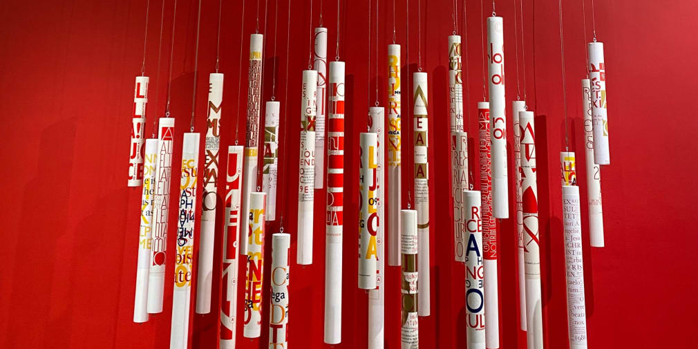
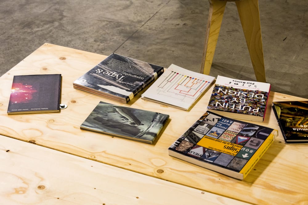
This week Central Saint Martins opened a perspective on the craft and teaching of lettering and typography with an exhibition that considers the meaning and possibilities of letterforms through the lens of Professor Emeritus Phil Baines’ work. Showing to 3 December at the Lethaby Gallery, Extol: Phil Baines celebrating letters reflects on the richness of lettering - from book and type design and decorative signage to public memorials.
Taking a not so typical route in, Phil Baines originally studied for the Roman Catholic priesthood, until 1980 and an art and design foundation course came calling. The next year Phil moved to London to study graphic design at St Martin’s School of Art (1982-85) followed with more design studies the Royal College of Art (RCA). Marriage to Jackie Warner and a respected career spanning design, teaching, writing and curation followed.
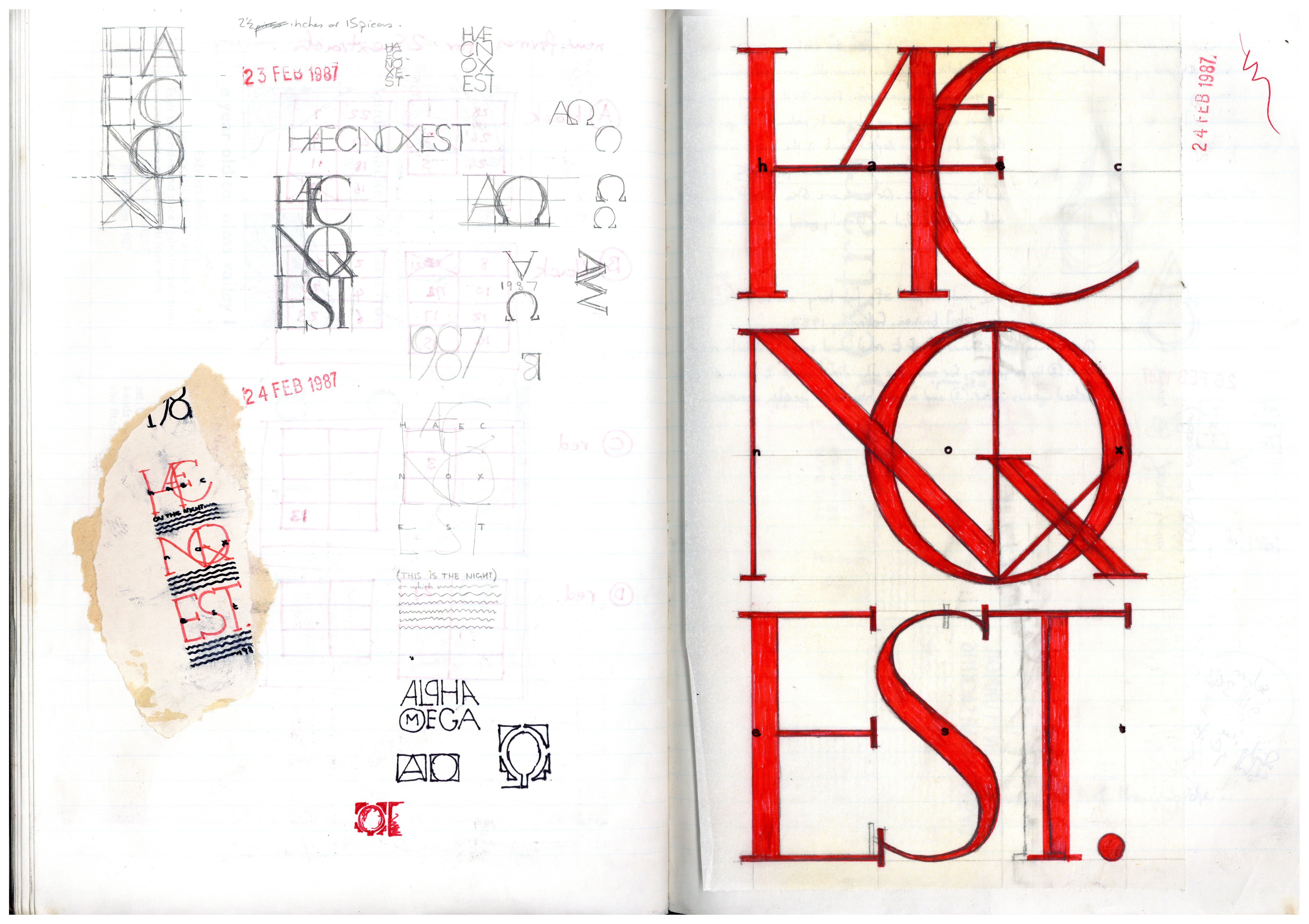
Extol shares some of the influences on Phil’s interest in lettering, including medieval manuscripts and rare and early printed books such as the Book of Hours dating from the late 14th/early 15th century, photographic archives and many examples of Phil’s work and process.
Phil talks about when he was first drawn to the look and feel of text and the idea of working with type design:
With a body of Phil’s notes, sketchbooks, ephemera and research on display, Extol also celebrates the practice of collecting. Close collaborator Catherine Dixon, BA Graphic Communication Design Stage Leader, describes Phil’s habit of documenting and observing what is around him as “a sharpness and an awareness” that would inform his approach and guide his work, bringing his passions like trains and nature into his design. Supporting the exhibition, Catherine and colleagues at CSM Museum & Study Collection work closely with students to share the idea that a person’s identity can be instrumental in how work is generated and a career is built:
-
Credit: Phil Baines
-
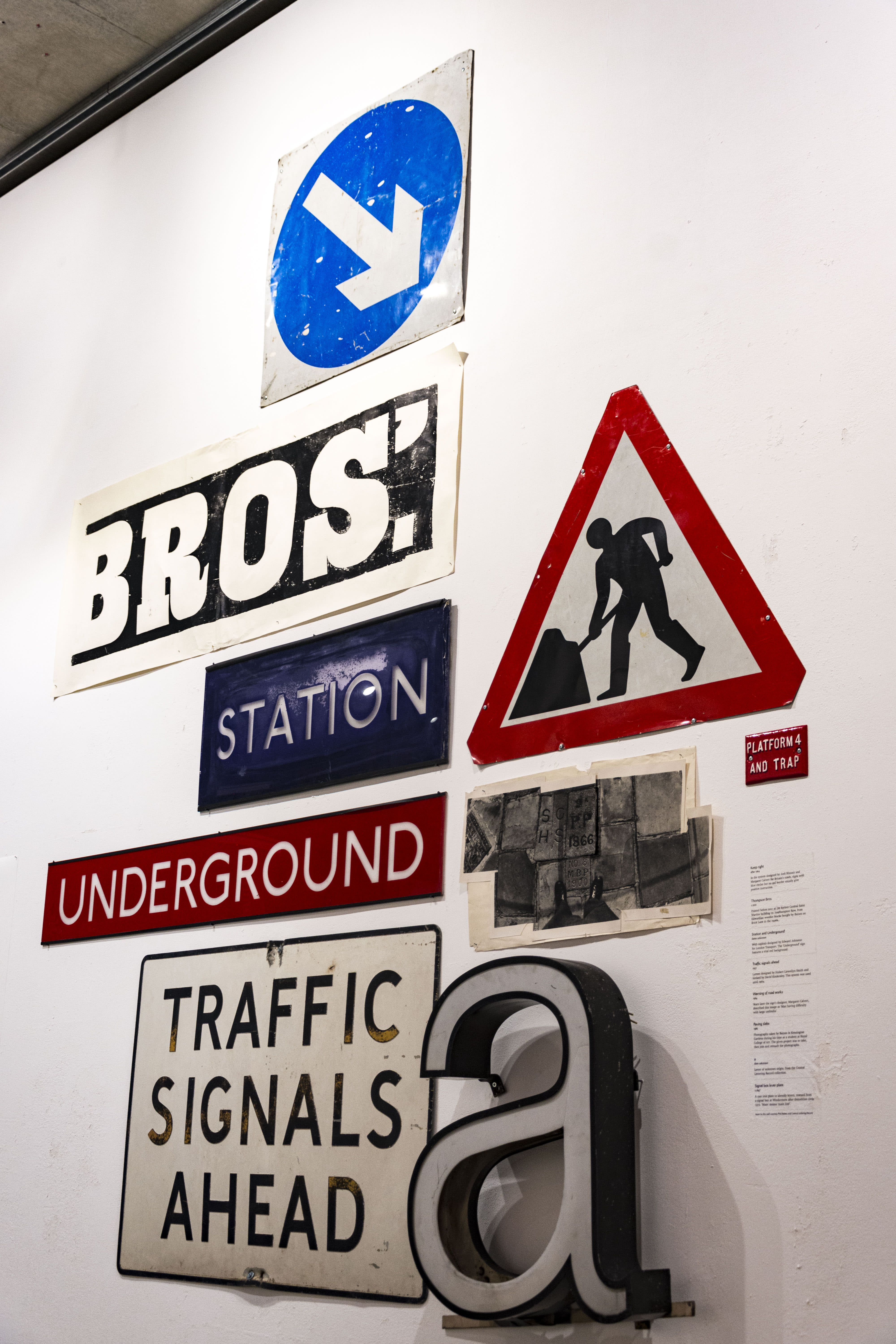
Photo: Jamie Johnson
-
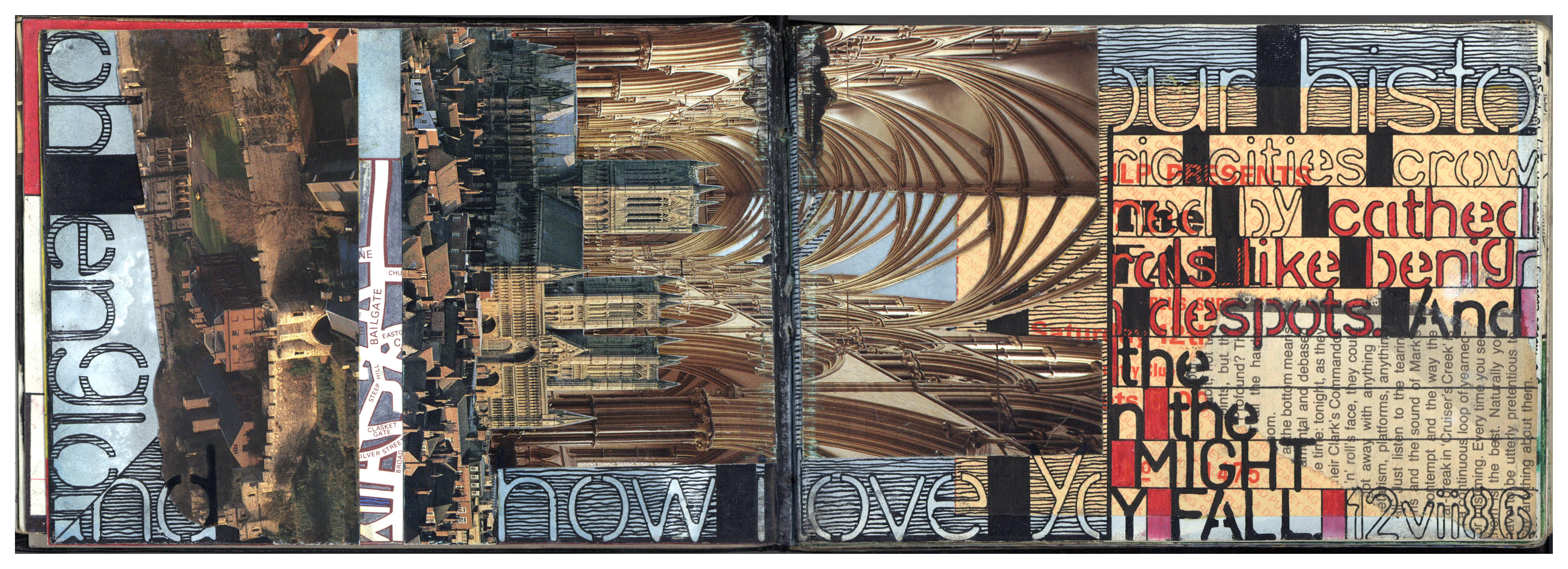
Artwords, 15. Credit: Phil Baines
Design as collaboration
Graphic designer and teacher David Pearson, Royal Designer for Industry, runs his own studio specialising in print design and typography and has been listed as one of Britain’s top 50 designers by The Guardian. David talks about working and collaborating with Phil:
“Phil to me is the perfect balance of fastidiousness, flair and fun. He’s also from the North of England, which doesn’t harm his cause. I was lucky enough to work with Phil mid-way through my degree course – on a Phaidon book called Lawrence Alma-Tadema – and my career course was set as a result. The way in which I work was too: using typography as a form of expression. It’s all Phil’s influence and it’s all his fault.” - David Pearson
Phil’s print design work includes commissions for Penguin, Puffin and Phaidon as well as RCA, Crafts Council and St Martin's catalogues and promotional materials. He is a long-time contributor to Eye Magazine and other journals. In his career, Phil collaborated on many artists’ books and with arts clients.
“What is super interesting about Phil’s work is how it grows out of conversation in little networks and little communities, and an interest in giving artists and collaborators space to be heard.” - Catherine Dixon
Phil is the author or co-author of four books: Type and typography' with Andrew Haslam (Laurence King 2002); 'Signs, lettering in the environment' with Catherine Dixon (Laurence King 2003); 'Penguin by design, a cover story 1935-2005', 2005 and a companion charting 70 years of the design of Puffin books: Puffin By Design: 70 Years of Imagination, 2010, both Allen Lane. Phil was enlisted for ‘Penguin by Design’ by David Pearson, who was Penguin’s designer at the time.
“When it came to choosing an author for Penguin by Design Phil was the natural choice, not just for his knowledge of the subject and research skill, but because I knew he would write a balanced history. He was fair but critical when it was called for. In other hands it could so easily have been a frothing account of the company’s successes but Phil’s even-handed account was perfectly judged. - David Pearson
“I knew many of the cover designers of the Penguin books already and a lot of them were associated with St Martin’s or the Central School. So writing this book was a pleasure.” - Phil Baines
Permanent London memorials
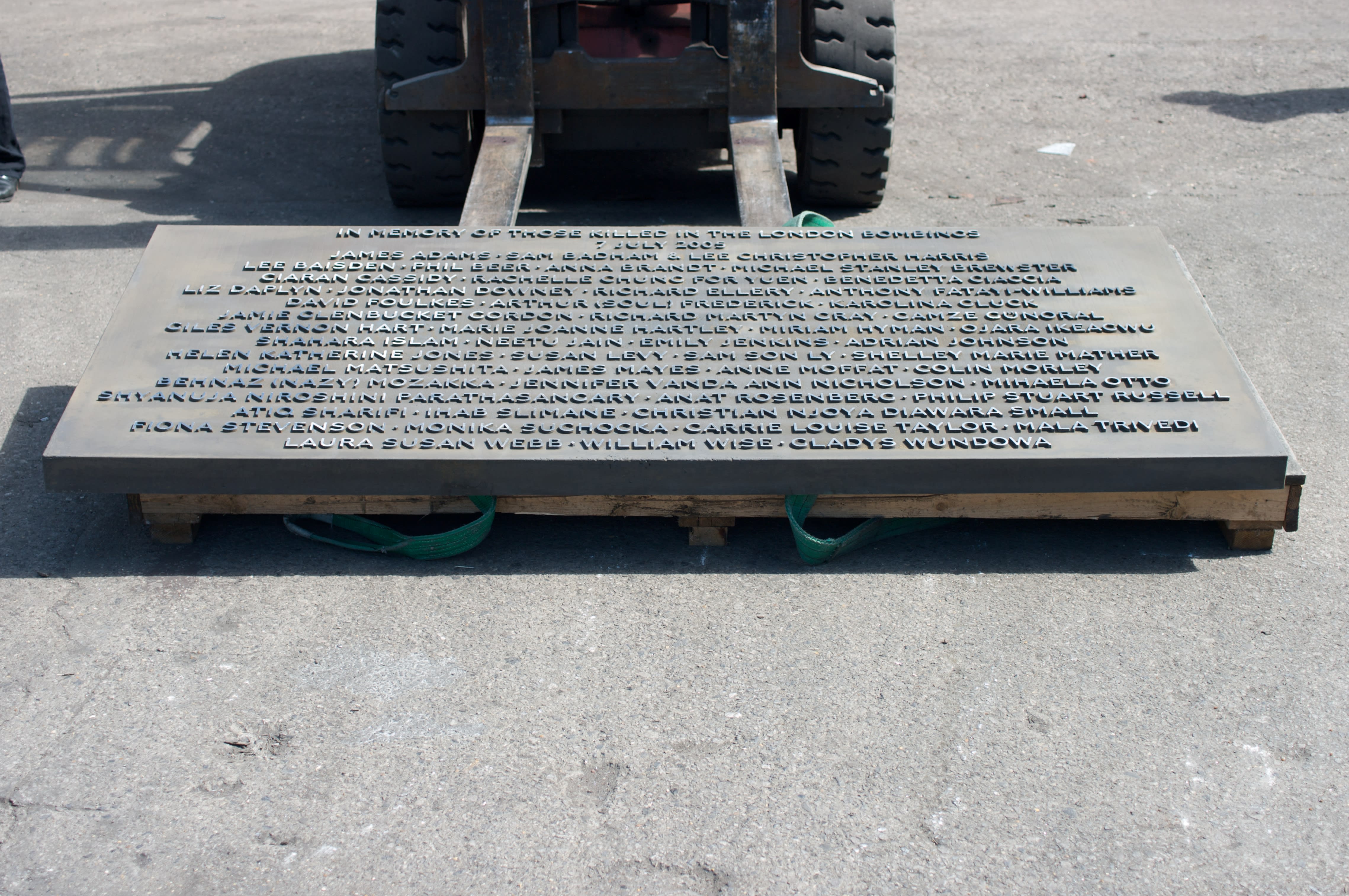
Phil is also known for his collaboration with architects Carmody Groarke on three contemporary memorials, one honouring lives lost to the 2004 Indian Ocean Tsunami, located at the Natural History Museum and two remembering those killed in the 7 July 2005 London bombings, at Hyde Park and Tavistock Square. From Phil’s perspective, the collaboration was a natural fit, born of a shared concern about the physicality of how things should appear in a certain way:
“They understood that they needed someone who knew about letters and who worked in the same way as them. We had similar interests in the properties of materials. At presentations, my Professorship was used to our advantage with clients, to persuade them that our methods were right.” - Phil Baines
In the exhibition, we can see initial lettering tests on wood, granite and resin and on screens, a body of photographs held by Carmody Groarke carefully record the making of the memorials, from architectural drawings to the casting, transporting and laying of the monuments in their permanent London locations.
“The common ground in our collaboration with Phil Baines is based in a shared interest in the making of physical things. Using projects as a type of conversation between designers, we developed a clear understanding of the ideas and material techniques in each project, specific to where they have originated from and how they have been appropriated into our cities. We have often discussed this as a cultural understanding of place and purpose. We find clarity in this approach as an understanding of the process of how something is made, to arrive at its material, form, design and cultural value.” - Kevin Carmody, director, Carmody Groarke
-
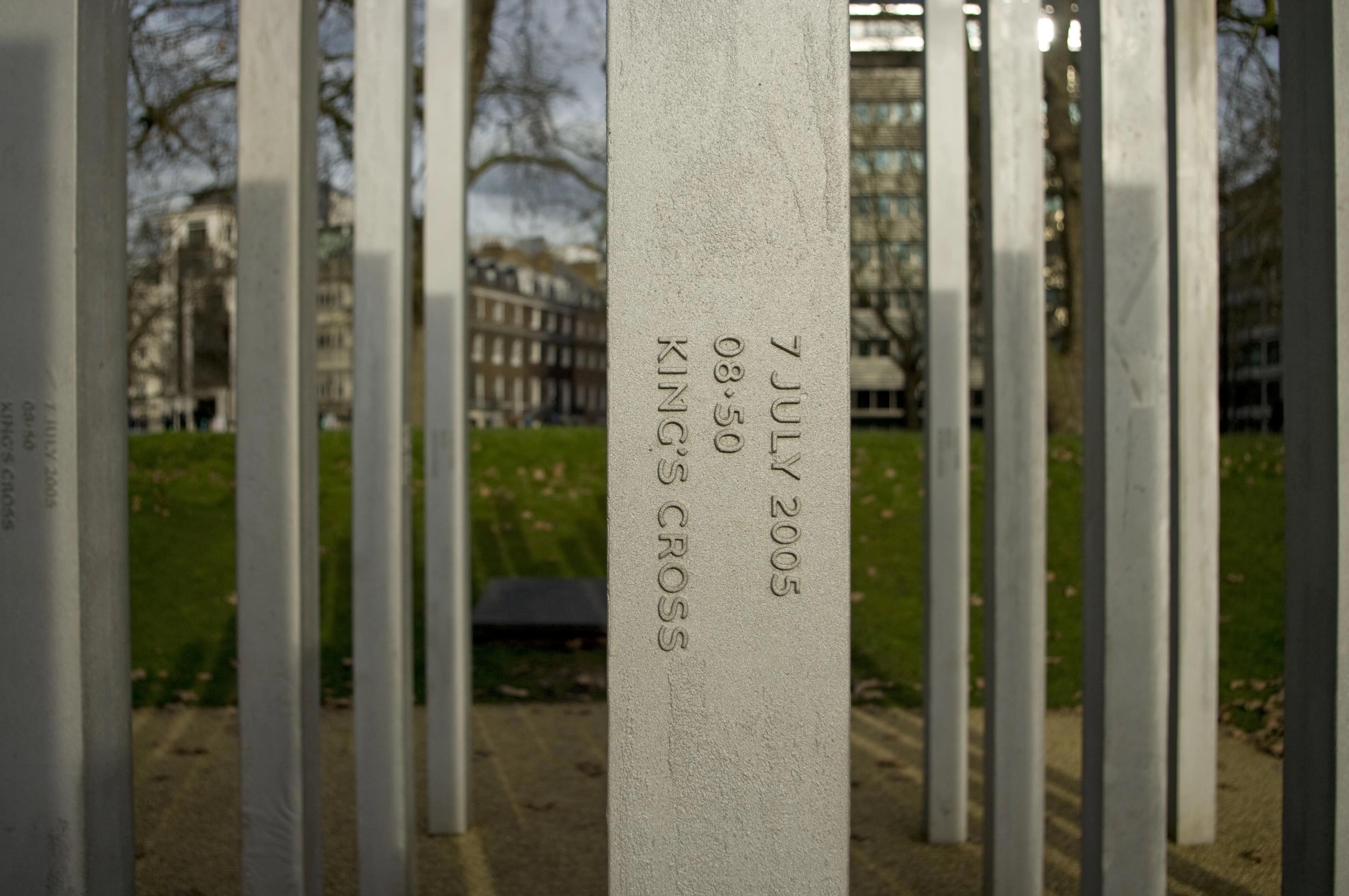
7 July Memorial, Hyde Park, Carmody Groarke architects and lettering by Phil Baines
-
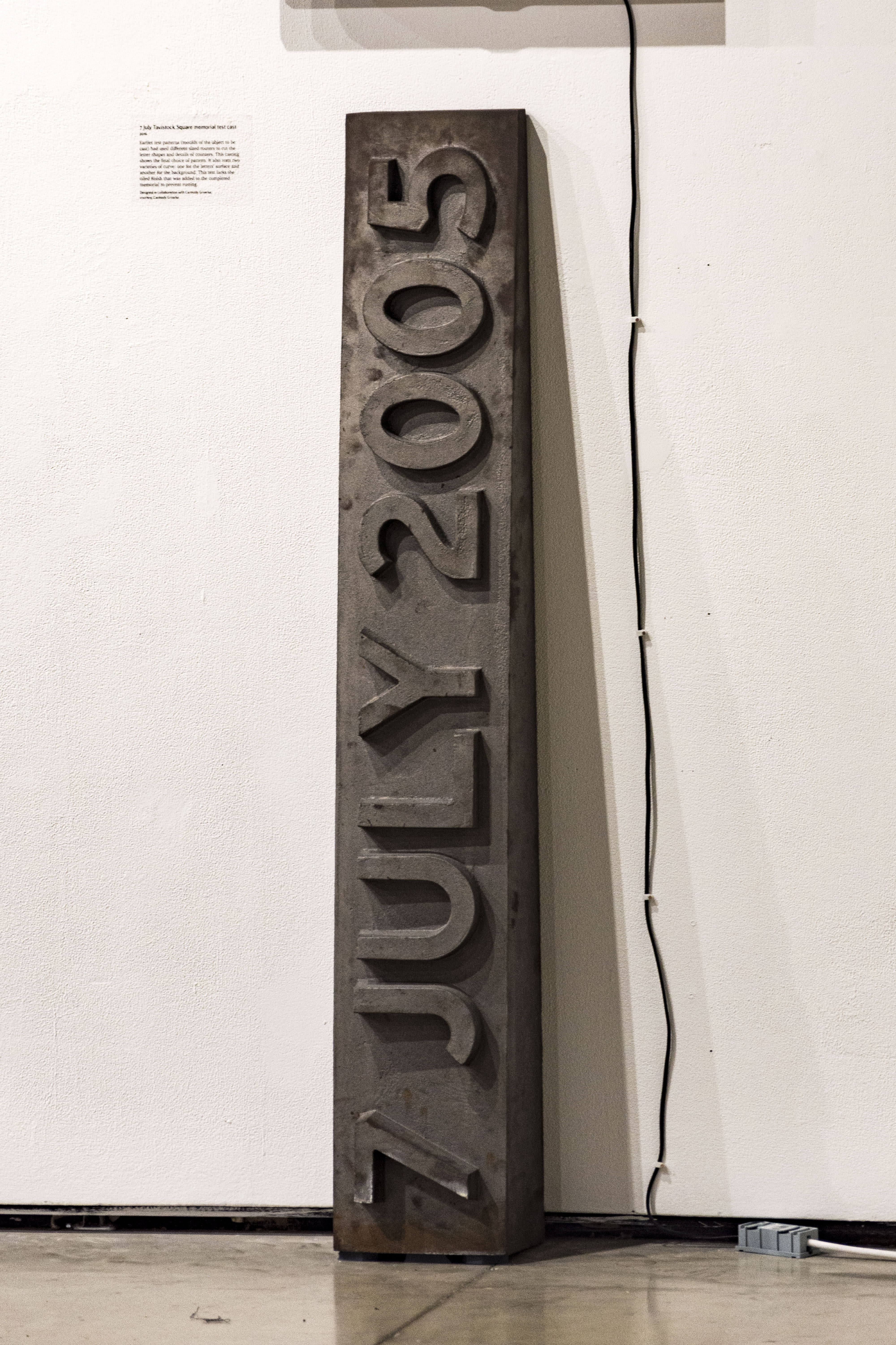
Photo: Jamie Johnson
-
Credit: Phil Baines
The Central Lettering Record
CSM Museum holds the Central Lettering Record which Phil and Catherine co-curated for many years until Phil’s retirement. The collection of 10,000 photographs and 3,000 slides was started in 1963 and subsequently built up by Nicolete Gray and Nicholas Biddulph. In 2002 it benefited from the donation of the lettering photographs of graphic designer Alan Bartram as used in his many books on lettering practice. Many of these records document historic lettering and signage that no longer exists, for instance on storefronts or buildings from times past.
A recent project has catalogued around 2000 of these items and later this year, the images will be digitised so they can be opened up to the public via the Museum’s online catalogue.
The Record reflects a tradition of interest in letters at the Central School, from the likes of Edward Johnston who developed the typeface for Transport for London in 1916, and the foundational teachings of Biddulph and Gray who developed in students an understanding of the materiality of lettering on the page through shared objects and examples.
Phil favourite items from the Record?
“It’s difficult to say as there were so many fabulous things. If I had to choose, possibly the terracotta gothic letters for building names or maybe the original drawings for the New Scotland Yard Sign, which I later developed for the Metropolitan Police.” - Phil Baines
Outside of the exhibition, Phil’s work can be encountered day to day in the signage system used across the Central Saint Martins Granary Building - a design inspired by its original warehouse building and the heavy sanserif Victorian lettering of the King’s Cross Parcel Yard.
CSM Museum interviews with Phil: listen on Soundcloud
1. From Priesthood to Art and Design
2. Studying at St. Martin's School of Art
3. Life as a St. Martin's student
4. Invention of the Apple Mac
5. Teaching before computers
6. Complementary studies
7. Rebelling at the Royal College of Art
8. Designing the Royal College of Art catalogue
9. Beginning a career
10. Designing typefaces
11. Teaching at St. Martin's
12. Phil's early students
13. The Central Lettering Record
-

Lethaby logo