
Introducing CSM Shifts, the bespoke typeface at the heart of the College’s new visual style, designed by Boyle&Perks and Colophon Foundry
Since 2018, Boyle&Perks has been working with Central Saint Martins to create a visual language for the College. Designed to fit within the parameters of the existing branding for UAL, the resulting scheme uses typography, a colour palette and visual system to bring both cohesion but also the flexibility to represent the diverse creative community within the College walls.

“The last thing we wanted to do was create another typeface,” confesses Elaine Perks, “then we went full circle because we came to the realisation that it was the only way to create something distinct within the constraints of the overarching UAL branding. It was the opportunity to create something that is anarchic, unpredictable and characterful within that system.”
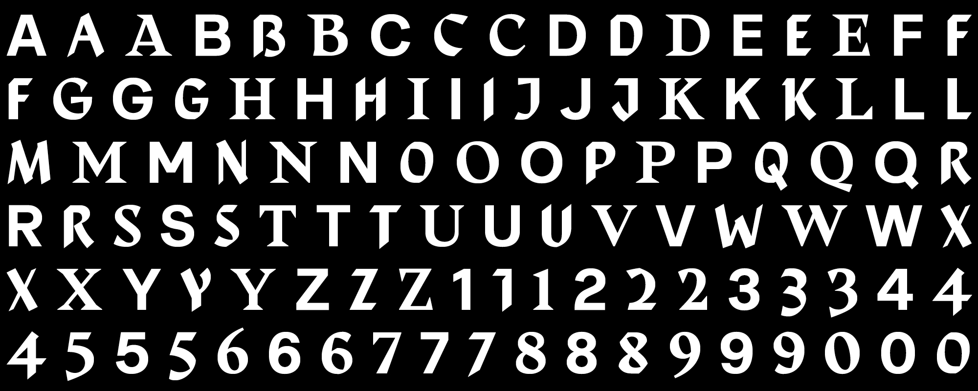
To achieve this unpredictability, the designers alighted on randomised typefaces that shift so the same word appears differently each time it’s written out. Colophon Foundry had just completed a randomised project so Boyle&Perks challenged them to create a typeface that could encompass Central Saint Martins’ past, present and future all at once.
“They wanted a design that would be dynamic, changing every time you used it, but to celebrate these pillars of Central Saint Martins: the past (the incredibly rich heritage and history), the present (the students there now) and the future (which is obviously very ambiguous). That’s what we thought was really challenging, these three moments that are quantifiable, in some sense, but open to interpretation,” says Edd Harrington of Colophon Foundry.
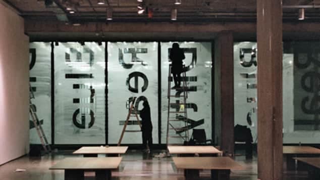
Gallery
-
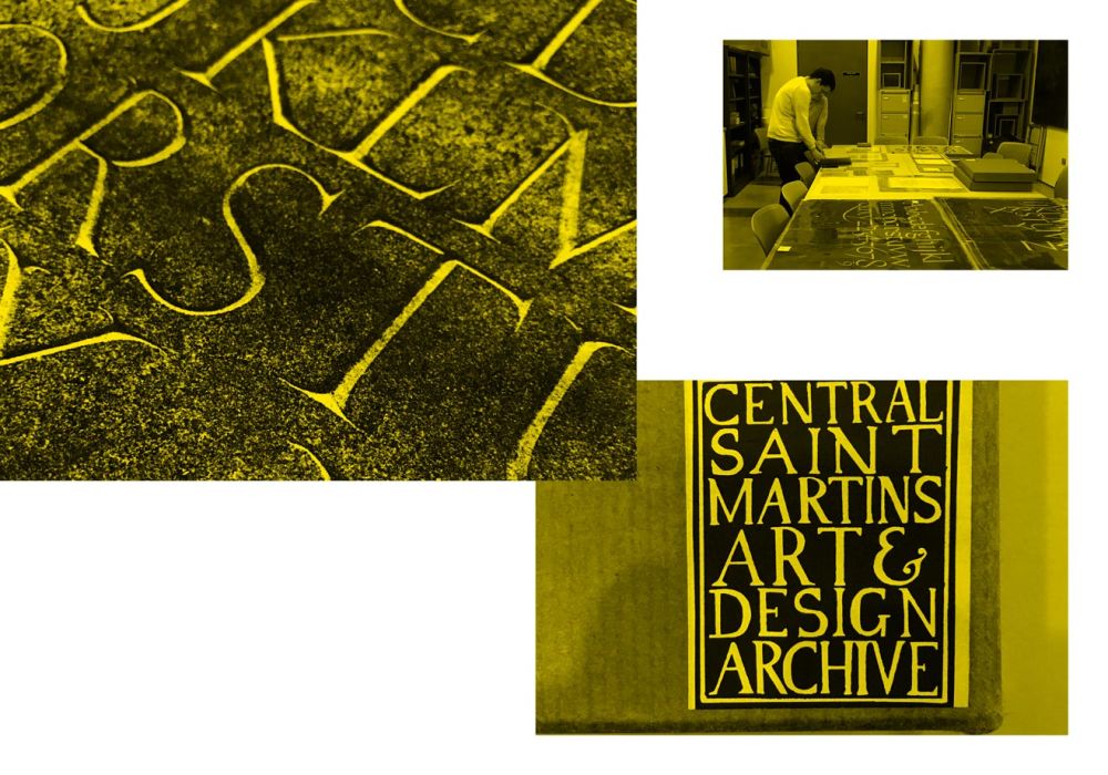
Research in the Central Saint Martins Museum and Study Collection
-
Selection of historic examples from Central Saint Martins Museum and Study Collection
-
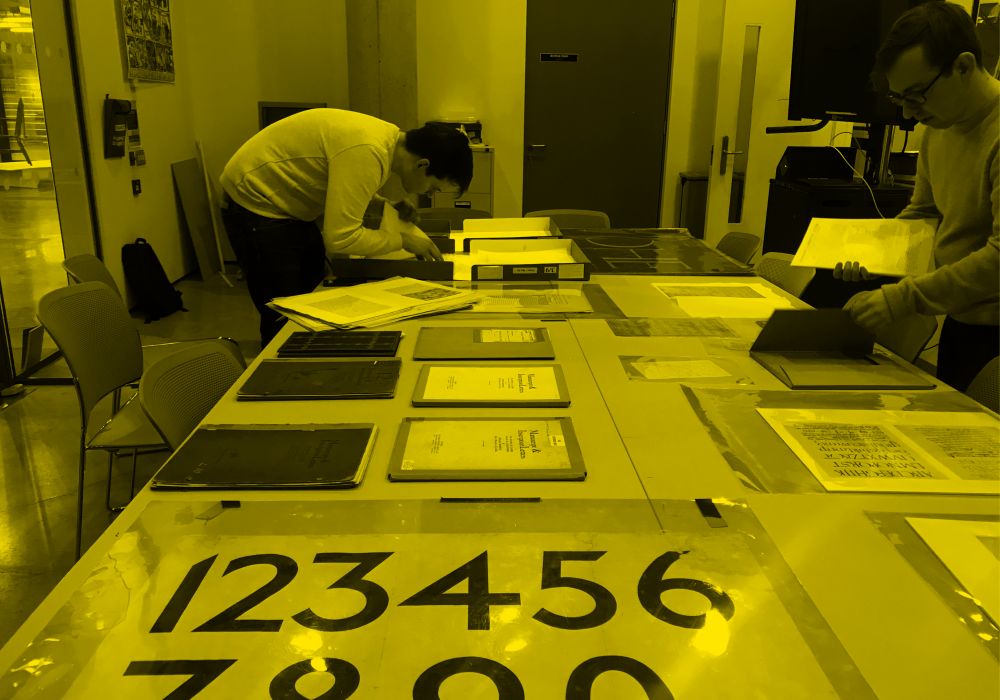
Research in the Central Saint Martins Museum and Study Collection
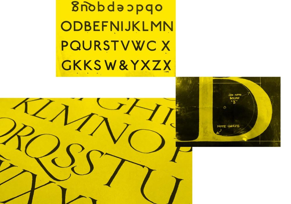
For Colophon to create an alphabet in each of the three styles, the first stop was the Central Saint Martins Museum & Study Collection to get a sense of the institution’s history. Unsurprisingly, they were drawn to the work of Edward Johnston, the celebrated designer and influential teacher at the Central School of Art and Craft in the early 20th century.
The past typeface, therefore, is represented by a calligraphic style inpsired by a Johnston type sheet. The present forms the stable foundation of the typeface and, as a sans serif, it reflects the modern movement of letterforms. The future was the trickiest to pin down. “We can’t outline one version of the future,” says Harrington, so the style became a reinterpretation of the past, a recognition that whatever is coming it responds to what was there to begin with.
In a collaborative back and forth, Colophon and Boyle&Perks refined the three typefaces that would form CSM Shifts. Once the three styles were ready, Colophon began crafting the code to denote how one letter would interact with another. Particularly ugly clashes were removed so the final typeface may appear random but is actually pseudo-random.

For a typeface that marks the genealogy of the institution, it’s pleasing that the production of the it also reflects that chronology. For the project, Boyle&Perks consulted resident College experts in the shape of Rebecca Wright, Dean of Academic Programmes, Cath Caldwell, Senior Lecturer, and Phil Baines, Typography Subject Leader, both on BA Graphic Communication Design. “Phil taught me twenty years ago,” explains Perks who is an alumna of the College, “I have memories of showing him the first typesetting that I had done for my dissertation and he destroyed it with a red pen! For this project, it’s been great to have someone of his standing to back it up. He’s been really encouraging, emphasising that it needs to be designed for the end user, the students, and it needs to look like art school.”
“Every time you type another character everything changes. It designs itself. It has a mind of its own… We’re not giving people a font, we’re giving people something that’s alive. That’s why I’m relishing seeing what everyone comes up with. It’s a bit of a beast, it does what it wants to and not what you tell it to.”
Edd Harrington, Colophon Foundry

While the typeface has initially been used, as a headline font, for print in publications like the College prospectus, the team is particularly interested in the digital potential. “When Colophon delivered the type, I was writing on screen watching as the words were remade with each keystroke,” says Bill Boyle, “It is more than a print typeface, it has a performative element. The boundaries of what people are doing with type on screen are changing at a rapid pace and pushing at what’s possible. It’s good to have a typeface that could push boundaries in terms of digital use.”
Supporting this boisterous type, Boyle&Perks has created a wider visual system that leave space for creativity. “We don’t want to restrict the creative output of Central Saint Martins,’ Perks emphasises, “We’re really conscious that we don’t want to slap a big brand on everything, so we have created space that hopefully allows for collaboration and retains the energy.”
CSM Shifts is now set free into the Central Saint Martins community to be used and possibly abused. As Harrington says, “When a type is used by a range of different people it really shows its worth.” Let’s see what happens.
For enquiries and access please contact Brand Manager, Colin Buttimer (c.buttimer@csm.arts.ac.uk)