
A jury of over 40 industry experts has recognised London College of Communication's Hannah Tunley as one of the most promising new talents in graphic and communication design.
D&AD is a non-profit association which has been inspiring creative thinkers since 1962. Their community was founded to celebrate the best work across design and advertising while encouraging movement towards a fairer, more sustainable future.
One of the core aims of D&AD is to support the next generation of creative talent. In this year's D&AD New Blood Festival Ones To Watch list, graduating BA (Hons) Graphic Branding and Identity student, Hannah, was highlighted as one of the most exciting new names in the industry.
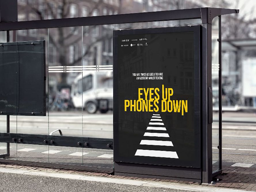
As a creative designer and strategist, Hannah creates bright, memorable visuals that capture brand personality through illustration and design. Her website features a range of responses to briefs developed throughout her time at LCC, including concept designs for Shift, Missguided and Ford.
"How lovely it can look"
What have you most enjoyed working on throughout your time on the BA (Hons) Graphic Branding and Identity course at LCC?
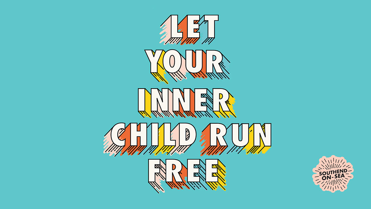
For my final year, I had the opportunity to start my own self-initiated project, so I chose to rebrand Southend-On-Sea.
While living in London, I noticed how many people would opt for Margate or Brighton for their trip to the seaside, but not necessarily Southend.
Through my rebrand, I wanted to highlighted everything Southend has going for it and what makes it unique. I opted for bright colours inspired by the seafront and illustrated some of its unique features. It was also fun to photograph Southend and show people how lovely it can look.
"It's my favourite project to date"
You also recently won the BrandOpus Chrysalis Award - what was the creative process behind your entry, and how do you feel about your win?
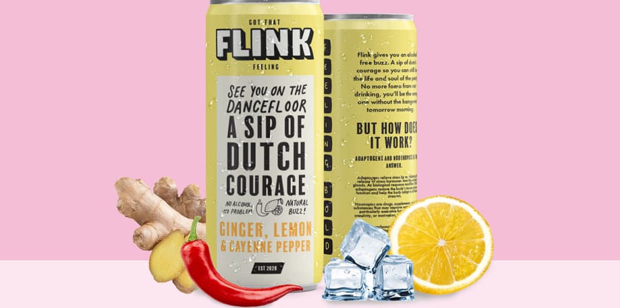
The BrandOpus Chrysalis Award asked students to create and brand a drinks company that could go beyond the benefit of refreshment.
My creative process saw me exploring multiple different, unique potential avenues, searching for a blue-sky idea. My key concept was sparked after listening to a podcast called Millennial Love, where two hosts were discussing the idea of sober dating and how unnerving that would be for them. This got me thinking about just how many situations we find ourselves in where we rely on alcohol as a confidence boost, and how it’s often used as a crutch in social situations - or, as the term goes, ‘a sip of dutch courage’.
'Dutch courage' then became the lead for my brand, Flink Drinks, which aimed to create an alcohol-free version of the concept. The name ‘Flink’ is quite literally the Dutch word for courage, and I designed my brand with a really fun and vibrant tone of voice to create the sense of confidence that alcohol seemingly does.
I’m over the moon to be the overall winner for the award. Flink is my favourite project to date, with a lot of love and passion going into it! I’m now looking forward to interning with BrandOpus and kickstarting life post-graduation.
Related links
- Explore Hannah's work on her website: hannahtunley.com
- Read our interview with Hannah on her time at LCC.
- Find out more about the D&AD New Blood Festival Ones To Watch
- Learn more about our BA (Hons) Graphic Branding and Identity course.