MA Data Visualisation students have worked with Market Café Magazine, the world’s first data visualisation zine, on a space-themed zine called Data SpaceX.
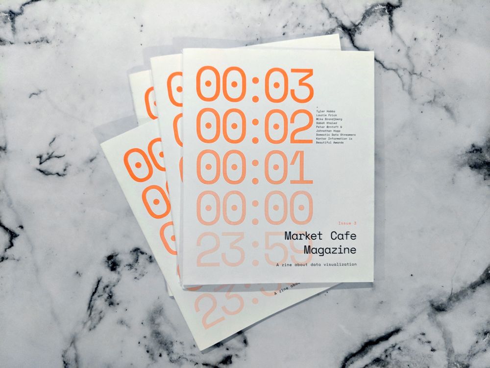
Market Café Magazine was founded in 2017 by information designers and educators Tiziana Alocci and Piero Zagami. The zine explores data visualisation as an industry and community, and is independently-run and self-published in London.
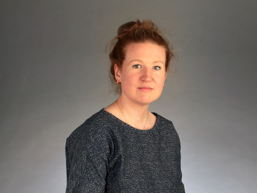
We spoke to Piero about the project, working with the students, and how data can be used to tell a story and have an impact.
Hi Piero! Can you explain a bit about Market Café Magazine?
We self-publish, self-design and sell the zine entirely on e-commerce. We also organise launch parties and events to preserve the data that is being created in London. There’s this whole community, and through time we’ve experienced that it started to meet through the magazine and the events we organised.
How have you been working with the students here?
It was a two-day workshop, and was very fast-paced and condensed. The goal was to give students the opportunity to work with data in a different way. Using data can sometimes be very computer-based. With Market Café Magazine we do something a bit different, more underground, and more print-based.
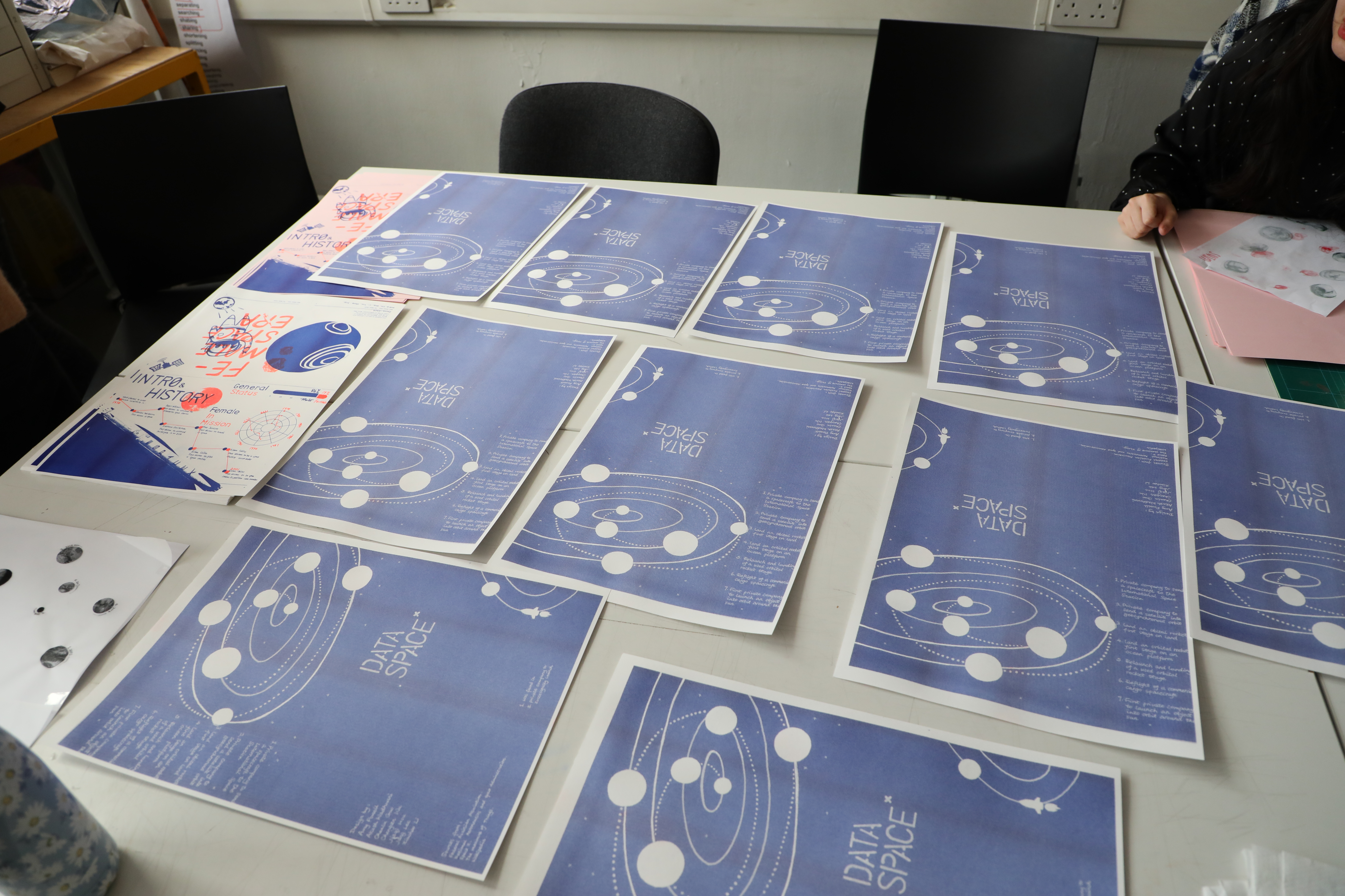
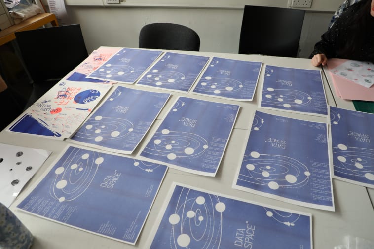
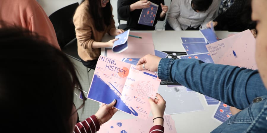
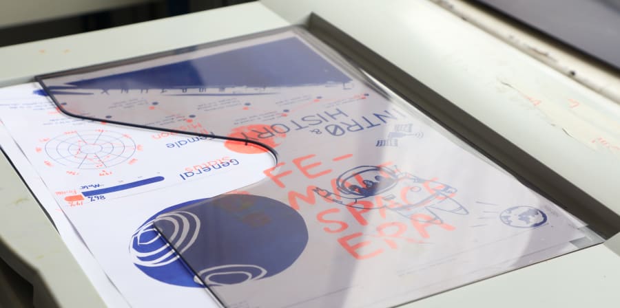
We gave students data around specific topics related to space, from new technologies to women in the field. We provided the data and printed it, as we wanted to make sure this workshop was computer-free.
The students then used the data to come up with data visualisations. We provided printers where they could use stickers, markers, and other kinds of visual language, even photography, to begin to put together a zine.
The zine was printed using risograph. What are the benefits of this printing method?
It’s a great resource for workshops, as it allows you to be creative, experimental, and create punchy effects. It also allows you to print many copies very quickly.
To what extent is storytelling important to your work and data visualisation in general?
The purpose of this workshop was to help students narrow down a topic, not just in terms of space, but also in little stories. We gave students the data, but we left it up to them to decide what kind of angle they wanted to use. We didn’t want to give them all the answers, so that it could be fun and exciting.
With our magazine, when we print a new issue, we don’t always showcase articles and interviews. We try to find a very specific topic. Our last issue was all about time and temporality, so all the projects we looked at had that in common. In that sense, everything has an angle.
What do you want students to take away from the workshop?
We’re a small media outlet, and when there are a lot of different stories to cover, we need to divide responsibilities effectively. It’s important to work collaboratively. Before you jump into a project, you need to make sure there is a plan in place and that everyone works as a team.
We’ve also shown students the steps to take when producing their own data – almost like a recipe. We wanted students to learn a process, so that they can then go and form their own.
Find out more:
- Find out more about MA Data Visualisation
- Find out more about Market Café Magazine
- Come to an open day