
London College of Communication’s MA Graphic Media Design course explores the use of graphic design as a critical tool to probe the particularities and complexities of contemporary culture through intensive practice-led research.
Students of this year’s course will exhibit at the LCC Postgraduate Shows 2017: Show 2, and will include responses to a range of timely subjects from fields as varied as literature, politics, and architecture through the practices of editorial design, installation, performance, filmmaking and many others.
We highlight some of the projects on show…
Andy Renmei
Better Babies/Higher Humans

Better Babies/ Higher Humans by Andy Renmei
Better Babies/Higher Humans is a Parafictional narrative that combines visual language and digital interactivity to expose gene editing technology as a tool for designing human beings in the near future. Which limits can be defined between curing hereditary diseases and enhancing traits that are subject to personal and cultural preferences? The project raises warnings regarding how gene editing, as a market-based asset, might ratify a price valuation practice towards an individual’s genetic code. This could also affect the way parents build their families and decide ‘what is best’ for their descendants. These ideas are embodied within the aim of this project, which is to expose a new form of eugenic language as a potential tool to promote the commercialisation of upcoming gene editing technologies.
Da-E Chung
HANTIN

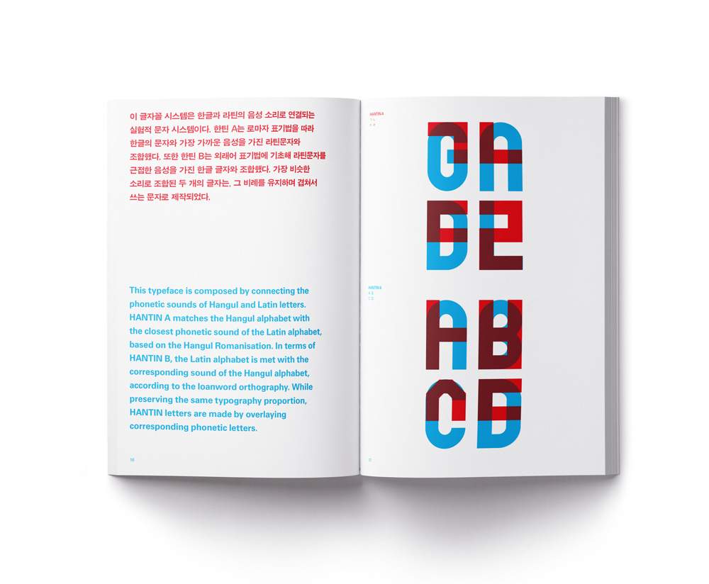
HANTIN by Da-E Chung
HANTIN is a hybrid modular typeface system that consists of Korean and Latin scripts. The primary interest in creating hybrid typeface was based on personal experience as a bilingual speaker of Korean and English. This typography enables one to read a Latin phonetic sound without needing to study English beforehand, and reading Korean phonetic sound without needing to study Korean beforehand. It is based on the analytic way to harmonise characters from different phonetic sounds and their writing system.
As a bilingual speaker of Korean and English, I often linked Latin and Korean alphabets by the similarity of their shapes or phonetic sounds. On account of these, I found this to be a very interesting way to address this issue because bilingual speakers such as myself may also experience a similar phenomena while reading a mixture of ‘ㅅ+A, S+ㅏ=SA or 사’ because of the common feature of two languages as phonogram.
HANTIN consist of two styles; HANTIN A and HANTIN B. HANTIN A is that Korean and Latin alphabet arranged by following Korean writing system which allows the English speakers to read Korean language. The Korean writing system is syllable-based writing system which the consonants and vowels are combined together on to the side, or upward or downward, coming out with a distinctive combined form. HANTIN B writes both alphabets in Latin writing system, and this make the Korean speakers to read Latin letters. The Korean writing system is phonemic writing system which the consonants and vowels arranged side by side.
HANTIN is a typeface for the Korean or Latin speakers who willing to know or learn about the Korean or Latin language.
Eugenia Luchetta
Here be Dragons

Here be Dragons by Eugenia Luchetta
My current research focuses on the constructed visual representation of the darknet and the role graphic design can assume in exposing its biases. The visual representation proposed by different media to introduce the darknet, in fact, commonly depicts its criminal and obscure side only, encouraging urban legends and myths exaggerating its mysteriousness and perilousness, in complete disregard of the central role of darknet in escaping internet surveillance and in empowering citizens under oppressive regimes.
I reconstructed a narrative around the darknet that hyperbolically embraces the stereotypical features attributed, but decontextualises them from any digital and virtual connotation transporting them into a physical world, specifically an island. The darknet is presented as if it was a remote island and its account is based exclusively on the most common as well as imaginative fictions and myths which spread around it, as if I had never visited it and no real trustful descriptions existed. The project takes the form of a book, a sort of hybrid between an atlas, an exploration log and a fantasy short story.
Richard Ashton
Leisure This Way

Leisure This Way by Richard Ashton
Leisure This Way explores how the boundaries of work and leisure time are continually shifting due to the expectations associated with both terms and their environments.
Experience Factories are environments which provide (and capitalise on) a steady stream of pleasurable experiences to a society that has come to expect them. These Experience Factories prompt, capture and distract audiences whilst providing as many options for leisure as possible.
Within the publication, writing is accompanied by three visual essays that utilise Westfield London as a case study to highlight the semiotics of the leisure industry and its ability to control consumers’ actions and time.
Bec Worth
A Common Practice
A Common Practice presents an intention, a methodology and a terrain. It is a proposition for a design studio and ongoing research inquiry which takes the context of accelerated culture as its starting point. It explores the methodology of digression and association to reshape practice around values of the common(s).
The briefly vacant site, commonpractice.info, marks the terrain of anticipated dialogue, which will emerge through writing, intimate conversations and group discussions. The project framework – roam, traverse and trespass – is navigated through an expanding index, and prompts us to rethink relations to self, labour and the commons.
Carlos Romo-Melgar
Expanding the Field of Architectural Publishing

Expanding the Field of Architectural Publishing by Carlos Romo-Melgar
Expanding the Field of Architectural Publishing is a practice-led research project that looks for opportunities within the field of speculative graphic design to amplify the agency of small architectural publications. EF—AP establishes a methodology in which the speculative publication is a source for opinions, conversations and modes of practice around the subject of study.
The intention of this assemblage is to provide a critical response to the common practices and politics of architectural publishing, which are fixed.
The project is supported by a complex theoretical framework that crosscuts different disciplines and practices such as architecture, graphic design, philosophy and publishing. The purpose is to surpass parochial ways of creating design and architectural discourse.
Aldo Caprini
DAMNED GREEN

DAMNED GREEN by Aldo Caprini
The Green Book is a literal book and rhetorical device that was used by Gaddafi to rule over Libya during a period bookended by two revolutions. In 1969, the Libyan dictator took power after a military coup that he led as Colonel—deposing the old monarch, King Idris I—and was, in turn, overthrown during the Libyan Civil War in 2011. During his dictatorship, The Green Book became the basic element of Gaddafi’s ideological apparatus, even more so than his political programme.
DAMNED GREEN is a publication that sits within a larger research project titled The Green Book, The Red Book, and The Blue Book. The research is positioned in an area of study known as political design, and is intended as a think tank for ideas about power and leadership, the status quo and subversion, representation and reproduction. The key inquiry of the research is to establish the original network behind the production and diffusion of The Green Book.
Cate Rickards
The Shadow for the Thing

The Shadow for the Thing by Cate Rickards
A dummy hand grenade from the film Full Metal Jacket is held in the Stanley Kubrick Archive at London College of Communication. Central to my research, this object is used as a case study to address a broader research question: ‘How can the perception of an object be problematised through graphic design?’
The final outcome of my project is a single ‘monograph’ offering a fragmented biography of the grenade and a series of hand-sized books containing print off cuts and selected research images. Expectations of the book are challenged by a purposeful derailment of conventions. The books are unbound and coverless, mimicking hand grenade-like objects.