
The world renowned book designer and Swiss typographer Jost Hochuli delivered a sold out talk at London College of Communication, recounting his remarkable 60 year career to students, staff and the public.
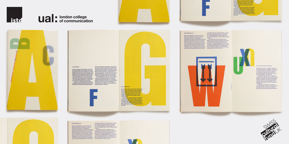
Jost Hochuli is the author of numerous highly acclaimed books on graphic design and typography. Highly-sought titles from his collection include; Detail in Typography (1987), Designing books: Practice and Theory (1996) and Printed Matter, Mainly Books (2001). Many of the books designed by Hochuli have been selected for the Most Beautiful Swiss Books and Most Beautiful Books of the World exhibitions. Hochuli has been acclaimed as a quintessential typographer – the typographer’s typographer.
The talk was hosted by Tony Pritchard, Course Leader for LCC’s Postgraduate Design for Visual Communication course, curated by LCC and the International Society of Typography Designers (ISTD), and further supported by the Swiss Culture Fund.We look back at some of the highlights from the talk and round up a handful of the key takeaways from the evening where Hochuli recalls his early influences…
Yesterday evening
with friends at the ISTD/LCC event, Lecture Theatre B
Jost Hochuli, typographer and Grafiker
To… https://t.co/mKro8hY16o pic.twitter.com/Mzc7r5Mreh— Baseline Magazine (@baseline_mag) September 20, 2017
The talk commenced with David Kilian Beck, the Switzerland Embassy’s UK Head of Culture, who recalled when he first began working at the Swiss Embassy. David was given the task of clearing out a collection of books to make space in the office for him to work, told that the only real no-go was to touch a row of 12 publications – known to the culture department as their holy grail.
“Many people have the misconception that Swiss typography is only in Switzerland. This is a very common but untrue thought. In fact, Swiss typography has nothing to do with Switzerland as a whole. It is only connected to the German speaking part. In the French and Italian speaking part typography differed and caught on later when people studied in cities such as Basel.” – Jost Hochuli
The publications were giveaways published by the Swiss Arts Council in 1993 and Beck seemed skeptical that a book published 20 years earlier still held relevance. But he revealed that 5 years down the line he is grateful for it; every year students call to ask if they could get ahold of Jost’s work.
“I am indebted to Jost now as those books are still relevant and probably one of the best giveaways ever produced, which has held importance for so many years.”
A rare image of work by #JostHochuli a fave of @Foundry_Types taken by @HenriettaRoss07 for @ISTDworldwide pic.twitter.com/XdezP5hEi2
— Tony Pritchard (@tonyplcc) September 20, 2017
ISTD director Freda Sack was also a welcoming speaker and detailed their exhibition in AMBIT before introducing Tony Pritchard to open the discussion with Hochuli.
Hochuli described how he first came to be interested in typography and what his early influences were. He recalled: “In 1955 I met the artistic director of a large printing firm. I became his intern for a year, working 3 half days a week and that sparked my interest in typography.
“In those times the only way to get into typography was to do an apprenticeship, which I did in two and a half years instead of four and began working as a graphic designer. Being a modern designer back then I took up any opportunity for designing, whether it was a book poster or flyer or whatever. ”
Hochuli humorously recollected that, when he was first starting out, no matter what you were designing, typography designs were limited to Akzidenz Grotesk, Monotype 213, Times New Roman and Bodoni fonts – limiting their creative output.
Jost Hochuli talk was interesting, very on board with everything he had to say! pic.twitter.com/9J73jo8m0N
— Theo Inglis (@Theo_Inglis) September 19, 2017
The prominent typographer paid tribute to Emil Ruder for his book Typographie (1967), and Rudolph Hostettler, editor of the Swiss journal Typografishe Monatsblätter between 1952 and 1981.
He also praised the work of Jan Tschichold, who created a series of designs for Catholic and Protestant Hymn books in Switzerland: “These were exemplary for its functionality – the legibility of the text is tested in poorly lit churches. I had not before this considered the design of sheet music before, despite it being right in front of my eyes for so long.”
Speaking more on the typographic situation in Switzerland when he was younger, Hochuli explains that he only saw Ruder and Hostettler as only one side of the mill. He said, “Many people have the misconception that Swiss typography is only in Switzerland. This is a very common but untrue thought. In fact, Swiss typography has nothing to do with Switzerland as a whole. It is only connected to the German speaking part. In the French and Italian speaking part typography differed and caught on later when people studied in cities such as Basel.”
https://twitter.com/designbyatlas/status/910496898347388928
Drawing the conversation to a close, Hochuli payed homage to his close friend and influencer Max Koller. “Back then, whenever typographers made a catalogue they had always done things using a grid. Max was first to show me that you can do things without a grid, which gives a more natural look and you can experiment with several formats of the same size.”
He described the typographic designer as a pioneer in his field, who published a type specimen book made of only 16 pages in the 1990s when no one had filled the void.
Design historian Paul Shaw has commented on Jost’s work: “Through his books, particularly English language editions, Jost has become probably the most influential theorist of book designs since Jan Tschichold.” It was a pleasure to welcome him at London College of Communication.