As part of our ongoing features around LCC Degree Shows 2018, we caught up with alumna and identity designer Weronika Rafa to talk about her approach to this year’s visual identity for the Degree Shows, bringing graphic design into a three-dimensional space and reflecting back on the history of the College.
Tell us about yourself and your time at LCC
I’m a print and exhibition graphic designer with focus on typography. In my work I like to rely on contrasts, such as juxtapositions of shapes or underlined meanings to the visual of the design. This approach is useful when designing posters and identities for the cultural sector, which is mainly what I do. Privately, I’m a typography nerd and a person who enjoys unusual food stickers.


My time at LCC started in January 2015 when I enrolled into MA Graphic Design course, taught by Paul Bailey, Vanessa Price and Tony Credland. I freelanced during my studies and continued to do so after graduation. After a 6 month stay at a design studio in Germany I returned to London to continue working for LCC, on this occasion, full time.
There are so many different elements of a Degree Show identity to consider, how did you approach the brief and what were your priorities at the start of the project?
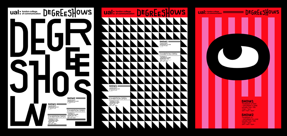
With a complex event like this you need to think about creating an overall design system that can be applicable across different exhibition channels (print, digital etc). It’s not just about making a logo or a poster, but rather creating a family of elements which are transformable and reworked according to the format you’re given.


My priority was to start with a concept first and develop from there. For this particular event – Degree Shows 2018 – I tried to remember when I was a student and what emotions I felt when I was submitting my final project.
There are so many components to your Degree Show identity – gifs, transforming the front of the building with flashes of colour etc. Tell us a bit about the concept behind the design and how you shaped it to be easily transferable across different formats?
This year’s concept was inspired by LCC students and their creative journey – we teach them their craft but also encourage to ask questions and be observant of the world around. It’s such a crazy time – you hardly sleep, live off Tesco sandwiches and (in my case) move margins one millimetre to the side because you want your final piece as perfect as possible. Ultimately though, these final moments are a time for celebration. The students have worked so hard and they’ve done such an amazing job – this was what I wanted to emphasise with my identity, by making it fun.


This curiosity was transformed into the 2018 eyes – the symbol of the identity which symbolise creative curiosity and observation of the world around you. Their quirky character emphasizes the nature of the Degree Shows. We’re saying goodbye to 2018 students but ultimately celebrating their achievement and welcoming a group of young professionals into the creative industries. It’s a happy, fun and bold occasion and I wanted my identity to reflect that on every level.
What have been the main differences between designing an identity for a Degree Show compared to an exhibition in a gallery setting?
To me, Degree Shows are more of a festival rather than a gallery exhibition. Definitely the scale of the project is different – with art and design galleries you wouldn’t have so many elements to the project. I often found myself working on 8 tasks simultaneously on top of my day-to-day job, which was challenging but exciting. Gallery exhibitions are a bit calmer and the process is more predictable, at least in my experience.

What is your favourite element of the show identity and why?
Looking at the identity though, the typeface pops up – it’s a mixture of Exposit Bold and the glyphs I’ve developed. It holds all the elements together while maintaining a distinct personality of the event. I like it. I’m also glad I was allowed to use black on white text combination which can be a challenging combo to push through.


What has been the most challenging moment of the process? And the best?
Letting go of the control was the hardest part – there were moments when I had to rely on other people, which meant believing in them even with my designs. I’ve learnt to manage my expectations and not dwell on the parts which weren’t perfect. Design was easy. Emails and spreadsheets were hard.
Now for the best part – it was easily all the people taking pictures of the identity. Speaking as a designer, the moment you manage to engage the viewers is both humbling and rewarding. It was all for them and I’m glad that they like the results.


What have you in plans for the future/what projects will you be working on?
Once we wrap up the shows I’m planning to take some time off to update my website (the horror). The next big project is LCC Postgraduate Shows – although these happen in winter, the design should be ready much earlier. That’ll keep me busy, I’m sure. Apart from my job at LCC, I’m developing a few editorial projects on the side and participating in various design events across Europe. I’m excited to see where that takes me.
Follow Weronika on Instagram.
- Find out more about LCC Degree Shows 2018: Show 2.
- Follow LCC on Instagram to see behind-the-scenes from Degree Shows and more.
- Find the perfect course for you at an LCC Open Day.