With our Design School Show launching this week, we caught up with alumna Nina Jua Klein to talk about her approach to this year’s visual identity for the Degree Shows, bringing graphic design into a three-dimensional space and reflecting back on the history of the College.
Tell us about yourself and your time at LCC
The work I am drawn to tends to go beyond the traditional bounds of ‘Graphic Design’, a notion that was instilled in me by my tutors during my time at LCC. We were encouraged not to rely on computers but to realise projects using the many facilities at our disposal – letterpress, screen printing, photography or the 3D workshops.
Since leaving LCC in 2008 I have been fortunate to continue working on projects as varied as designing prints for Alexander McQueen, working with Visual Editions on their books and visual identity, designing exhibitions and books at Praline and marketing campaigns, environments and exhibitions for Tate.

There are so many different elements of a Degree Show identity to consider, how did you approach the brief and what were your priorities at the start of the project?
LCC Degree Shows 2017 marks the first year where there isn’t just a Media School and Design School show, but also a third for the recently established Screen School. Rather than attempting to unify the work emerging from such a breadth of courses, I chose instead to focus on the history of the College – a rich heritage shared by all students through their participation within it.
I began the process by spending time in the LCC Collection of UAL’s Archives and Special Collections Centre, speaking to members of staff who have been part of the College for years, informing the development of the identity with a sense of celebration. Not only of the industrial history of the London College of Printing, as it was formerly, but of the evolving nature of London College of Communication as it is now. Overall, within the spaces and the printed and digital materials, I wanted to create a sense of movement, imbued with the College’s transition from the past to the present and into the future.

The front of the building has been turned into an installation bringing a physical presence to the identity, tell us a bit about the concept behind the design.
After visitors received animated digital invites scrolling in their inboxes as if running through a printing press, I wanted them to be greeted by an installation that brought this suggestion to life within a three-dimensional space. Reams of paper cascade through a scaffold structure which expands the existing grid of the windows into the volume of the space, evoking a giant printing press.
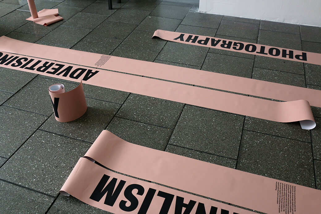
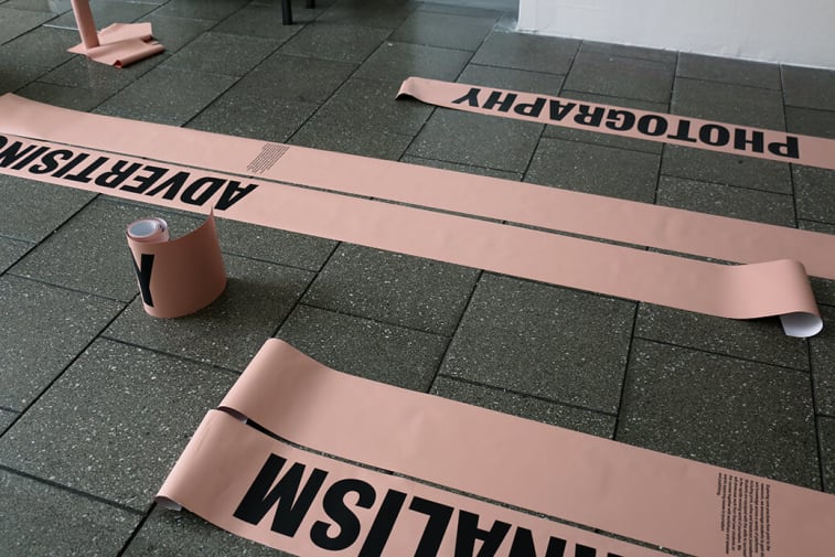
Beyond the entrance this theme runs through all internal signage with long strips reappearing throughout the building. Running vertically along the wall, ending wrapped along metal rollers, they reference the three-dimensional physicality of various printing processes. For directional signage, text is applied directly to metal rollers which are mounted to the wall. Visitors are encouraged to interact with them, and by doing so they are setting the static in motion.

What have been the main differences between designing an identity for a Degree Show compared to an exhibition in a gallery setting?
Equally relevant to both an exhibition in a gallery and a Degree Show context is the development of a graphic language that unifies the character of the work exhibited. In a public gallery this is usually the work of just one artist, who may or may not be alive, while at a Degree Show the design is for hundreds of students who of course are very much alive. My priority has been to develop a graphic language that the students will hopefully enjoy.

What is your favourite element of the show identity and why?
One of my favourite elements is the show guide. From the outset I was very conscious of not wanting to only look back at the history of print but also celebrate it’s developments and the possibilities which the latest technological elements allow. The printed show guide seemed like the perfect opportunity to showcase the contemporary potential of print.

Working closely with Paul Regan at FE Burman, himself an alumni of the London College of Printing, we developed a system which would bring to life the continuous movement that runs through the identity. The guide is printed on loose strips of coloured paper, hanging from pegs on the wall – one for each show: Media, Screen and Design.
Making use of HP Indigo technology, a software plugin nudges the text up vertically by a small increment on each sheet, reappearing at the bottom as it begins to disappear at the top, moving in a continuous loop. As visitors take leaflets of the pegs they begin to set the show titles in motion, mirroring their movement through the printing press and by doing so, becoming part of the process that produced them.

What has been the most challenging moment of the process? And the best?
Realising the entrance installation in a very short space of time was perhaps the most challenging but also the most rewarding part of the process. For my first concept presentation I made a small model of how I envisaged the entrance of the College to look.
Wanting to build a large scale three-dimensional structure I decided to involve the very talented set designers Isabel + Helen to help me with the logistics of bringing my model to life. Their experience, knowledge and enthusiasm have been invaluable and yet none of us could have foreseen the many challenges we would have to overcome in the process. If we had known, perhaps we would never have attempted it but I am so glad we did, with the perhaps slightly foolish optimism that we could pull it off. Seeing the finished installation in daylight when the sun came up after a weekend of night installs was a very special moment.
