The Story behind the graphics
Graphic Designer James Land tells us all about the story behind the graphic design for Origins Creative Arts Festival 2019.
How did you first get into Graphic Design and what is it that you enjoy most about it?
I studied BA Graphic and Media Design at London College of Communication, focusing my work on editorial and branding. Two of my favourite projects during my time at LCC included branding Brighton and Hove for a City of Culture festival, and designing, writing and making a gay film magazine. For me, the research and development stage of the design process is the most important, I think having a well thought out concept is key to creating great design; it’s not just about making something that looks cool!
What made you decide to go freelance?
After a couple of internships and short-term design jobs, I decided to start freelancing as this gave me the opportunity to pick and choose the projects I wanted to work on, as well as giving me control over each stage of the project, which you don’t always get when working in a company. I’ve done a couple of branding projects whilst freelancing, and my time at LCC has given me invaluable skills in being able to see a project to completion, through all stages.
Tell us about the design process for Origins Creative Arts Festival 2019.
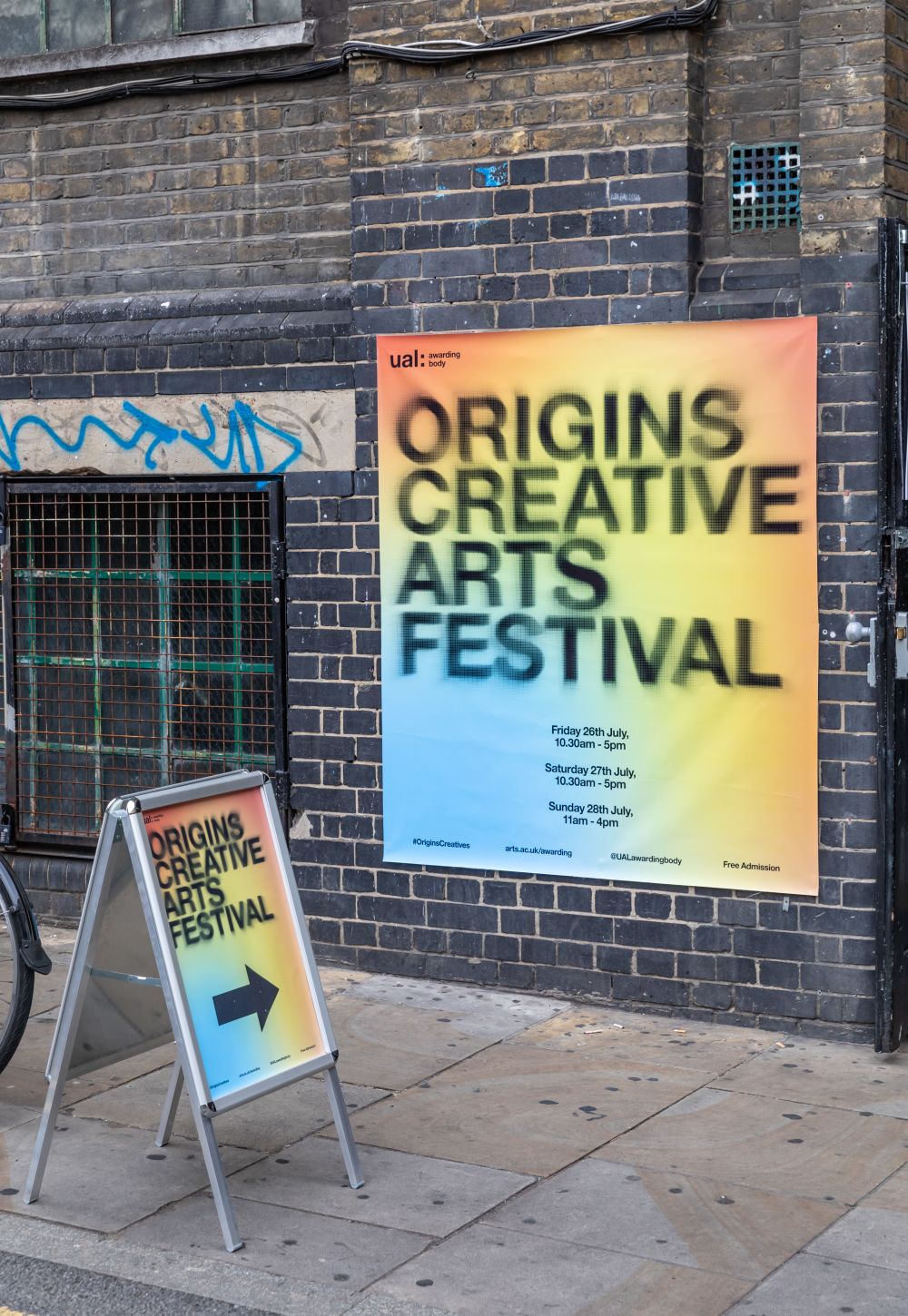
The design process for Origins Creative Arts Festival’s visual identity started by analysing the word ‘Origins’ itself. It’s defined as being the point of place that something begins, arises or is derived, and various ways of representing this through visual means were considered. The purpose of the festival was also considered, it provides a platform and brings focus on young emerging artists. After several stages of experimentation and development, the idea of literally playing with the scale of the focus of design elements was decided on; expressing the theme of something coming into focus in the identity.
The concept for the identity allows the logo, typography and images associated with the brand to be playful, having no fixed focus, instead scaling from unidentifiable blurriness to the reveal of something in full.
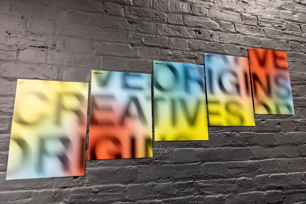
The creation of the logo started with a cheap projector lighting up my bedroom wall with the title of the festival in Helvetica Neue - UAL’s brand typeface. I moved the projector forwards and backwards, with each adjustment of focus creating a different form and possible logo.
I then started doing this digitally, allowing me more control and manipulation over the text. Using Photoshop, I pinned different sections of the words, adjusting them so that some sections were blurred, whilst others in full focus. One of many variations I experimented with ended up becoming the final logo for the festival, with a halftone pattern applied to allow us to scale the logo up and down without the loss of quality.
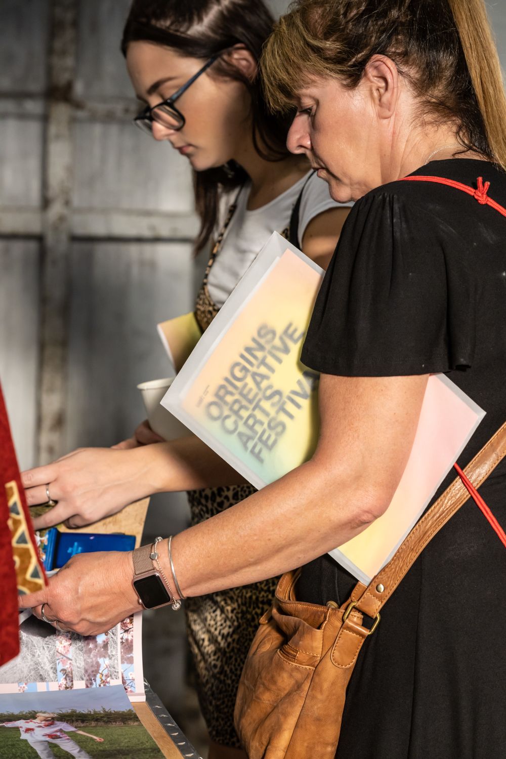
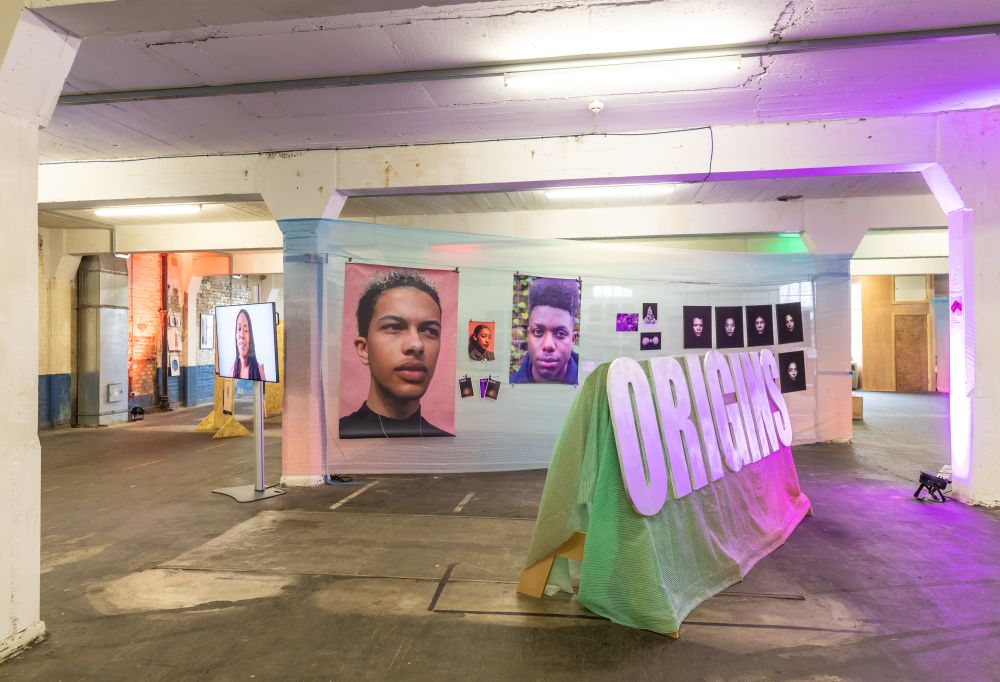
The use of blurring and gradients allowed for integration of images of the work which was exhibited. As the festival approached, the blurred images came into focus across UAL Awarding Body social media channels, acting as a slow reveal of the work that visitors could expect to see.
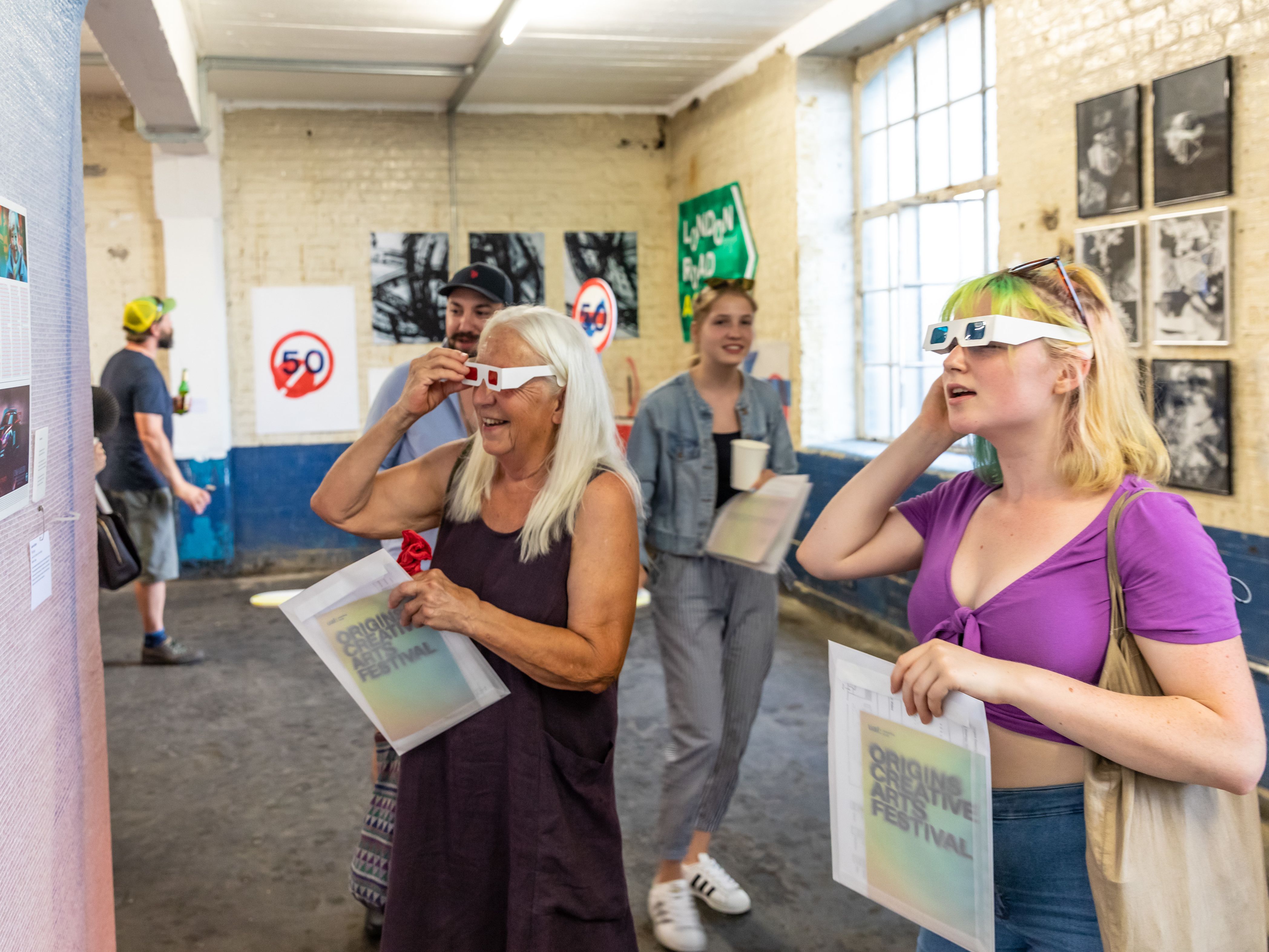
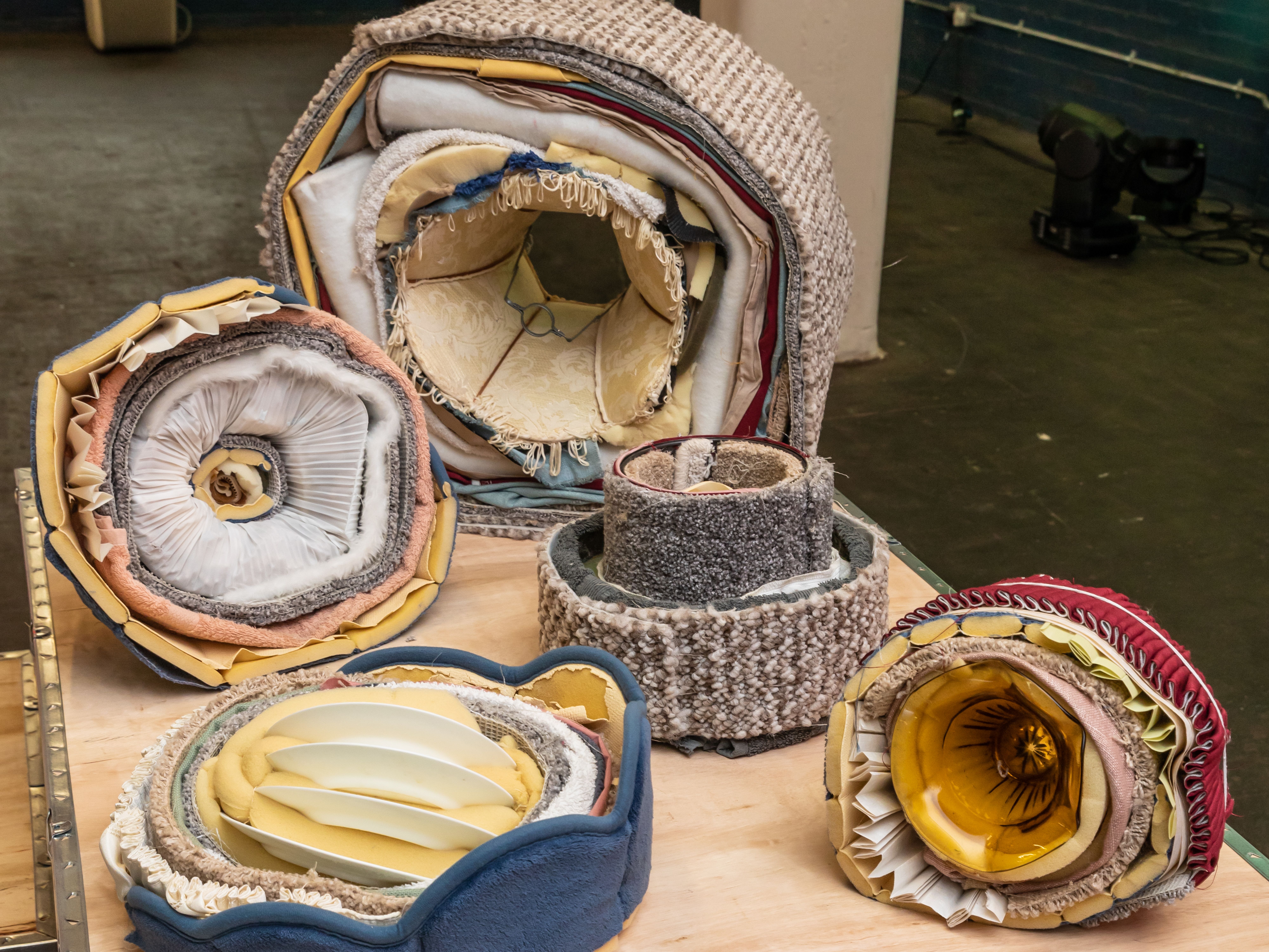
Check out some of the photos below to see how the graphic design translated into the design of the exhibition!
You can see more of James’ design portfolio here - https://james-land.com/.