
Students on the Postgraduate Certificate and Diploma Design for Visual Communication courses adopt a diverse and integrated approach to design incorporating the benefits of both digital and physical design processes.
The display of work on show was produced by both part-time and full-time participants on the course in support of the annual publication.
Explore a handful of the projects on show at LCC Degree Shows 2019:
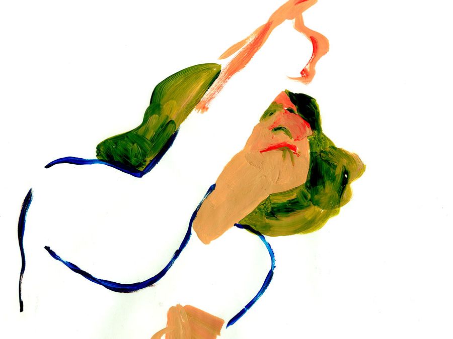
Emilia Kalyvides
Digital vs Analogue
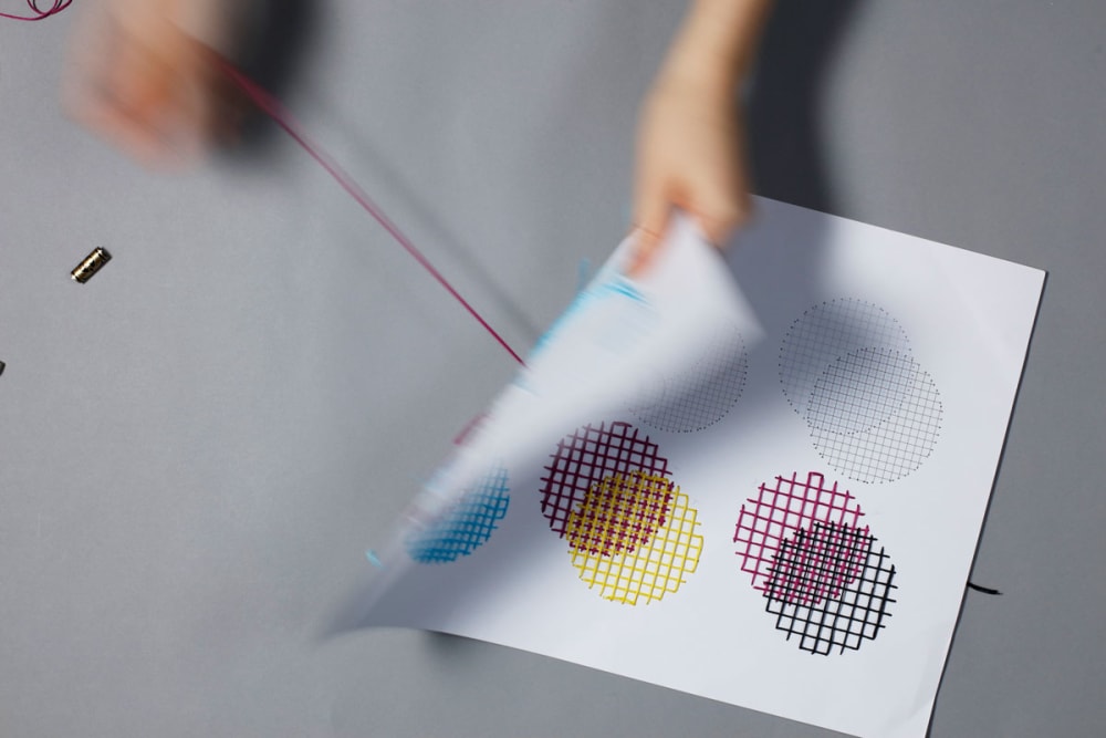
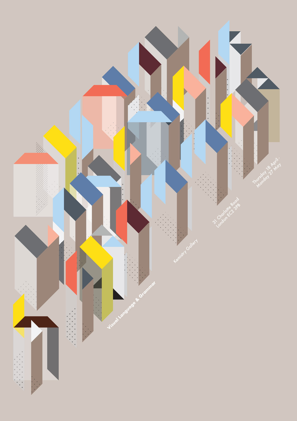
‘Digital vs Analogue’ explores the integration of digital and physical craft through an exhibition poster for ‘Visual Language & Grammar’ at Kemistry Gallery. Today, digital experience is changing our perception of the physical world around us. This exhibition poster uses CMYK coloured embroidery thread to evoke three-dimensionality and experiment with digital colour theory.
The poster draws inspiration from traditional embroidery design and grid systems to create a new technique of physical printing with the different combinations of cyan, magenta, yellow and black resulting in a spectrum of new colours which reveal themselves when viewed from afar and at different angles. The nature of embroidery encourages the viewer to engage with both the front and reverse of the poster.
Jens Wolter
BAU (Building artistic understanding)
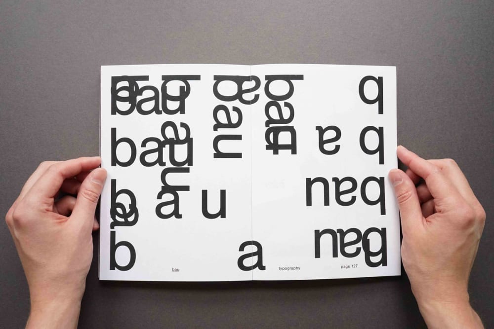
In the Bauhaus manifesto from 1919, founder and director Walter Gropius proclaimed that we "must return to the crafts" and argued that "proficiency in a craft is essential to every artist". The curriculum of the revolutionary design school was based on a preliminary course that taught basics of composition.
In my publication, I imagine a contemporary revival called BAU, an acronym for ‘building artistic understanding’. It explores original Bauhaus themes and modern approaches whilst also addressing the past and visually discussing the variety of multi-disciplinary experimentation today. The balance between knowledge and freedom at an art school is one I highly appreciate. Susan Orr and Alison Shreeve, professors at UAL, wrote that "the art school needs to both stabilise and destabilise."
This is a notion I tried to apply to my concept. In most parts, the book doesn’t explain itself and aims to act as a visual compilation. Inspired by Bauhaus teacher Herbert Bayer, I abandoned capital letters and decided to use type and image as main graphic solutions. I took unusual paths with black ink on a black cover, changing paper stocks, an unconventional and raw typographical approach, whilst also trying to frame content within a stable and pure form.
Anna Harrison
Visual Language and Grammar
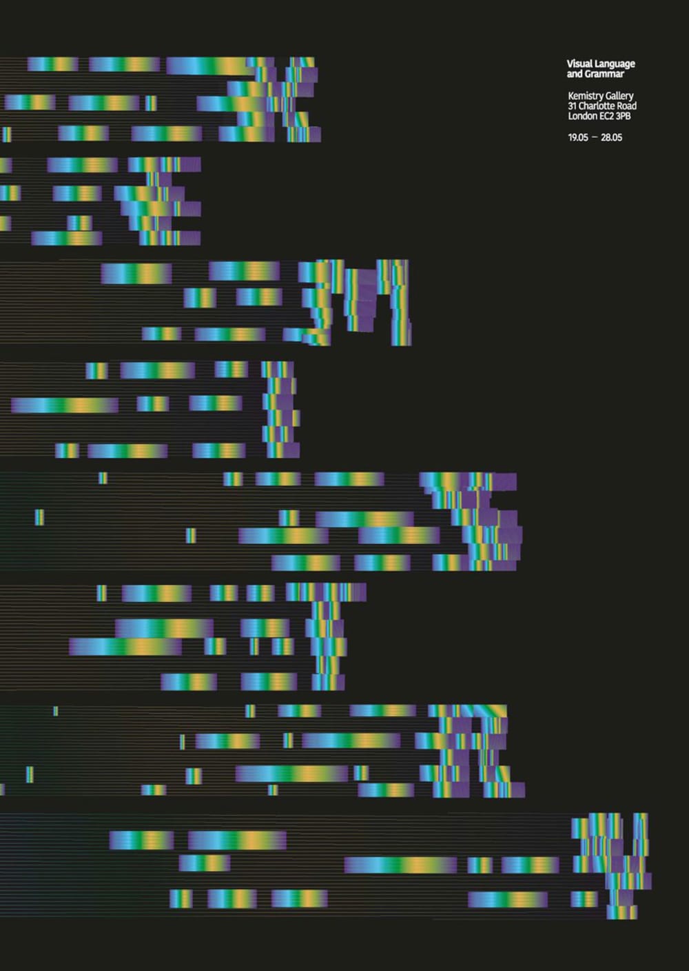
Exploring Visual Language and Grammar I focused on shape and form to create a new typeface to spell the name 'Kemistry'. I created a metal print using lithographic printing and a CYMK colour process. The form and positioning of the created typeface creates motion, something mimicked by the reflected light in the metal print.
https://annakeharrison.myportfolio.com/work
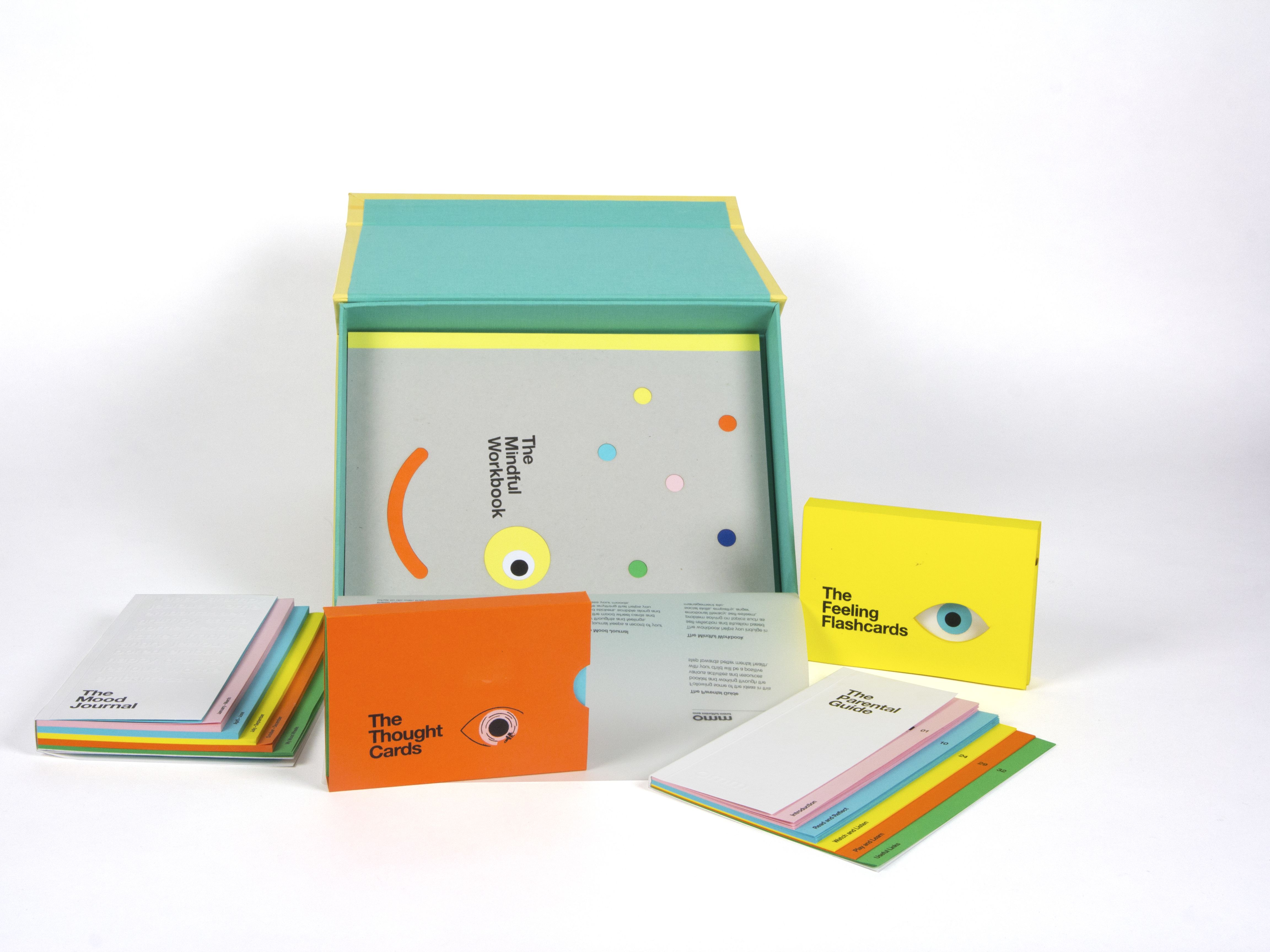
Aastha Mehta
Chapter: Doing
Chapter: Doing comprises of a series of works that are the result of my exploration and experimentation with different materials, media and printmaking processes. Cutting, carving, coating, inking. The act of doing, repeatedly, without any thoughts or speculation of the outcome in itself became very meditative.
https://behance.net/aastha_mehta
Crystal Lin
Visual Language and Grammar

This A2 poster experiments with visual language by using axonometric letters and an abstract, geometric typeface – the letters are intended to to feel sculptural, and the diagonal composition is intended to recall an architectural drawing style.
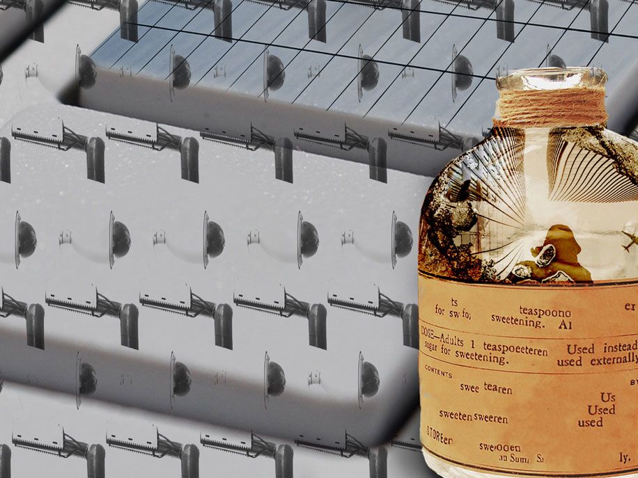
Amanda Claudine Aspeborg
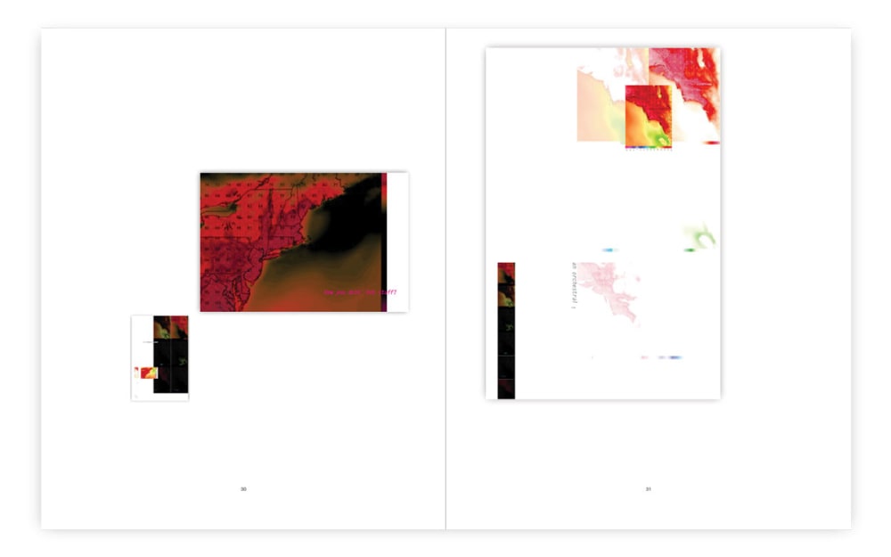
Make Space
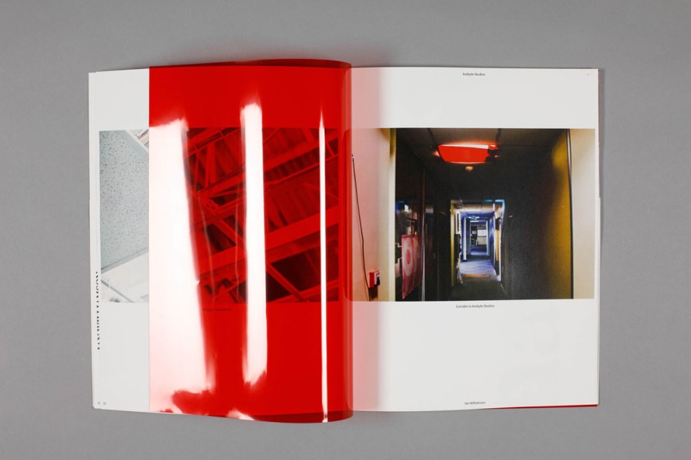
With a special focus on the lack of affordable space, the issue of artists studios have become a topic of conversation over the last couple of years. Make Space is collection of publications made exploring this topic. Each publication focuses on one artist and the space they occupy to continue with their artistic practice.
- Find out about Postgraduate Certificate and Diploma Design for Visual Communication at London College of Communication
- Explore events at London College of Communication
- Follow LCC on Instagram to see behind-the-scenes at the College
LCC Degree Shows 2019: Show 2 takes place from 19–22 June 2019.