MA Graphic Media Design explores the use of graphic design as a critical tool to probe the particularities and complexities of contemporary culture through intensive practice-led research. This year’s show, LCC Postgraduate Shows 2018: Show 2, 5th – 8th December 2018, will include responses to a range of timely subjects from fields as varied as topography, literature, politics, and architecture through the practices of editorial design, installation, performance, film-making and many others.
Here we shine a spotlight on some of projects on show…
Jaya Modi
‘E.A.T – Evolution, Aesthetics, Technology’

‘E.A.T is an anthropocentric study, that interrogates the act of eating as a recombinatorial of our progressing evolution, aesthetics and technology. It accepts the finding that eating is, and will always be, inherently ritualised. By reflecting on the conviviality of our eating implements, it begets a contemporary conversation about their future interpretation and influence. Using design research as a tool to explore the fundamental relationships between humans and eating tools. Using the spoon – an archetypal tool that has very well assimilated into our living, E.A.T tries to unravel ideas of its preconditioning by engaging a speculative study of its future form and functionality through the aesthetic capacities of design. By experimenting with the presumed shape and function of the spoon, E.A.T uses the notion of discomfort to repurpose the utilitarian governance of the tool with regard to structure, usability and placement.’
Cristina Rosique Gómez
‘NO! I don’t want to take an Uber, I want to be a Street Hunter.’
‘NO! I don’t want to take an Uber, I want to be a street Hunter. [Femme] Urban explorer is an attempt to manifest and to spread the female wandering; the way that we experience the city and our perceptions of it. With the final aim to increase empathy and awareness about our experiences; the non-front page news (rapes nor robberies are not considered in a newspaper) although they are stressful situations that we have to face our daily lives. [Femme] street hunter is an interactive video, as the final medium supports my research and allows me to achieve the objective of reaching a wider audience. It shows different spaces based on women’s experiences, which leads to the creation of a [femme] city, and as long as you are wandering inside it, a poetic voice is narrating stories, feelings beyond every spot. A reader, which includes all the urban poems, supports the video, moreover it makes it easier to engage with the content.’
https://www.cristinarosique.com/
Suki Law
‘I Can’t Speak With a Weapon’
‘From the historical invention of newsprint to virtual reality today, journalists have been adopting different ways to engage their audience. I Can’t Speak With a Weapon explores how the Syrian Refugee Crisis could be broadcasted through virtual reality journalism. Critical design methodologies, such as appropriation of ideas on objects adopted in the project of Sealand by Metahaven, visual association of textures and objects in another project of the studio, the Sprawl, as well as juxtaposition, repetition and overlapping of representations in the project of Keffiyah Dreams by Foundland Collective, are applied in the process of production. By challenging the predictable stylish approaches through the development of radical visual language, the audience is invited to examine the relationship between graphics and political issues. In opposition to the fact reporting methods applied by major news media companies, a critical, audio-visual, poetic narrative is generated in virtual reality.’
Rong Tang
‘Made in China / Designed in China’

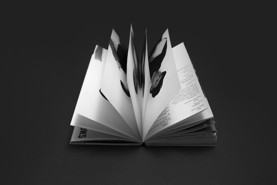
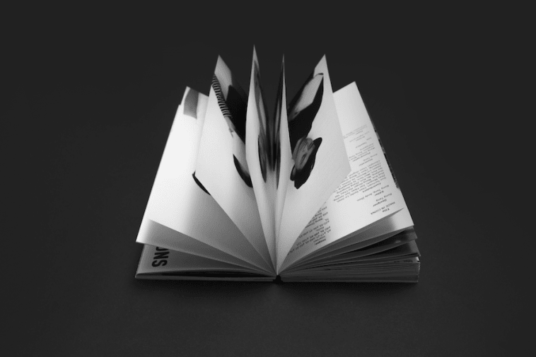
‘Although China has been working hard to transform from ‘Made in China’ to ‘Designed in China’, ‘Made in China’ is still a phrase with a connotation of mass production, poor quality, and fake products. It seems that this situation and design education has a direct connection. The publication ‘Made in China / Designed in China’ explores the current and the future Chinese design education. ‘Made in China’ focuses on the three issues (Education Industrialization, Examination Standardization, and Academic Politicization) which are mentioned by a Chinese critic and educator Chen Danqing (陈丹青). The cube mass produced by a mould is used as a metaphor, to symbolise the homogenisation of mass education. ‘Designed in China’ attempts to examine questions, it concentrates on the public voice in the future design education.’
Virginia Christak
‘Terra Australis Incognita’
‘Terra Australis Incognita aims to create a unique brand around Antarctica in an attempt to prolong and ensure the treaty’s future, which prospers the scientific research programs, that highlight global threats, such as global warming and the ozone depletion. Additionally, the Terra Australis variable font aims to provide a unique code of visual representation of the weather conditions to the workers and scientists living on earth’s southernmost edge. The font has 3 axes which, based on obtained information, influence the weight, width and slant. The date affects the weight and characters’ paramorphosis, the average outdoor temperature alters the width and finally, the wind speed changes the slant. The modification of these values constitute a discrete set of letters; thus, generating a distinctive typeface every day.’
- Find out about MA Graphic Media Design at LCC.
- Follow LCC on Instagram to see behind-the-scenes from Degree Shows and more.
- Find the perfect course for you at an LCC Open Day.

