
‘The Visual History of Type’, the new book from Paul McNeil, Senior Lecturer on LCC’s prestigious BA (Hons) Graphic and Media Design course, is a definitive survey of the major typefaces produced since the advent of printing with movable type in the mid-fifteenth century to the present day.
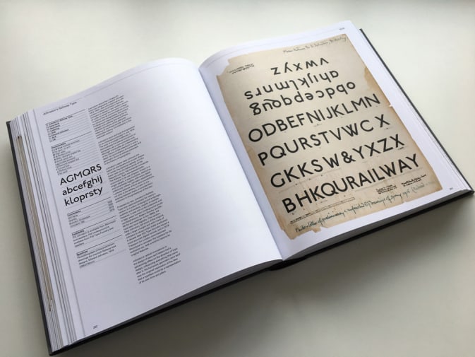
Arranged chronologically, more than 320 typefaces are faithfully reproduced in the form of their original type specimens or earliest printings, located in their historical context through brief overviews and descriptions of the key characteristics of each typeface.
“I found researching this book to be an utter delight, designing it an anticipated chore, and writing it, really, really tough. As both author and designer, much of the process was a solitary, arduous and rather lonely task although, I was ably supported by a great team of people: picture researchers, photographers and editors,” Paul told us.
Working with students on a daily basis, Paul – one half of design studio MuirMcNeil alongside LCC’s Hamish Muir – became increasingly aware of their comparative lack of knowledge of the history of type. We reached out to Paul to hear more about putting it together and what it involved…
What inspired you to create The Visual History of Type?
That’s simple: I’ve always been obsessed with language and its many possible solid forms. It is no exaggeration to say that I find type utterly enthralling, a product of human ingenuity that has had an influence on civilisation greater than any other, and which continues. Type and typography are the central pillars of communication, rather than merely instruments in a design toolkit, and I’ve been studying them throughout my career, accumulating a large collection of books and specimens in the process. So being given the opportunity to share my passion for type and typography was just perfect.

I take delight in every single item that I’ve included in the book (even Comic Sans) and it is my sincere hope that others will appreciate them too, or most of them. On an almost daily basis I see a new typeface that I wish I could have included, but I’m very pleased not to have to worry about things I can’t change now.
What was the process of putting together the book and how long was it in the making?
In total, this project has had a 7 year span for me, undertaken in addition to teaching and other design work. Including downtime – extended periods where the ball was not in my court – the schedule roughly breaks down into one year of initial proposals and negotiations with the publisher, 3 years of subject and image research, 2 years of writing and a one year cycle of origination: designing, art working, retouching, corrections etc.
“It is no exaggeration to say that I find type utterly enthralling, a product of human ingenuity that has had an influence on civilisation greater than any other, and which continues.” – Paul McNeil
A project of this scale would not have been possible without the cooperation of many contributors who were generous in sharing their knowledge and providing materials, but one particular resource was vital to the book: London’s St Bride Library. On a point of information, The St Bride is also where LCC originated in the late 1800s. It remains an absolutely peerless resource – long may it continue.
What did you hope to achieve through this work?
A few years ago, I became aware of the absence of any definitive histories of type other than Jaspert, Berry and Johnson’s seminal Encyclopedia of Typefaces, which has been continuously in print since 1953, and Sutton And Bartram’s unsurpassed Atlas of Typeforms from 1968 – 2 books I hold in the highest regard. There hasn’t been a publication of this sort before as far as I know – it’s unique in the way that it focuses on showing rather than telling.

Paul McNeil, Senior Lecturer for BA (Hons) Graphic and Media Design at London College of Communication
Having originated a considerable amount of printed material during my career, I was also very keen to avoid what might be called a conventionally rhetorical approach to the design. In many books, the layout and the typography draw attention to themselves as if to compensate for deficiencies in content, in order to ‘make a stupid thing look pretty’ (to paraphrasing the words of the design educator Ian Noble).
The approach to the design of The Visual History of Type is the opposite of this. Its intention is to provide a definitive visual survey of the major typefaces produced since the advent of printing in the 1450s until the present day, with an emphasis on the faithful representation of key historical typefaces presented in their original specimens or, where more suitable, set in contemporary documents.
“History seems to hold little status in design education but, undoubtedly, we should be looking in the rear view mirror a little more diligently if we want to know where we’re going.” – Paul McNeil
The book is thick because it is full of content and large because the images shown are at actual size or as close as possible to it. All 320+ typefaces are displayed on spreads that are arranged systematically throughout, supported by succinct summaries of the development, appearance and application of each design, and tables locating firmly it within its context.
How are students of your course taught about the history of type?
It’s embedded in several practical projects and tasks as one of the ways in which they can understand how typographic design works. Discovering its history might also be facilitated by Contextual and Theoretical Studies teaching and several final year students have done exceptional work by combining ideas from typographic CTS studies with practical projects in designing typographic objects or typefaces, for instance. But in my opinion, a closer integration of theory, context and history with studio and technical practice would be hugely beneficial. The question is: how can that be achieved?

Why do you feel it was important for the history of its development to be seen in that way?
The Visual History of Type is a microcosmic reflection of culture. History seems to hold little status in design education but, undoubtedly, we should be looking in the rear view mirror a little more diligently if we want to know where we’re going. I’m convinced that the history of type and its continued social impact is well worth knowing about. Discovering the evolution of typefaces over half a millennium gives a clear understanding of the ways in which they operate culturally, technologically and psychodynamically.
There are many implications in understanding how and why typefaces provide different tones of voice to visual communications and also a huge number of issues associated with technological influences and the process of reading. Done right, typography balances these issues with extraordinary delicacy.
What advice would you give to students wanting to apply for your course?
Anyone can make graphic design and use type, but what makes a graphic designer is a matter of conscious intention, interest and commitment to the project. Make work. Learn the pleasure of looking. Make work. Immerse yourself in whatever aspect of visual culture is of value and purpose. Make work. Explore techniques and technologies. And make work.

What is your top typeface included in the book?
That’s hard. I love them all, but if I was on a desert island and could only choose one, it would probably be Paul Elliman’s Found Fount from 1989. Some might say that it isn’t really a typeface: it consists of a potentially infinite collection of rubbish – tiny pieces of manmade detritus found on the street or in the trash – that he arranges, without any modification, to represent linguistic signs and symbols. Reflecting Elliman’s belief that literacy is a universal attribute of culture rather than a mere technology, the Found Fount project tests the boundaries of representation. Existing as objects that can fit in the mouth, all of the elements in Found Fount can also be transformed into two-dimensional representations of themselves as photographs, scans, drawings, vectors or digital type. ‘Even if we could imagine a world without words,’ Elliman has written, ‘it would be held together by a kind of typography… The structures and formats of an irrepressibly modern world, configured around unit-shifting patterns of production, display and consumption.’
Was it difficult to include 320 typefaces?
Choosing 320 was easy for me. Because I’ve been marinating in typography for a quite a while, I had a clear idea of the typefaces I wanted to include from the outset, but I made many fantastic discoveries on the way, like the 1922 Bremer Presse Antiqua and Sandrine Nugue’s spectacular Infini from 2015. Of the 320+ typefaces represented in the book, many had to be included because they are widely upheld as ‘classics’ having proven time after time to be readable, versatile and unobtrusive; designs such as Garamond and Baskerville, for example. Because generations of readers have found these familiar forms effortlessly legible, generations of printers and publishers have depended on them and they have become accepted as benchmarks of typographic excellence, efficiency and beauty.
“Anyone can make graphic design and use type, but what makes a graphic designer is a matter of conscious intention, interest and commitment to the project.” – Paul McNeil
The objective of The Visual History of Type though is to present an accurate picture of every stage of its development and the book therefore includes several typefaces that may have only survived briefly. The book also includes a number of groundbreaking experimental designs that may have failed commercially or never have been published at all but that opened up new directions in the development of the field. Although many of these choices might be disputed as irrelevant, incorrect, localised, outdated or just plain ugly, they have all been chosen with care for their relevance to this narrative instead of those that some might deem more wholesome.

What has been the highlight of putting together The Visual History of Type?
The research, no doubt at all about that, not just reading secondary material but digging for typographic gold. Room 19 of London’s St Bride Library is a place where I spent some of my happiest hours ever, pouring over their exceptional collection of historical specimens. LCC holds some extraordinary examples of the printing arts and typography too, as does Central St Martins and Reading University’s Department of Typography.
What has been the most challenging aspect of the journey?
Not so much its twists and turns, more its distance. My mum, who is in her nineties and inclined to being dramatic, would often say: “Paul, you must finish it before I die”. My true concern though, for years, was that I might never reach the end myself. But now it’s done and I’m beginning work on the next one.
Get a copy of Paul McNeil’s ‘The Visual History of Type’ from Laurence King, Amazon, Wordery and more.
Follow Paul on Twitter.
Words by Jyoti Mann