Images by advertising photographer and LCC alumnus STAK, whose work included the ‘shaken not stirred’ print ad for BMW, are being shown in a retrospective exhibition at the College in September.
To find out more about STAK’s career and the significance of London’s 1970s and 80s advertising landscape today, we spoke to LCC’s Creative Practice Director Communications and Media Jo Hodges.

Creative Practice Director Communications and Media, Jo Hodges.
Jo, can you tell us how the concept for this exhibition first came about?
I was the Course Leader of BA (Hons) Advertising and was very fortunate to have very brilliant and well-connected students. One student, Karen Hernandez, had connections with the owner of STAK’s estate, Maria Frangeskides, and came to me asking if we could exhibit the work.

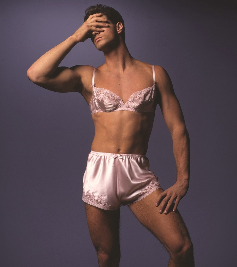
Image courtesy of STAK estate.
STAK was an alumnus of LCC and studied photography at what was then called London College of Printing. I know STAK from back in the day when I was in advertising; just previous to my generation, he was a massive advertising photographer. So that was very interesting to me, that actually BA (Hons) Photography and BA (Hons) Advertising had a link.
Here was a person who was an alumnus in fine art photography, who then went on and became one of the renowned photographers of the 70s and 80s. I didn’t join advertising until 1984-85, so STAK’s era started a bit before my time and continued right through the 80s.
Now as a PhD student I’m looking at that era – I’m not doing photography per se but I’m looking at the image and how that changed through technology.

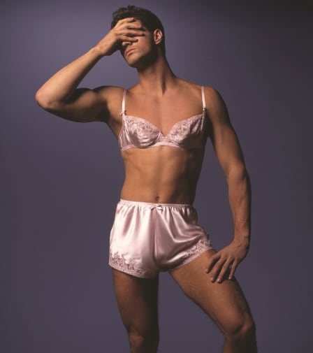
Image courtesy of STAK estate.
What was so significant for STAK about that time?
STAK’s images came about at a time when technology was changing – we have colour TV, and before that we have the colour magazine, the Sunday Times.
I think the Sunday Times for this country, especially in advertising, was the turning point for lots of photographers. Here suddenly was a commercial space but also an art space to show their fantastic work, and STAK was one of them.
If you subscribed to the magazine, it would come and land on your doorstep on a Sunday, you would open it up and see beautiful photographs.
They may have been beautiful photographs of the Vietnam War – horror, but shot beautifully. Or fashion shot beautifully. Or commercials shot beautifully. And so that’s where STAK’s work came to be known throughout the country.

Image courtesy of STAK estate.
You’d see some fantastic campaigns which he was at the helm of – Guinness, particularly. At that particular time, advertising was the space for things cutting edge.
David Puttnam was at Collett Dickenson Pearce, a massive agency at the time, and some leading lights happened to go there, including Sir John Hegarty and Charles Saatchi, and they hired STAK. They formed a nucleus.
David Puttnam later formed his own photography agency round the corner from Charlotte Street. And right next door the Saatchi and Saatchi agency opened up, all in the same building. STAK would have been in those circles where he then got his photography through.
Photography and art direction and advertising really took off, in fact they were adored. The images that STAK did really blurred the lines between what was commercial and what was art.

Image courtesy of STAK estate.
Can you tell us more about the importance of showing this work here at LCC?
Bruno Ceschel, who’s a brilliant fine artist and also a director of SPBH Editions, is the curator of the exhibition. The original photographs are going to be on the wall, but you’re also going to be able to see the adverts they came from with text. It’s going to be really beautiful.
This is going to be a homage to STAK as a fantastic photographer, and you’ll also see how the images were used in advertising. You might like photography and dislike advertising, or love advertising but not photography. It’s great to have that at this College, because we are London College of Communication. It’s right and interesting that it should be here because the intersection of photography and advertising is fantastic.
If you’re a historian of advertising, you can actually trace where the adverts came from. And I think it’s going to be really interesting for students of the future as well, because this work was done at a time without digital technology. Digital stuff was around, but STAK took pride in doing photography which was mystery. We don’t really get to know exactly how he did it – it looks easy but it isn’t.

Image courtesy of STAK estate.
There are some amazing images of stacks of cars – he didn’t slot them in with Photoshop, he did it somehow but we don’t know how. So that’s going to be interesting for people to look at as well.
And if you’re a student, like I am, of understanding why one type of image changes to another, then we can look at the technical processes and how they change and then the advent of the internet. The internet comes in and it changes everything again. At the disposal of the photographer and the artist and the communicator in advertising is a brand new world.
So if we look at how STAK changed the conversation, that then gives us the opportunity to discuss STAKs of the future, and the STAKs of the future – the people who are brilliant at photography and brilliant at advertising – come to this College.

Image courtesy of STAK estate.
Is there a “STAK style”?
There’s definitely a STAK style. The STAK style actually is the 1970s and 80s advertising style, like Collett Dickenson Pearce. He did a lot of those photographs and his was the dominant style, so if you look at all the award-winning adverts of the time, they have that clear, documentary, serious feel, but with beauty as well.
Whereas before it might have been romantic and blurred and Babysham-y, now advertising became prominent, it became an authority, so the works have a look of authority about them. “Here’s an idea, and here’s the idea condensed and succinct in that image.”
Now of course the art directors and Sir John Hegarty and Robin Wight and all these brilliant people, including Charles Saatchi, had their input into the ideas behind the images, but STAK and people like him brought them to life.

Image courtesy of STAK estate.
There is also a symposium taking place during the exhibition – what can people expect from that?
My colleague Dr Jonathan Wright is running the symposium, which is going to be looking at the exhibition and abstracting what’s in there. The call for papers is for people who want to talk about the work.
Some people are going to be doing stuff looking back on how it’s changed their practice. I’m going to talk about changing the conversation; the photographic image and its intersection with advertising changing over the 70s, the 80s and the 90s to the present day.

Image courtesy of STAK estate.
STAK
Private View: Thursday 10 September 6-9pm
Exhibition open: Friday 11 – Monday 21 September
Monday – Friday 10am – 5pm
Saturday 11am – 4pm
Sunday 20 September 11am – 4pm (closed on other Sundays)
Symposium: Wednesday 16 September 10am-5pm
Read more about our 3 to see exhibitions opening for London Design Festival