London College of Communication student, Sam Underwood, attended magCulture’s Modern Magazine Conference in 2017. Sam, a final year student from the BA (Hons) Graphic Media Design, who undertook the Diploma in Professional Studies, reports back on the highlights in this guest blog post.
magCulture Conference is a hugely successful annual celebration of independent magazines, organised by LCC’s Design School alumni Jeremy Leslie. Managing and creating magazines for 30 years, Jeremy Leslie is the designer, writer, and curator at the centre of magCulture and has written four books about editorial design and regularly contributes to the creative press and lectures internationally.
‘We love magazines’ is the magCulture rallying cry; reflecting Jeremy’s belief that editorial design is an ever-developing discipline that continually adapts to new technologies and circumstances.
As ever, ModMag featured an international lineup of some of the most exciting figures in current magazine publishing, from founders of emerging independent titles to senior figures from established magazines. All provided their own unique insight into today’s magazines and the challenges they face.
With 2017 marking the fifth edition of the conference, Jeremy celebrated by welcoming back some of his favourite speakers from past years too, to discuss how things have changed since they last heard from them. The event was held at the beautiful Conway Hall, a unique, wood-panelled central London venue designed in 1929 by Frederick Mansford, an ideal new home for ModMag.
New #podcast! Jeremy Leslie of @magculture at this year's #ModernMagazine conference https://t.co/AvEEdZB1nC pic.twitter.com/jVIdWEbm1t
— StackMagazines (@StackMagazines) October 31, 2016
In spite of the magazine’s unsteady future, Jeremy Leslie kicked off the day by stating the event was a “celebration of magazines of all types”. A celebration it was, with each speaker paying reverence to the magazine through aspects such as its creative freedom, materiality, reinvention of journalism, history and resurgence of the printed publication.
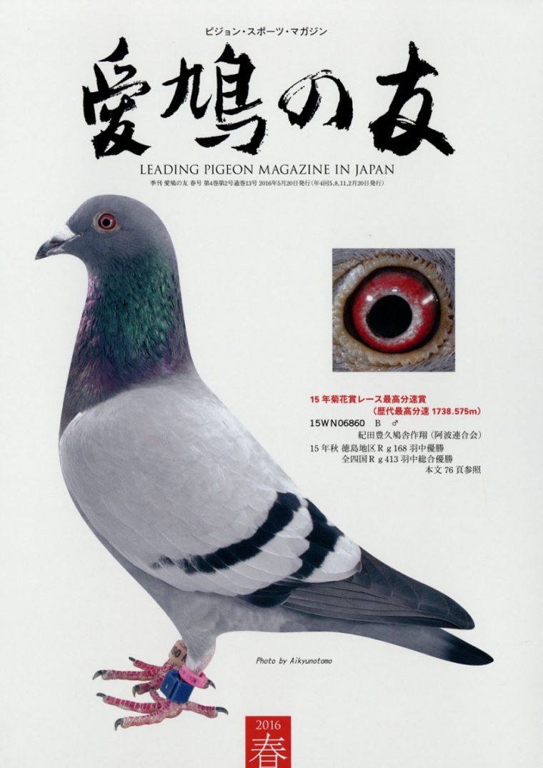
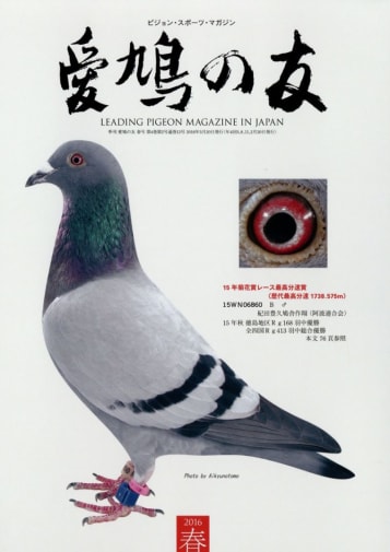
Hearing from Takahiro Kinoshita, editor in chief of Popeye Magazine, it is clear that Japanese magazine culture is in a world of its own. Described as an overly saturated and subdivided industry, Kinoshita showcased a range of near identical sumo wrestling titles, a five year incremental approach to the women’s lifestyle magazine (from ages 15 to 50) and subject matters as niche as pigeons, bob haircuts and mushrooms. Perhaps an insight into why the many indistinguishable commercial magazines of Britain are hanging on by a thread.

Ocappa Magazine
Liv Siddall, the host for the day and former editor of Rough Trade magazine, expressed the joy of working on a magazine and the freedom it provides as a vehicle of information. With a limited budget of £1000 per issue, the means of sourcing content got fairly inventive.
Through various requests they were able to source an abundance of unique content, such as mock horoscopes from bands, a running series about the ridiculous phobias of a colleague and in one issue they even allowed Mac Demarco to edit and provide all the content. Unfortunately in late August the magazine became another casualty of digital marketing, and consequently the visual expression was drained from the content.
A pinnacle point in the day’s schedule was a talk from Nicholas Blechman, art director of The New Yorker, who took us on an inspiring and envy inducing illustrated tour of the magazine’s office space in the One World Trade Centre.
Through each stop at a different department, Blechman highlighted the importance of everyone behind the process of the magazine. This ranged from the all important fact checking team, who possess the power to stop the release of an issue at any minute, and the cartoonists that provide the magazine’s prestigious illustrations.

The New Yorker (1925)
Blechman also spoke about The New Yorker’s ‘respect for legacy’ and how that factors into limitations with the design. Restrictions such as the use of only black and red ink, their insistence on syntax (‘reëlect’) and the resilient set of three typefaces (Irvin, Neutra and Caslon). However, Blechman describes The New Yorker’s minimal design changes from the first issue in 1925 as being a part of their visual identity, an identity know throughout the world.
Words by Sam Underwood