
Words by Ian Gustav Ahlberg a BA(Hons) Public Relations graduate.
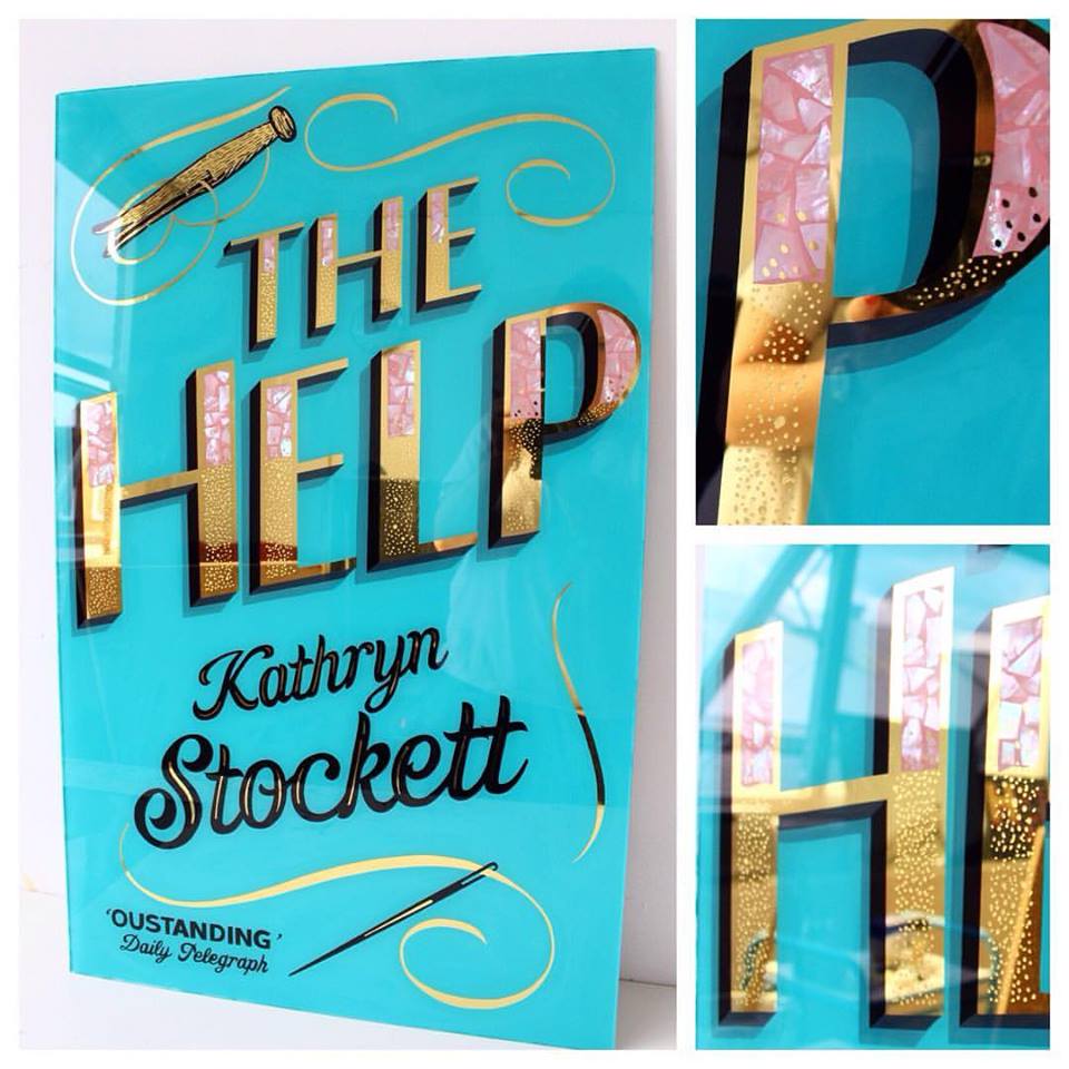
To engage new audiences, world-renowned book publisher, Penguin, recently republished classic book titles from the last 100 years. They commissioned LCC’s BA (Hons) Graphic and Media Design alumna, Alex May Hughes to redesign the cover of The Help by Kathryn Stockett.
We caught up with Alex about the project and her precious metal typography design practice.
Alex May Hughes graduated from BA (Hons) Graphic and Media Design in 2012 and has since developed her own distinct style of work, combining Victorian sign-making with precious metals, pearls, mirrors and glass.

Alex May Hughes, BA (Hons) Graphic and Media Design alumna and designer of The Help front cover
Soon after graduating, Alex began an apprenticeship with the acclaimed London sign writer, Pete Hardwicke, and began painting signs on East London shop-fronts and restaurants, picking up particular skills working with gold leaf on glass.
Since her apprenticeship, Alex has been working almost exclusively with precious metals on glass and receives regular commission requests. Earlier this year, Penguin commissioned Alex to use her unique practice to capture the spirit of The Help book in a new cover design.
Congratulations on being chosen by Penguin to create a cover for The Help! How did you feel about being chosen?
Thank you! It was a very exciting email to receive; like most people I grew up with Penguin books, so it was amazing to work with them.
What was the inspiration behind your work for The Help?
The idea behind the cover was to serve as a contrast or veneer to the difficult themes within the book; this idea of everything appearing fine and even glamorous when the reality is very different, runs through the book.

Alex’s final front cover for The Help by Kathryn Stockett
What was it like working with Penguin?
It was great fun, Richard Bravery who was my point of contact at Penguin was wonderful with helping on the brief and suggesting ideas – it was a dream job!
The story is fantastic, I really recommend reading it. I was already a big fan and the imagery within the book is so rich, there was plenty to draw on.
Your work has a very distinct glamorous and retro feel to it, what inspired you to start working with metals and glass?
I did a project towards the end of my degree at LCC about writer, H.G Wells, Victorian London and traditional signage. I was doing lots of screen printing at the time and started screen printing directly on to glass to save time (typical last minute project!) and from there, it just kept growing.

Alex May Hughes’ front cover design for The Help
What’s the process you go through when making your artworks?
All my work is hand painted in reverse on to glass and typically uses 23ct gold or white gold leaf and elements of pearl shell – each piece depends on the job or client. It is usually a very collaborative process.
Are there any particular artists you look to when designing your work?
There are lots of sign painters that serve as fantastic inspiration, but I try to keep my influences as broad as possible. Sometimes the most unlikely people or places will spark an idea that stands out.

More work by Alex May Hughes
How did your experience at LCC contribute to your development as an artist?
I really enjoyed my time at LCC, the facilities are some of the best in London and my experience of the teachers, tutors and technicians was always positive.
Like with most things, you get out what you put in!
What other projects are you’re working on at the minute?
I’m designing some large typographic posters for SONY/ATV of which I’ll hopefully get to make glass mirror versions. I’m also busy making work for my second solo show Glass and Gold on 10 November at the 71a Gallery in London.
And finally, what are your hopes for the future?
I guess just to keep making and learning. It’s so rewarding. I really am doing my dream job, so as long as I can keep doing it, I’ll be happy!
Read more about Alex’s course BA (Hons) Graphic and Media Design