
With Show Two well underway, we’ve been talking to exhibiting students to find out about the inspirations and ideas behind their final projects
Having experimented with digital printing, illustration and materials, BA Fashion student Ben Waters’ final collection looked romantically to the digital age.
To me the digital glitch is a visual representation of vulnerability in the seemingly infallible algorithm of pixels we absorb almost constantly; where the limitations of digital emotion are met. Compressed, zipped and lossy, this is how we now experience nostalgia.
From Nina Beier to fabric hunting, we caught up with Ben to find out more about his collection and the experimentation and inspirations that were behind it:

- Visiting the last Frieze Art Fair in London I was immediately drawn to the work of Nina Beier. On display was a selection of different coloured human hair wigs, squashed in to glass photo frames on very muted, pink tone backgrounds. These were influential in my initial concept for the project, the idea of transforming a familiar and highly textural object in to a sort of physical image of itself and removing it from its contextual function, but also, in a way, preserving it like an artefact. I furthered my research from this to question how clothes can become contained and become images whilst still being worn on the body, and started draping faux fur wrapped in PVC.

I worked with Stylo Graphics in Watford to print glitch inspired prints on to industrial weight PVC. It was important to me to experiment with digital printing rather than hand painting or dying the material because I wanted to explore the digital image in particular as it is perhaps the most significant means of communication today. I made a physical pattern on paper for the skirts and capes that I cut in PVC by toiling in a lighter weight plastic, then I scanned these pattern pieces in to the computer, redrew them on Illustrator and created the patterns contained with in them on Photoshop. Starting with blocks of solid colour I over processed them with many varying effects and filters until they become unrecognizable and new colours and shapes emerge from with in them. A purely digital creation.

I discovered the work of french photographer Jacques Henri Lartigue online and immediately ordered a book of his work titled ‘Chic, Le Sport.’ It features black and white photographs from the 1920’s and early 30’s, focusing specifically on his photographs of sports, and the clothes worn to play them, which he is probably most known for. Big driving duster coats, pleated tennis skirts, spectators in gowns and furs, jackets worn by ice skaters and racing drivers; these were the sort of things I took reference from. As with Beiers compressed textures, I was excited by the idea of containing motion to an image as Lartigue did, many of them distorted and blurred by the subjects movement.

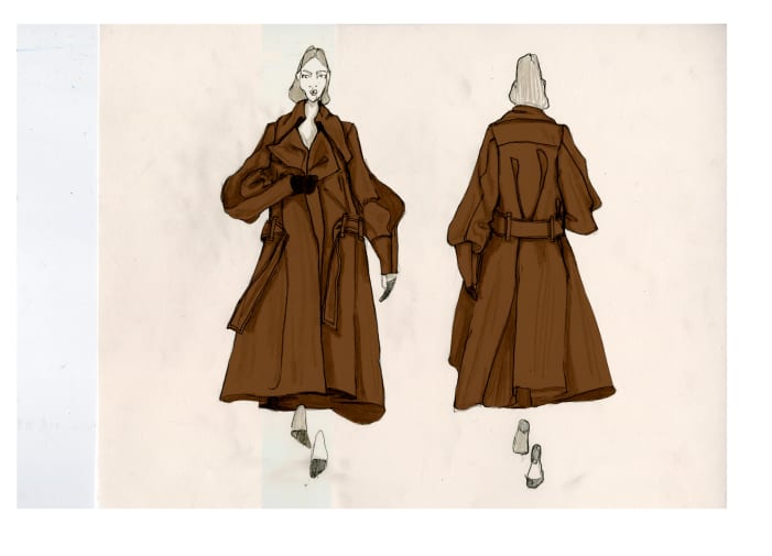
I have found a way of illustrating that involves a combination of hand drawing and digital manipulation that works for me, especially for this project. I would draw the figure and the silhouette and the shade in the shadow of the draping fabric. I always draw the figures walking so that as I fill them in I can imagine how their clothes will move around the body and where needs the most volume. I then scan them in high resolution and use Photoshop and Illustrator tools to add colour and to sharpen up the contrast of the pencil line. For this project I would also superimpose the glitched prints I was working on over images of the toiles to make decisions on the placement, colours and scale of the prints.

All the fabrics that I used, aside from the PVC, are composed of natural fibres, importantly they are all in shades of warm grey, beige and brown. I made this selection to almost emulate faded black and white/sepia photographs so that, when placed under the highly saturated digital prints, they would follow the notion of digital storage/distortion of history. It was also important to me when I was searching for these fabrics that they had a visibly textural quality, that could be flattened underneath shining transparent PVC. A few looks are made from heavy, cotton moleskin that have an almost suede-like softness, a coat inspired dress uses a combination of beige cotton velvet and beige cotton satin, a faux fur coat in natural muted tones and a stone linen dress for nature of the weave gives a beautiful bounce to the sleeves and the body in movement.


More: