

Philip Ellis, photo: Catwalking.com
Following a week that has been one of the most politically turbulent in recent history, we look back at projects in Show Two that question the status quo
Viewers of the BA Fashion Show will remember Phillip Ellis’s collection as a palimpsest of politics. The designer combined traditional British proverbs and Palestinian headscarves with contemporary political slogans and even a nod to David Cameron’s Pig-gate. Speaking to Dazed about fashion’s power to be political, Ellis said “I think that clothes are one of the most powerful ways to communicate yourself and that, in a sense, fashion is inherently political. I think that I’ve been given a platform to express myself creatively and that it’s fitting to use it to communicate my political agenda.”

Philip Ellis, photo: Catwalking.com
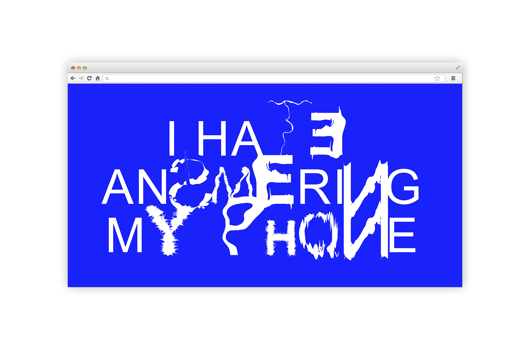
While Ellis’s work brings together the aesthetics of nationality, both culturally and politically, into a living breathing collage of multiculturalism, Emily Schofield (BA Graphic Design) has focused on the nature of protest. Inspired by the Situationist International of the 50s and 60s, a group that criticised the transactional and commercial nature of contemporary life, Schofield challenged herself to create a typeface of protest and disruption.

Situationist Typography, Emily Schofield
“Typography is a tool of communication and it has to abide by these rules to be efficient,” explains the graphic designer, “so on what level can a letterform express protest? Can it break out of its supposed structures?” Initially, the designer experimented with many forms in print, playfully obscuring and dissolving letter but her move to digital type brought a broader application: “Can it be a typeface that actually acts, that doesn’t work? That’s what the digital can do, you can create action in a typeface.”
And so, a word written in the entirely legible Ariel type on Schofield’s interface soon glitches and morphs. Protest may previously have been found in content, the words written, but here they don’t really matter. In an anthropomorphic turn, Schofield explains “my typeface refuses to stand still. It struggles with itself.”

Situationist Typography, Emily Schofield
The future of statehood itself is focus for Katy Shand (MA Material Futures). Looking at displacement and migration, Shand proposes the second half of 21st century will see people living on the oceans in floating island habitations. In what Shand describes as “a critical exploration of the implications of marginalising and isolating people” she has created a series of objects – including a raft – to aid the formation of future independent nations.

Order of Pius IX, Florance Tebbutt
But it’s not just the contemporary situation that inspires this year’s graduates. Florance Tebbutt, BA Jewellery Design, has created a series of goldwork and embroidery pieces made in response to the Magdalene laundries. The laundries were institutions in Ireland run by Roman Catholics, from the late 18th century to the late 20th, to house ‘fallen women’. Since the 1990s, the institutions have been exposed as places of systematised physical, sexual and emotional abuse of the women and children who were in its care.
With a family friend brought up in one of the Magdalene homes, the subject is personal for Tebbutt. In her work she embellishes christening dresses with traditional goldwork more usually seen on military and religious garments contrasting both the institutional and domestic narratives of stitch. Some pieces include intricate papal medals such as the Supreme Order of Christ while another details the names of 796 babies discovered in a mass grave in the grounds of a Catholic institution in County Galway in 2014.

Team, Florance Tebbutt
“I’m drawn to artefacts and narratives. Objects have the power to say a lot,” Tebbutt says. Her work acts as a commemoration of the lives about which she stitches but also an implied institutional critique juxtaposing the glory of such gilded medals against the vulnerable fabric of the christening gowns. “That’s what I wanted,” she says “A visual contrast – the goldwork is always going to be beautiful, the rich red colours of the papacy. I wanted to reel people in with that first but then there’s that underside that people then discover when they’ve stared at a bit longer… though it’s historic, it’s still very much present.”
From the meta-political nature of protest to the most personal and affecting of stories, these projects remind us of an object’s power to reflect our world back at us. One can be ever hopeful that we might learn something in the process.