
This is a guest blog from Drusilla Beyfus, who was a Senior Lecturer on our Fashion Communication and Promotion pathway for 19 years.
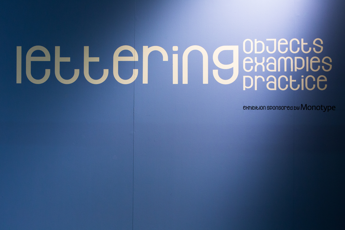
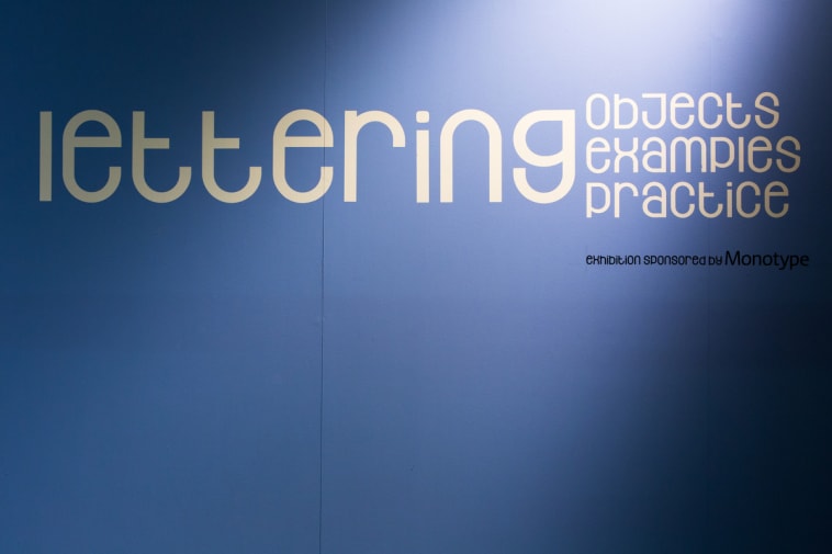
`Lettering’ at the Lethaby Gallery at Central Saint Martins takes us into the heart of a major teaching resource that is rarely put on public view as a collection. A rich and rare store of objects, artefacts and examples of practice has been traced from the college’s Museum & Study Collection, Central Lettering Record and from work by students, staff and alumni.
The show can be seen as further evidence of the college’s respect for the art and craft of lettering. You have only to set foot in the campus to identify lettering installations of many different types and periods. Take the example of the original logo done for J Lyons, the chain restaurant business, now sited above the college café, or the instance of road signage displayed on a stairway, or a period shop sign that once belonged to a successful grocer’s reinstated in the amenities. All attest to a pedagogic faith in the subject.
Part of the thrust of the exhibition is to show the influence of the past on current practice. Featured designers include Eric Gill, Edward Johnson, Catherine Dixon, Derek Birdsall, Ken Garland, Jeremy Tankard and Anthony Froshaug. Co-curated by Professor Phil Baines, Professor of Typography at CSM and by staff from the Museum & Study Collection, the collection is remarkably varied and covers a historical period from the Middle Ages to the present day. Phil combines teaching with his practice as a graphic designer and is well known to a wide audience for his work on Penguin book editions.
At the private view, I asked Phil to pick four exhibits that held a special interest for him. A 15th century music manuscript known by staff as `the one’ was his first choice. A magnificent monastic book of which he says, “it has got great initials, a lovely running hand ( a reference to the main text) and rubrics. So all elements are equally good. This is a real treasure.”
Two drawings of Roman letters by Eric Gill, the sculptor known for his classic sans serif typeface Gill Sans, won his attention. The work was done for W H Smith in 1907. “These are a fantastic set of teaching sheets,” he said. “The drawings are so detailed and contain a double instructional aspect. One is teaching a style, the other is how to form this particular Roman letter.” The collection has all four of these Gill sheets.
A preparatory drawing for the New Scotland Yard lettering was on Phil’s short list. It is by Edward Wright who ran an experimental letterpress course at the college in the ’50s. “I like the fact that the drawing shows the geometric basis for the letters,” he commented. It was the way that several of the letters at a time were constructed from one set of circles, and the slightly odd angles. “The playful use of geometry was different from the rather stiff geometry that informed the majority of geometric typefaces”. The type face is known as Flaxman after John Flaxman, the 18th century sculptor. Phil said, “Flaxman, like contemporaries George Dance and John Soane, had seen these primitive letters in Rome and Greece and brought them back. Flaxman was using such sans serifs on inscriptions before they appeared as type.”
A fourth pick focussed on the face shown on the banners at the gallery and the exhibition publicity (illustrated above). It is by CSM graduate Natalie Braune, 2012-2014. Phil said, “ One of the things I like in design is type and texture. Natalie did that face initially in a stencil-making workshop. She tried to combine capitals and lower case so everything is the same height, everything is quite modular and repetitive and I liked what it did when you set a lot of text in it.” At the conclusion of the exercise, Phil said that that he could easily, willingly, pick four more favourites.
Supporting the Museum collection which is a fully accredited museum, is among the responsibilities of Judy Wilcocks, Head of Museum and Study Collection. She relates that over the past five years visitor figures of which less than half were students, have increased from around 300 a year to in excess of 1,300 visitors a year most of whom were students.
“The holy grail for us is student projects. We find that the more that students get involved with the archive, the more they `get it’ and learn how to handle museum class material and interrogate objects intelligently.
“One of the things I find most energising about working with students is that often they bring a different sort of knowledge to the table.…some come back again and again over their time at the College. That’s hugely rewarding.”
Lettering closes on 12 April. Monday –Friday 10-6, Saturday 12-4. Sponsored by Monotype.


Drusilla Beyfus was a Senior Lecturer on our Fashion Communication and Promotion pathway for 19 years. A former features editor at Vogue, she continues to work closely with CSM on special projects. Drusilla’s new book ‘Vogue on Hubert De Givenchy‘ has just been published by Quadrille.