Insights

Themes/Form: Pattern- Make, shape, repeat, enjoy

null
null
Photograph: Mokuyobi.
Written by
Rachel Littlewood
Published date
14 November 2018

Whether it’s bright or pastel colours, geometric or organic shapes, the use of patterns in creative work is becoming ever more popular.

Patterns feature in our everyday lives whether we notice them or not; could be the tessellating concrete slabs on the pavement, the seats of a bus; or in the natural world around us. They can be geometric and predictably repeat, or more organic and fluid.

Artists & designers often use patterns in their work to decorate objects, to represent a story, or to illustrate an idea and can be figurative or abstract in form. Pattern use in the design world has become popular recently with the revival of the Memphis style, but hand drawn patterns featuring ranges of different brush strokes are also very present. They’re not just being used on flat surfaces like paper or fabric, but also on large 3D structures and furniture. Below are several creative practitioners who use contemporary patterns in their work in different and interesting ways.

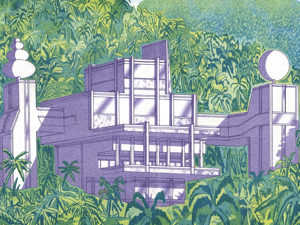
Adam Nathaniel Furman: Architectural installation

a picture displaying an installation of a wall with colourful shapes and patterns
‘Gateways’, Adam Nathaniel Furman, 2017. Photograph: Gareth Gardner.
‘Gateways’ was an installation of four ceramic gateways designed as an entrance for Design Junction as part of London Design Festival 2017. Each of the four components draw from the rich history of ceramics, and are shaped and decorated in a way that helps us revisit a particular time period. This allows us look at this everyday object in a new light particularly in regards to its architectural roots. ‘Gateways’ was made in collaboration with Turkish Ceramics.

Discover more of Adam’s work on his website
Follow Adam Nathaniel Furman on Instagram

Carlos Cruz-Diez: Interactive art

An abstract blue and black striped image
Carlos Cruz-Diez, Induction du jaune 221, Paris 2016, Acrylic on aluminium, 150 x 150 cm, Adagp 2018.
Carlos Cruz-Diez is considered to be one of the greatest figures of Kinetic & Op art. His recent exhibition ‘Luminous Reality’ features an immersive ‘Cromointerferent Environment’ which allows the audience to interact with his work and patterns directly. The ever-changing experience is created by rays of multi-coloured lights projected across the space, overlapping and shifting in waves of movement.

Explore more of Carlos’ work on his website
Follow Carlos Cruz-Diez on Instagram

Mokuyobi: Accessories and clothing

a lookbook shot of colourful patterned hairbands displayed on a wrist
Photograph: Mokuyobi
Based in LA, Mokuyobi produces brightly patterned bags, hats, patches, and clothing. All made in the USA, Mokuyobi products are designed to fulfil the company’s “desire to create something different” by using various styles and interesting colour palettes. They also hope that by using a combination of fun colours and motifs (like bananas, jazzy shapes, or noodle doodles) they can, “bring a smile to anyone that comes across them and make the world a little less serious.”

Browse Mokuyobi’s products on their website
Follow Mokuyobi on Instagram

Morag Myerscough/Studio Myerscough: Public art

a photo of a colourful railway bridge with 'POWER' painted on top
‘Power’, Morag Myerscough, 2017. Photograph: Gareth Gardner
Combining monochrome patterns with colourful ones, ‘Power’, is a public art commission that welcomes you to Battersea Power Station as part of a larger plan to rejuvenate the area of London. Morag drew inspiration from the art deco history of the iconic building, but gave the geometric design a modern feel by using bright, optimistic colours.

Discover more of Studio Myerscough’s work via Design Boom
Follow Morag Myerscough on Instagram

Yinka Ilori: Furniture

a studio shot of 5 colourful chairs lined up in a row
‘Restoration Station’, Yinka Ilori, 2017. Photograph: Dan Weill
Yinka’s work often makes use of discarded or found objects and furniture in an effort to avoid unnecessary waste. In collaboration with Restoration Station, Yinka and the volunteers upcycled chairs using a colour palette inspired by the patterns, fabrics and parables (stories with a lesson to them) that surrounded him during his childhood, growing up in a traditional Nigerian var/www.

Explore more of Yinka’s work on his website
Follow Yinka Ilori on Instagram

Related content

  • null
    Liam Cobb. Visual from The Fever Closing. 2016. Illustration: Liam Cobb.

    Themes/Colour: Make it spot on with risograph print

    Searching for your new go-to creative technique? Technician Rachel introduces you to some of her favourite riso print creatives.

  • Birds eye view of textile samples in pink and maroon tones
    Student work from UAL Insights Textiles Summer School, 2017. Photograph: Joygun Nehar.

    Challenges: Create your own original pattern

    Textiles technician Josephine challenges you to experiment and create your own unique pattern and texture designs.

  • A fashion editorial featuring a woman wearing a variety of colours and shapes.
    Sweet Addiction. 2016. Unpublished. Photograph: Simon Webb. Styling and direction: Dr Manrutt Wongkaew.

    Themes/Colour: Life in full colour

    Fashion tutor Dr Manrutt talks about colour and its power for communicating different thoughts and ideas.