In this Themes post, Manrutt introduces the works of creatives who use colour as a method of communication.
Colour comes in many shades and forms. It carries multiple meanings and is diverse in its applications. The term has been studied by many scholars and explored by practitioners for centuries across various disciplines such as art, psychology, neuroscience and more. Today, colour continues to impact our daily lives and raises many questions concerning the quality of that life itself.
For instance, during a scene in ‘The Matrix’, Morpheus explains to Neo that the world is an illusion created to prevent human beings from discovering they are slaves to an external influence: “You take the blue pill — the story ends… believe whatever you want to believe. You take the red pill — you stay in Wonderland, and I’ll show you how deep the rabbit hole goes.” Here, colour signifies danger, reality, psychological associations and options — a way of life.
Many art institutions teach colour techniques as part of design principles which have their values in the creative practices – the blue pill. However, in this article, I would like to introduce colour in its multifaceted properties that expand beyond its visual values – the red pill. So, let’s explore this rabbit hole.
Using colour to celebrate

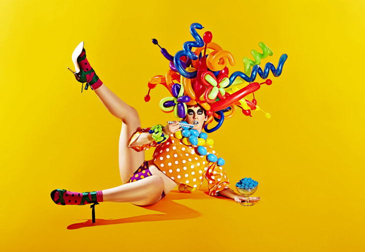
The ‘Sweet Addiction’ fashion editorial was one of my first. It celebrated my 1-year anniversary of leaving a full-time job in Savile Row to be colourful and to pursue my career in creative direction, styling and fashion choreography. Often wear and work with colour to challenge masculine norms, I wrote my Life in Full Colour manifesto:
“I see life in full colour. It gives me joy and vitalises me with immense energy. Having worked in corporate fashion where colours were discouraged, I decided to depart from this type of environment and be true to myself. I am a man of colour and I carry vibrant cultural heritage. I believe in colour and it is my vision to return colours back to fashion and the people.”
Using colour to rebel

For ‘Punk Story’ – a collaboration between fashion and dance – I set the colours to express anger. The work celebrates raw energy where fashion moves, colours dance, and every inner and rebellious child runs free. It’s a celebration of love and joy that doesn’t fit the mould. We used stop motion animation to offer a new way of making short fashion films. Each sequence consists of a series of photographs so it can be retouched and/or edited easily. This is highly cost effective in comparison to other film production techniques yet it produces an exceptionally outstanding outcome.
Using colour to communicate without words

Meena Bhella is a professional hair and make-up artist. She is also a specialist learning technician at London College of Fashion. For Meena, colour is much deeper than what we see with our eyes. She believes it is a feeling and a mood that can lift and inspire you:
“I use colour to communicate a story without using words. For example, whenever I add dark colours to an image or to my model, immediately the mood changes. It is heavy. It is mysterious. It could even be sinister. It may even indicate the time of year the image is set. Same as using lighter colours especially pastels. We immediately associate those colours with spring. It is angelic, joyful, and fresh, a contrasting energy to the previous palette. Colour is such an easy way to communicate your ideas, to tell a story and differentiate between characters.”
See more of Meena’s work on Instagram: @bhellamakeup
Using colour to push boundaries

Stuart Matuska is an international artistic director at Toni & Guy. He is passionate about pushing the boundaries of creativity within the world of hair, which is usually considered commercial:
“Working with hair colour creatively is something that I truly love. I always endeavour to work with a story or a concept when choosing colours for photographic shoots and shows. My inspiration comes from different places, it can be from graffiti on the walls of a decaying old house in Venice to old communist propaganda posters where pattern and colour are both hyper-stylised. One of my favourite forms of inspiration comes from colours found in nature – minerals and gemstones which provide a real array of colours and textures. Music is also a big inspiration for me. Certain sounds and songs enable me to visualise different colour spectrums. Not relying on hair for inspiration keeps my work from being monotonous and enables me to visualise new colour concepts in regards to hair. I work with colours seen in different formats and transfer it to my medium of working.”
See more of Stuart’s work on Instagram: @stuartmatuska_colour
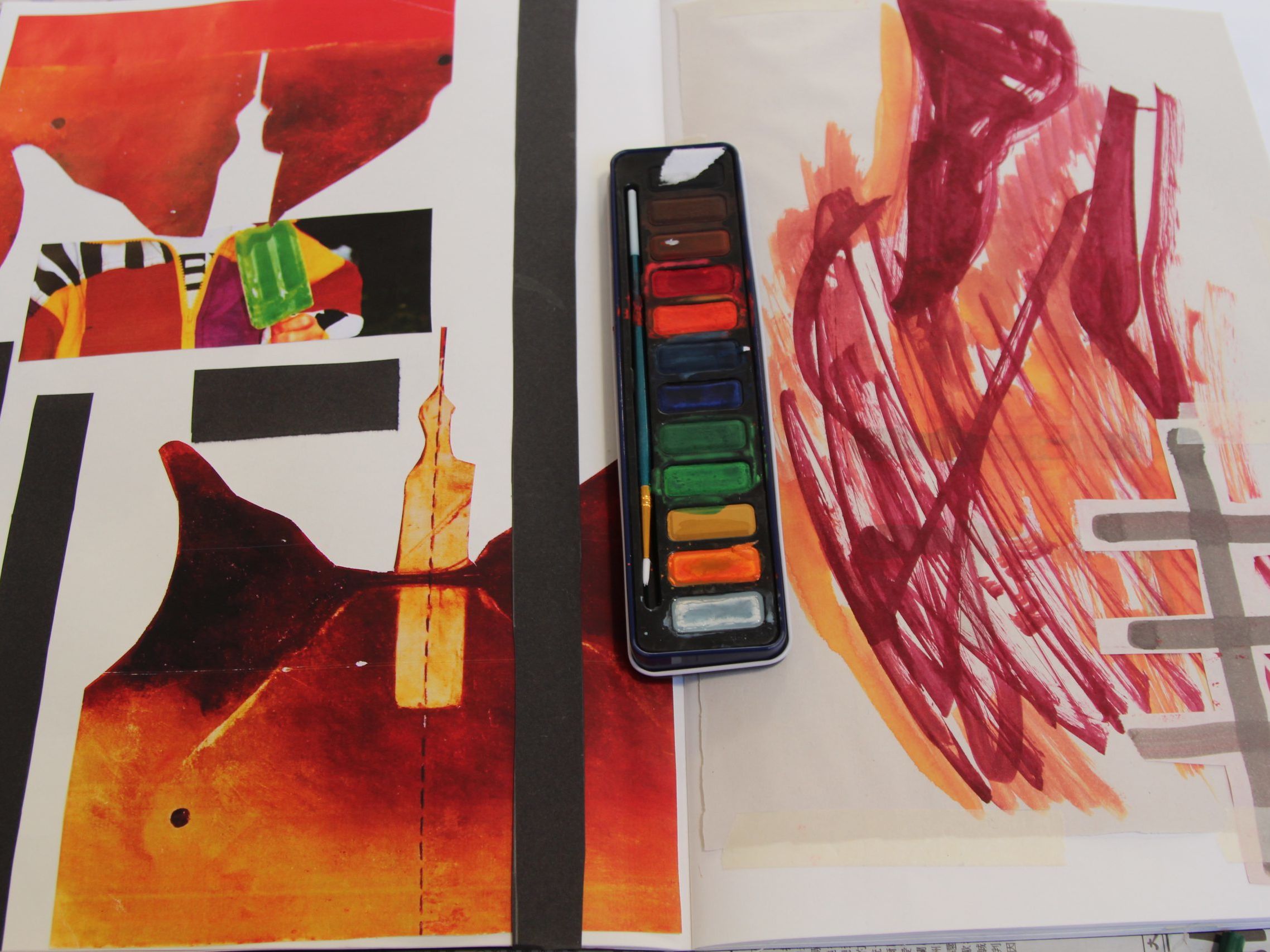
Using colour from home as reference

This example differs slightly from the others as it describes how you can look to your references as sources of colour inspiration. Until the summer of 2019, I had not been back home to Bangkok, Thailand for over 4 years. The trip allowed a lot of feelings, memories, and tales of the city to flood through me. I have always found peace and tranquillity at the Grand Palace where I pay respect to the emerald Buddha every time I return home. British designer Paul Smith once said, “You can find inspiration in everything. If you can’t, then you’re not looking properly.”
In response to this quote together with my warm feelings about being reconnected with my hometown, I started to notice all the colours and patterns that surrounded me at the Grand Palace. I therefore would like to take this opportunity to share it with you. It is very important to stay connected to our roots, our cultural heritage and our culture. As creative artists, we can use these as a source of inspiration in our research and then share it with the world through our art.
Using colour to raise awareness

Sanya Torkmorad-Jozavi is an artist, milliner, and costume designer. She is also a London College of Fashion alumni. Her work often explores the subject of suppression in religious expression. In ‘Target’ it is the image of Islam that is under attack – not the individual. This is why Sanya obscured the face in the piece. Her intention was to bring comfort to vulnerable Islamic people who had been victimised. The ‘attacker’ is not present in the piece. This is so they are not given undeserved attention.
Sanya explains the symbolic nature of ‘Target’: “The primary colours used are to emphasise the layers of abuse that do not leave the body but are only further burdened on, and using costume to imply a female Muslim whose face and body is left vandalised as a result of discrimination.”
See more of Sanya’s work on Instagram: @jozavi.made
By taking you on this journey, through colours, I hope this will encourage you to locate your personal and professional interrelationships with the theme and extend its meanings beyond what I have provided. Find what colours mean to you, how you apply them in your creative practice, and how you can live your life in full colour.
Dr Manrutt is a creative director, stylist and visual artist.
See more of his work on his website : manrutt.com
Follow him on Instagram: @manrutt