2021 Graduate Diploma Graphic Design, Chelsea College of Arts, UAL | Photograph: Kate Bedford
Graduate Diploma Graphic Design students have been using experimental processes to create type. Exploring different methods, histories and theories of type design, they have generated a huge range of different experiments each week, choosing one to develop into a final outcome.
The results include type made from soy sauce, tea leaves, rubber bands and glue, type constructed using rigorous grids and systems and type based on architecture of found forms - forms as varied and exciting as the students who created them.
The brief was supported by a series of creative online workshops by academic and technical staff. Taking place during the UK’s national lockdown, the staff co-designed theses experiences to encourage thinking-through-making and experimentation within the limitations of students’ own living spaces.
Workshops with Jake Hopwood, James Edgar, Eddie Niles and course leader Laura Knight have introduced students to drawing briefs, experimental printmaking with everyday objects, digitalisation of analogue experiments while exploring the history of experimental type and the more technical aspects of creating consistency and coherence within a set of letterforms.
We spoke to some of the students who took part to find out how they responded to the brief.
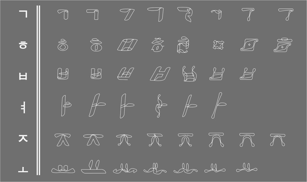
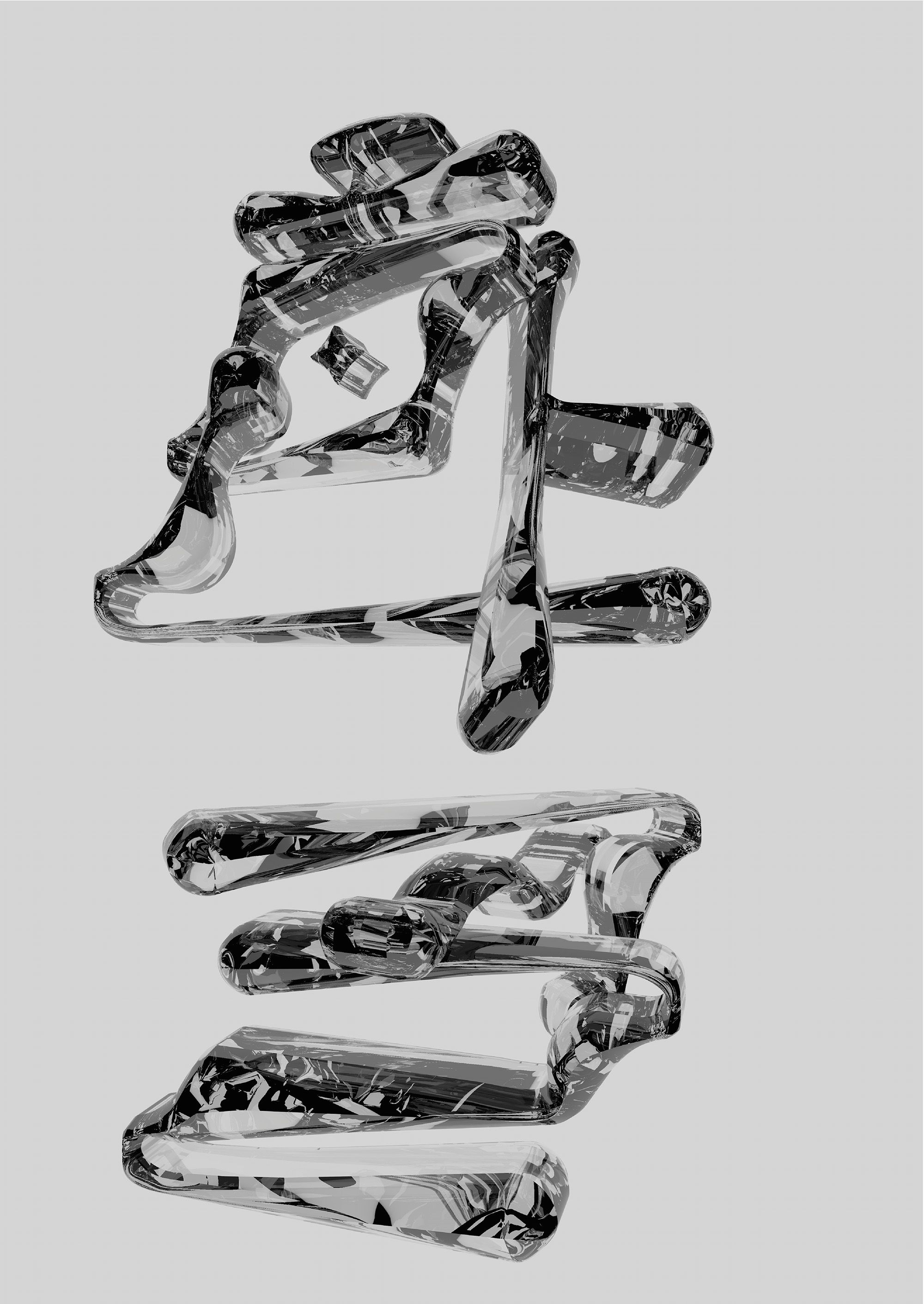
“As a writing system, Hangul really fascinates me. A couple of years ago I stumbled across O—O—H design studio by Ooh Yuni, and through her work fell head over heels for Hangu and its combination of a simple geometric structure, syllabic construction and its underlying aim to promote literacy for the common people.
The name of my type is Heuleum, which is the translation from Korean for flux and flow. Whilst experimenting and developing my type I found that in everything there lay a duality: from semantics and syntactics to form and function and even deeper within Korean culture where it is found in the symbolism of the Taeguek – the symbol which takes the form of a red and blue circle on the Korean flag.
I wanted to carry this idea of duality into my type by creating strokes that seemed to ebb and flow in and out of the more rigid confines of the syllables that the letters are structured in.
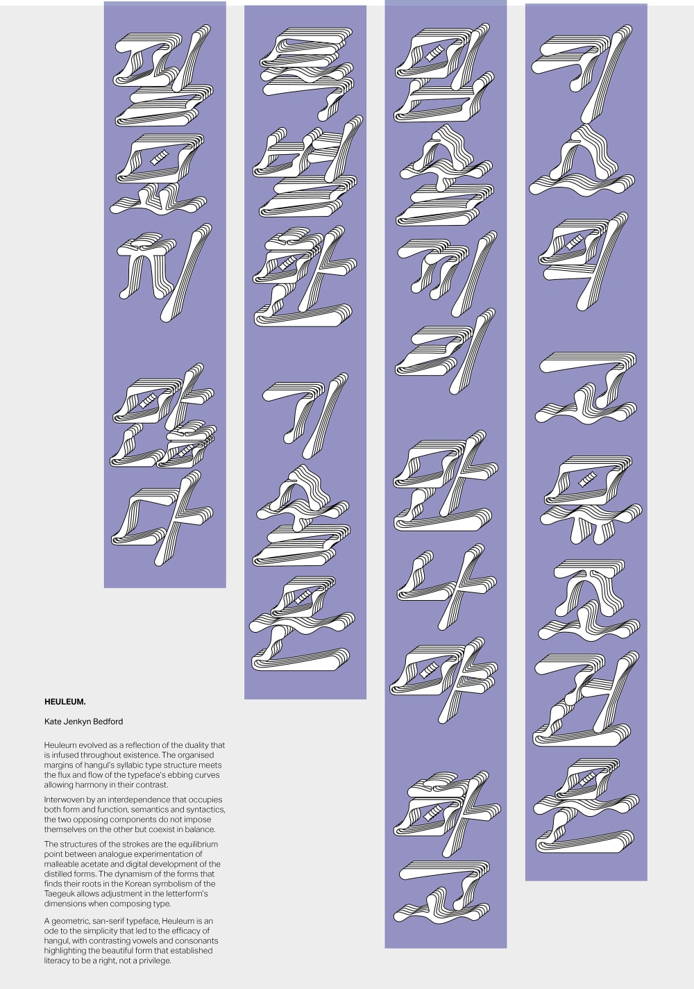
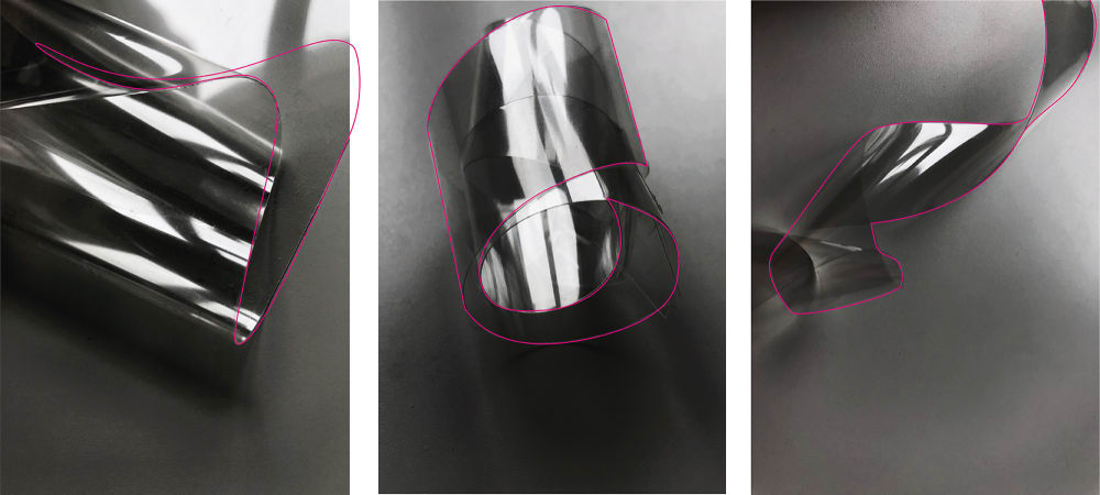
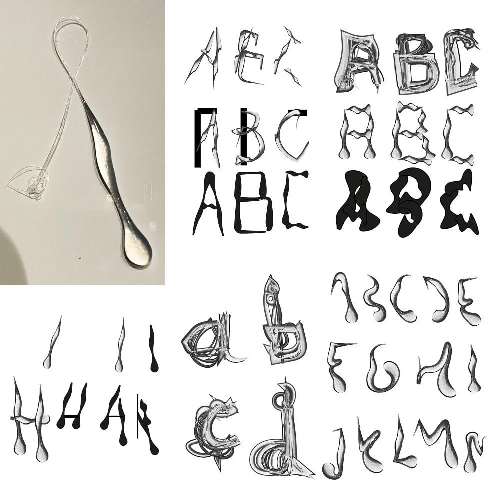
The experimental process began with a single sheet of acetate and three words: meander, twist, and fragment. With this I then morphed and shaped the material into different forms that I felt best characterised the underlying essence of my words and photographed the results. After distilling my selection down to the most interesting shape I found in each photo, I began to collage together different elements to form the strokes. After many iterations, I refined them to their present form.
This unit has been really eye-opening as an introduction into the world of font. It was definitely challenging to pick a writing system that I don’t use. As a non-native Korean speaker I also wanted to make sure that I had done enough research into the history and broader culture so that I could create a typeface that would be mindful to the work of designers before me such as the great Choi Jung-Ho and Ahn Sang-soo.
I would love to develop my type beyond the letters into more of the syllable forms, but I realise this is quite a task with 11,172 characters. This module has made me evaluate the importance of balancing the history and theory of graphic design, such as the anatomy and alterations required for legibility, whilst also pushing experiments to see how far they can go."
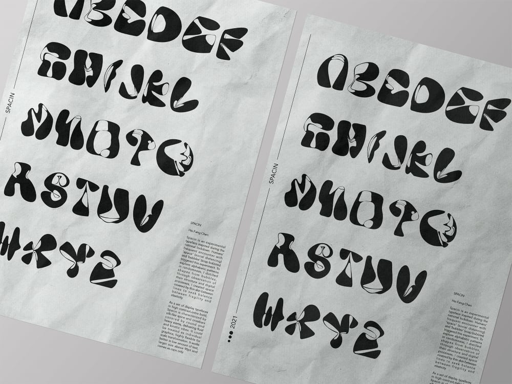
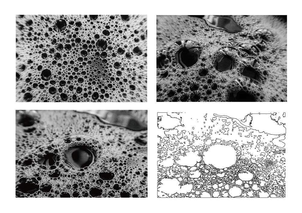
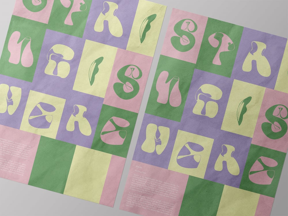
“This typeface was inspired by my frequent encounter with bubbles during the pandemic, as like all of us I was washing my hands more frequently than before! My goal was to find typefaces in randomness so I decided to go with bubbles as I always find their structure and movement interesting to stare at. The name of my type is Spacin, which is related to my making process.
The method is simple but takes a lot of time to finally know what you could do with the materials. I took a lot of photos from creating random flows of the soap bubble. During the process, some methods failed to meet my expectations. This was the most challenging part, but it’s also the most fun part of the experimental process, when you see a result completely different from what you expected in the beginning.
As this is a display typography, it’s best to use it with high flexibility. It works well in large scale, with the spaces I created in the typeface. It also works to play with overlapping and interweaving the typeface together. I would love to see it used in a playful way instead of just being typed out.
This brief helped me understand that being a graphic designer is not about being an expert and knowing everything. I have to deal with typography design, motion design and experimenting with various materials. Knowing how to work well with different realms of design and incorporate them appropriately into my work is what I found the most inspiring part from this module.”
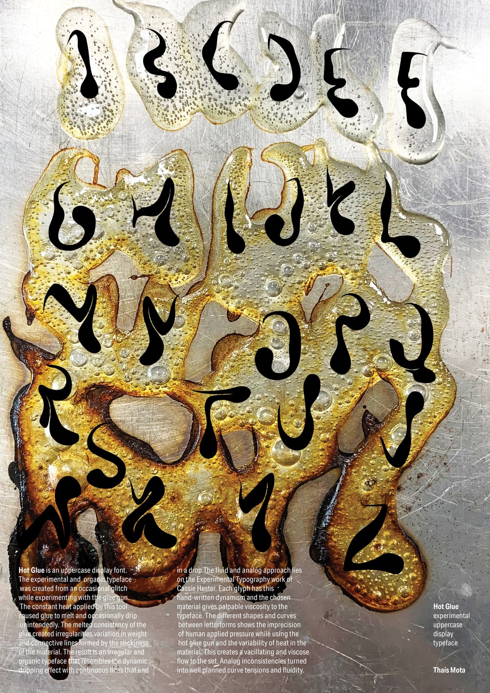
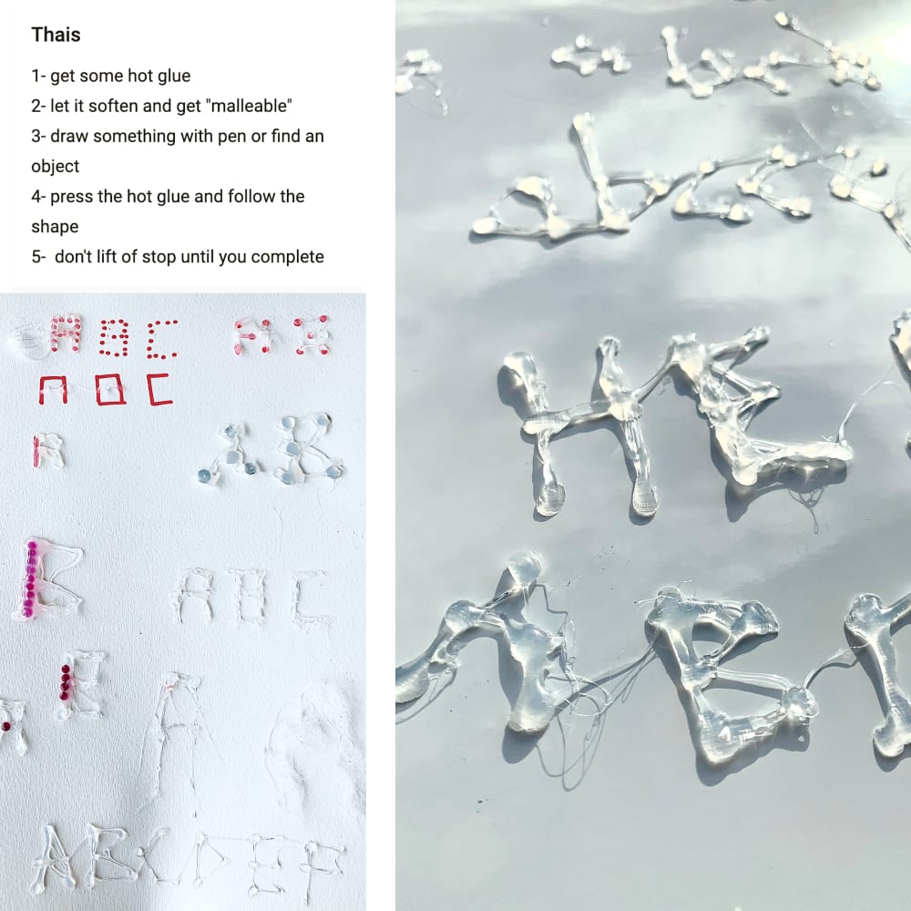
“The name of my typeface is Hot Glue. This experimental and organic type was created from an occasional glitch while experimenting with the glue gun. The constant heat applied by this tool caused glue to melt and occasionally drip unintendedly. The melted consistency of the glue created irregularities, variation in weight and connective lines formed by the stickiness of the material while trying to write with it. The result is this irregular and organic typeface that resembles the dynamic dripping effect with one continuous line that ends in a drop.
My experimental process is actually the soul of this type. It was how it was created and how I developed it along the way. Since the beginning I tested and did things in an analog way. Exploring it like that helped me really go deeper and understand texture, variable strokes and possible application of organic weights.
I have learnt that you can really acquire knowledge and develop your process by making. Testing and experimenting can take your project so much further and unwanted glitches may as well improve your whole project. This fluid and analog feel, achieved by the palpable viscosity of the chosen material, combined with really rich and real textures was a success for me. However, translating it into digital was definitely a challenge. Sometimes trying to mimic the outcomes you got in an analog way can create really stiff effects on a digital environment.
I would really like to further develop it as a lowercase option as well, that could be used in a more commercial way and with well-planned ligatures.
I am still not sure where exactly I plan on seeing my type in use, but it would be really fun to see experimental projects using my type both as a way to communicate and as a shape to layer in a composition.
This module made me get familiar with typographic nomenclatures, such as humanist and hybrid endings, and on a more practical level I could link the theory learnt, like history, anatomy, syntax and legibility of typography, with my own design led and experimental process. I had to understand rules and theories to then push my typography in a more emotional and provocative way, layering shapes and textures and pushing legibility to tell my own story.”
Find out more about Graduate Diploma Graphic Design at Chelsea
See the latest student work on the Graduate Diploma Graphic Design Instagram