Natalie Snodgrass joined Graphic Design at Camberwell as part of her integrated year abroad. We talked to Natalie about her work and research in typography, as well as her time in London and Camberwell, UAL.
Meet Natalie - a graphic designer and type designer from Ohio. Natalie joined the Graphic Design course at Camberwell in 2015 as part of her year abroad whilst she was studying at Cleveland State University. We caught up with Natalie about her work as a designer, her experience of the course at Camberwell and London.
One thing I loved about Camberwell was the interdisciplinary conversation—between different programs at the college, practitioners, different people in the local community, and more.
Tell us a little about yourself – where are you from? Could you briefly describe what kind of work you do?
I’m a graphic designer and type designer from Cleveland, Ohio. The primary focus of my work has been in book and print design, typography and typeface design, and branding. I particularly enjoy combining traditional craft with design.
I also have a practice that is very strongly rooted in design research. I’m interested in investigating the cultural implications of design. What effect do design, typography, and typeface design have on the broader culture? A lot of my research exists at the intersection of design and anthropological thinking.
Your work focuses on looking beyond the surface of language and prods the way we speak and form words, how does this research inform your design?
Typography is a coded form of language. It’s so closely interconnected with every form of communication, especially auditory languages. To me, understanding and recognizing that groups of people have extremely complex ways of communicating is the first step in making a typographic piece that is richer and more interesting. As I have come to recognize this and research it, my typographic practice has become more individualized and exciting. Obviously, these complexities shift with every community you’re designing for; I think that’s also where design becomes so interesting.
Speaking a bit more broadly, I am interested in the complexity of all cultural communication (including language, unique visual coding within distinct cultures, translation of these visual cultures between communities, etc.) and how this influences design practice. How do we as typographers or designers research different cultures, languages, and the various aspects of human communication? Recognizing the diversity of human communication—both visual and auditory—has informed my design greatly and has allowed me to create work that is more exciting, effective, and dynamic.
What course did you study at UAL and why?
I was in the BA Graphic Design course at Camberwell College of Arts. I chose it because I wanted a smaller, dynamic, and conceptually-based program. I was drawn to the course tutors’ own practices and what I might learn from them. I also found that the community in Southeast London had the energy I was looking for—friendly, open, and focused on independent making and publication, fine art, and more.
What did you discover whilst being in London?
I studied at Camberwell during my senior year of undergraduate studies, and my London experience came at a time when I was trying to define who I was as a designer, what my design philosophy might be. I think my time in London had a significant impact on this. It opened my eyes to different international viewpoints on design and art that I had not been exposed to previously. It wasn’t only my experience at Camberwell that influenced this, but also just being in such a dynamic city, coming into a large community of people who are so passionate about what they do and who wanted to share it. I discovered a community of makers and a network of peers that were engaging in exciting conversations on design theory and possible design futures.
What sort of work did you make whilst you were at UAL? Has your experience in London echoed in your practice?
When I think back to the briefs that were given to me during my time at Camberwell, I am especially appreciative of the program for opening my eyes to type design, which I went on to study in my Master’s.
One thing I loved about Camberwell was the interdisciplinary conversation—between different programs at the college, practitioners, different people in the local community, and more. The philosophies on design practice are what have stuck with me the most. There was such a strong focus on conceptual thinking and boundary-pushing, both in studio practice and writing/research. I try to take that process of experimentation into all the work I make today.
Are you working on any projects at the moment?
I recently joined Princeton Architectural Press in New York, a small publisher of design and art-focused books and goods. I am working primarily as a book designer, as well as designing their line of stationery products.
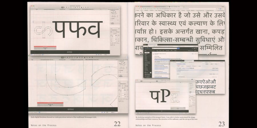
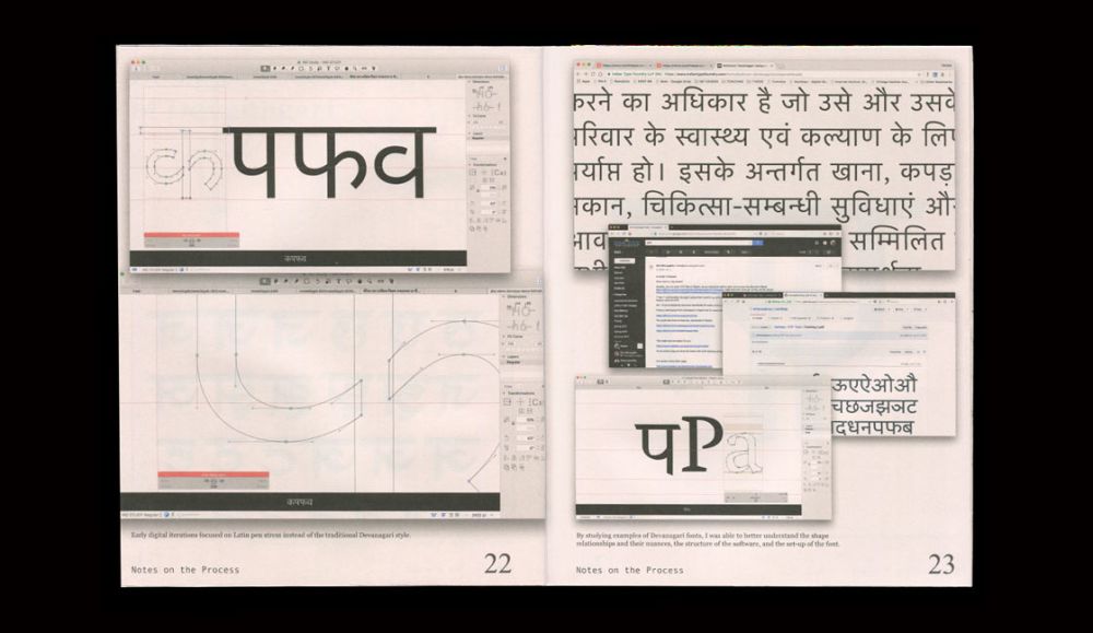
In my personal and freelance design work, my main focus has been continuing to expand my type design practice and typographic research. Specifically, I am starting new stages of my research into multi-script type design practices, establishing and testing a research framework that outlines best practices when designing in a non-native script.
Gallery
-
-
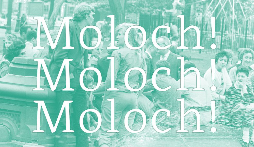
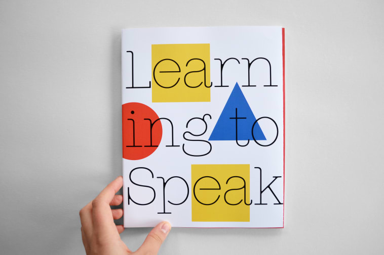
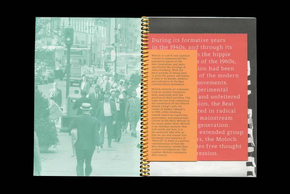
Artwork by Natalie Snodgrass.
-
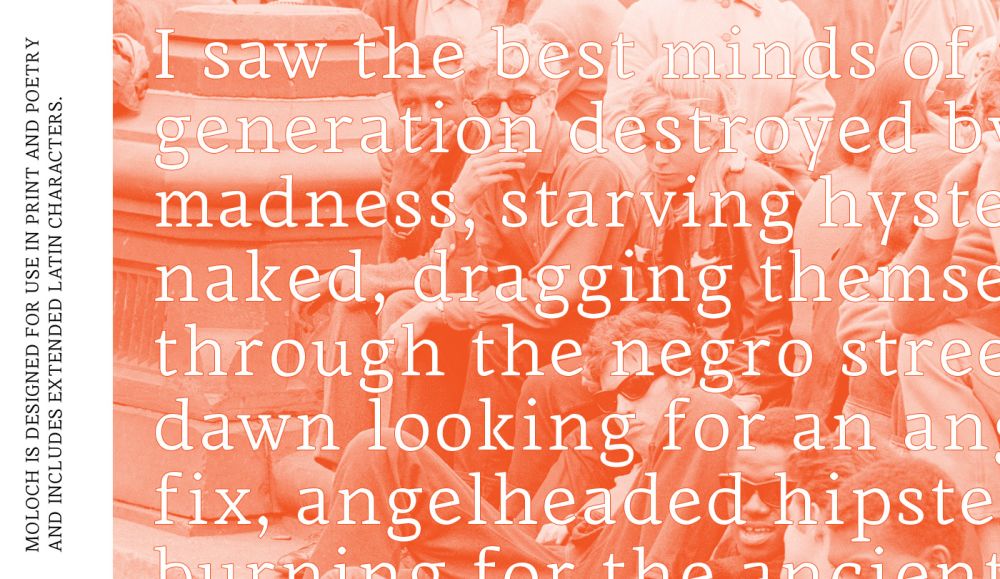
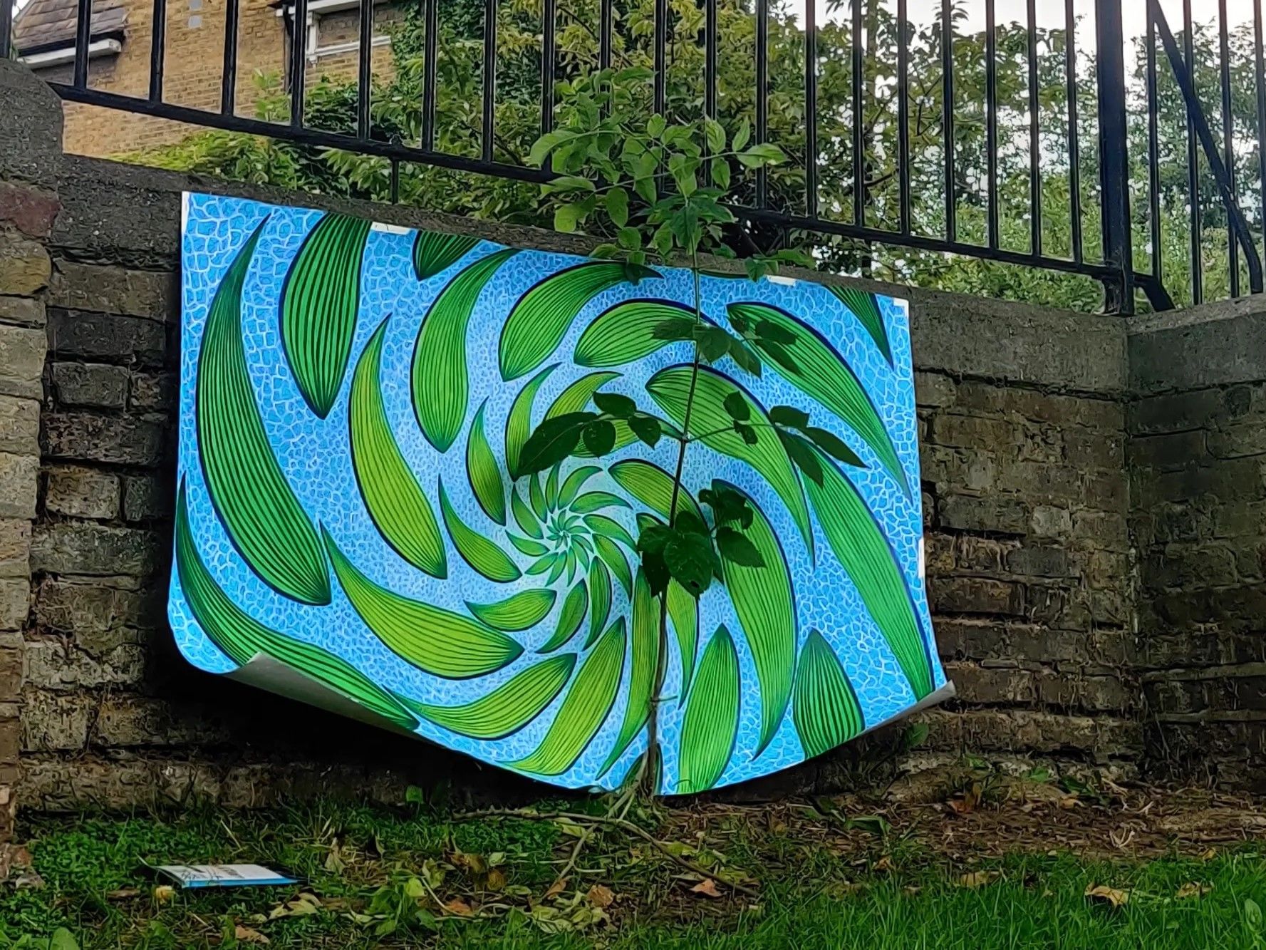
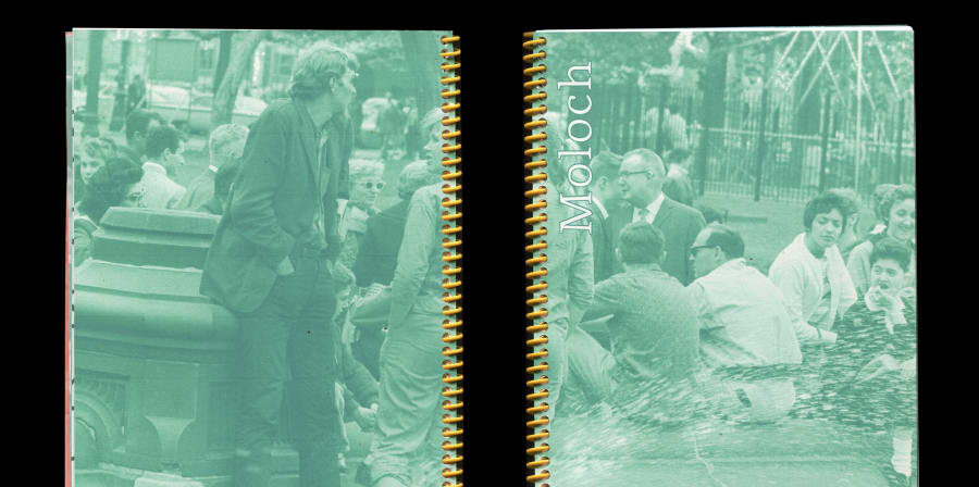
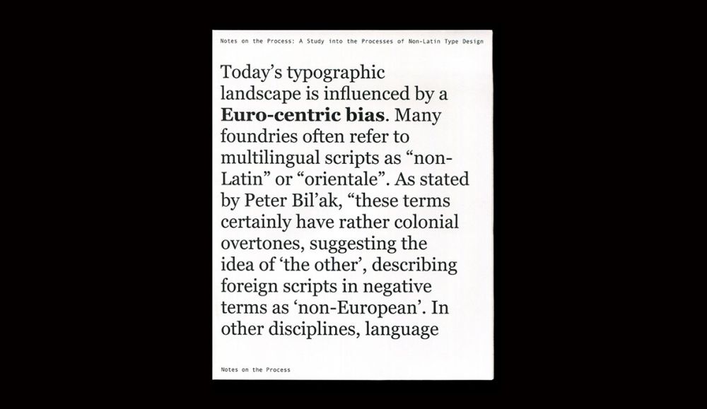
Artwork by Natalie Snodgrass.
-
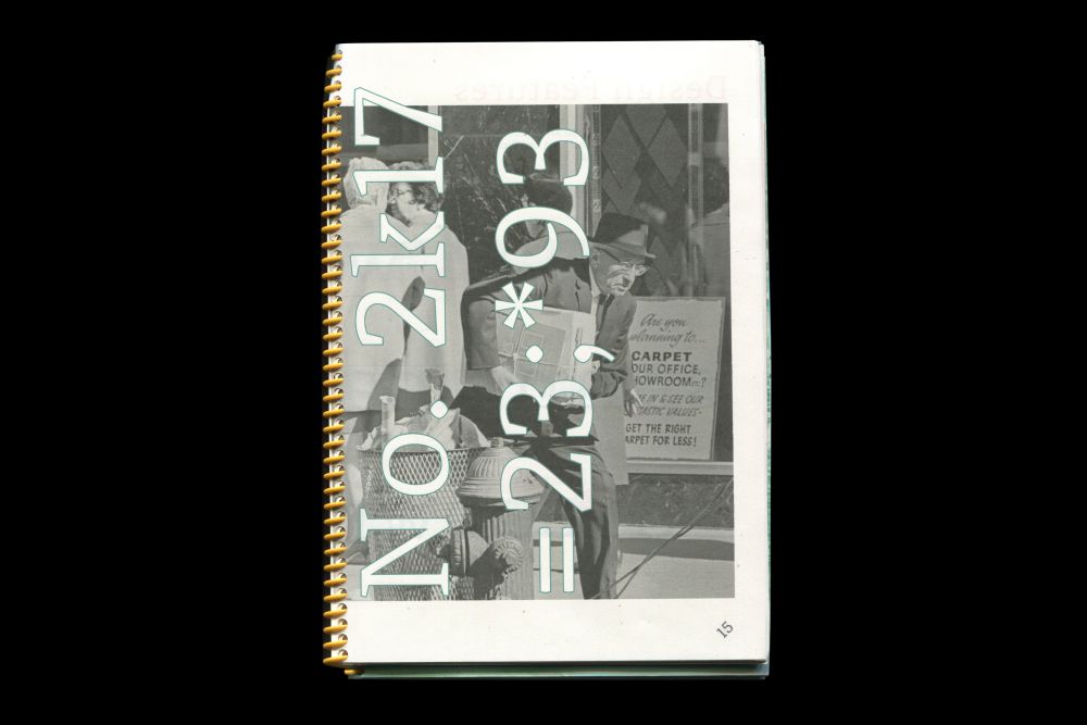
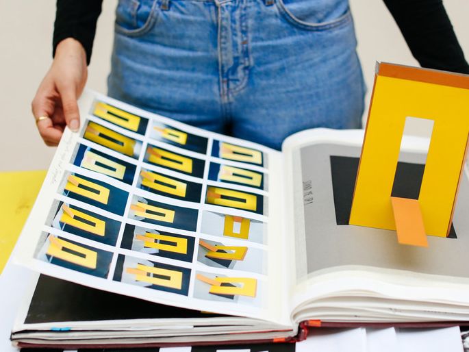
Artwork by Natalie Snodgrass.
-
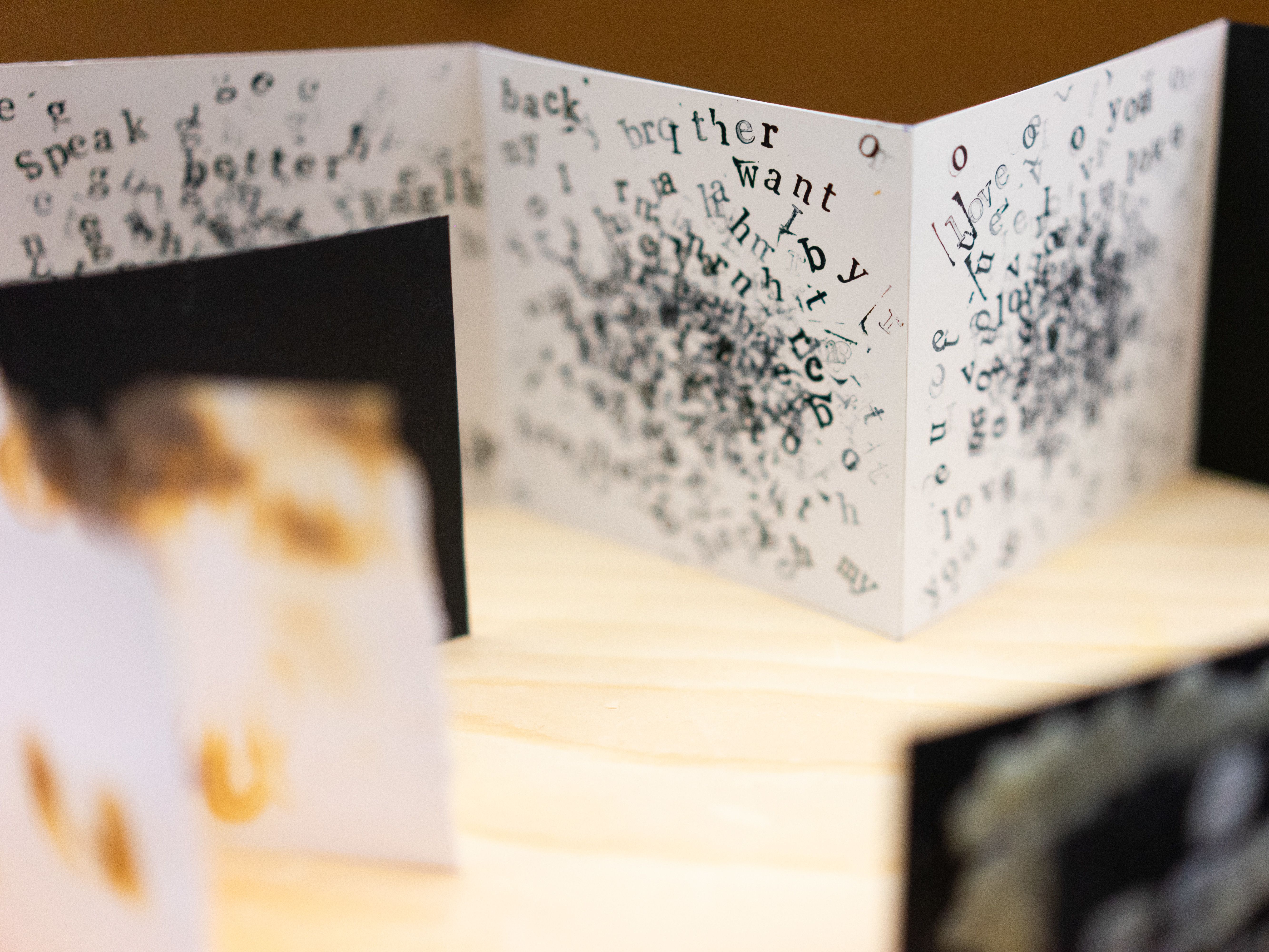
Work by Natalie Snodgrass.
-
-
-
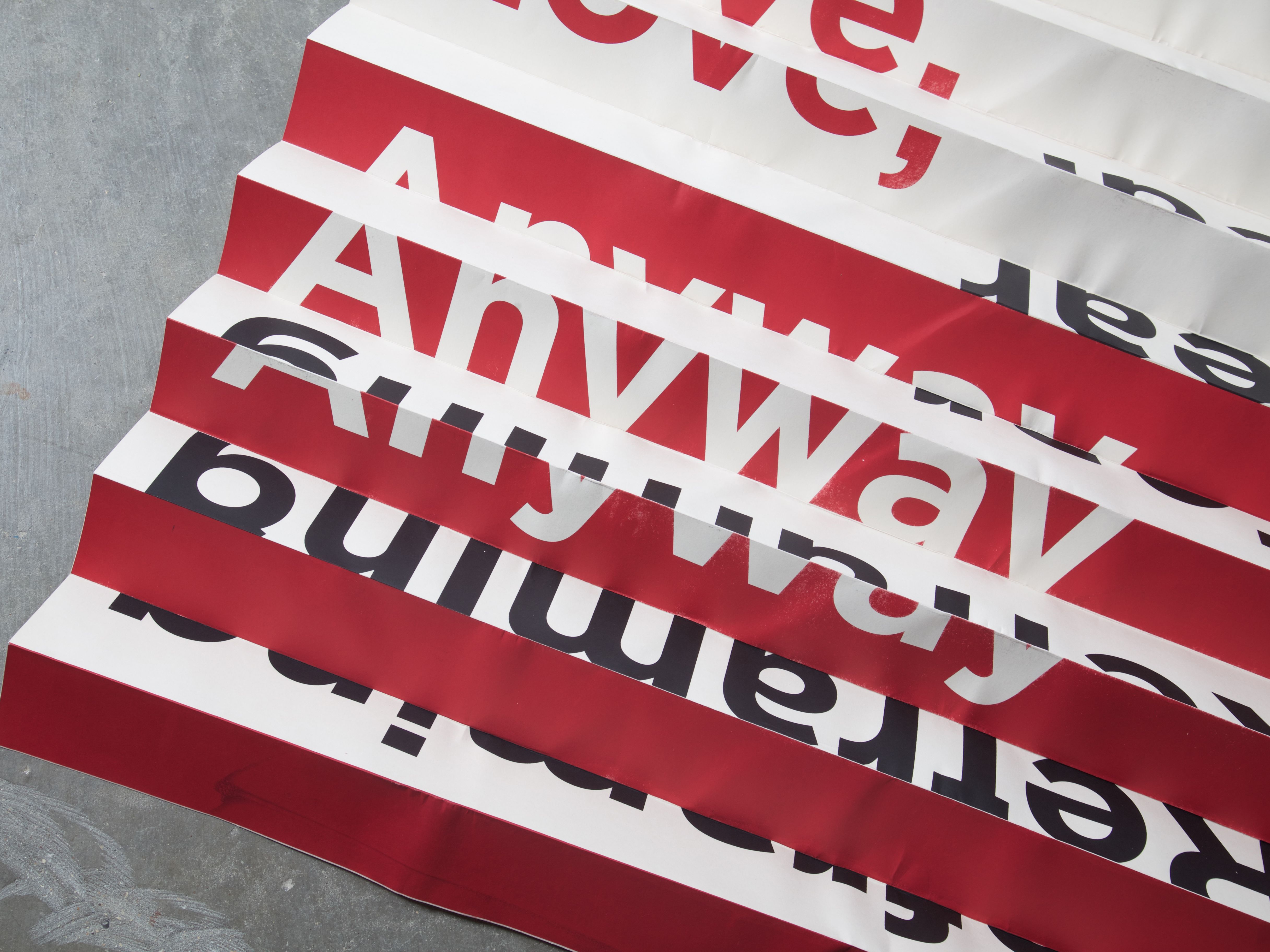
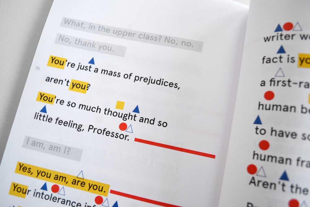
Work by Natalie Snodgrass.