
Meet: Brenda Birkby
- Written byEleanor Harvey
- Published date 18 August 2022
Share story
Brenda Birkby (nee Watson) studied Graphic Design at Central Saint Martins, UAL (then St Martin’s School of Art and Design) graduating in 1981.
Born in Zimbabwe, her childhood was a strong influence on her creativity. After studying in London, she moved to South Africa where in the 90’s she launched her brand ‘Isibuko’ (Zulu for mirror) and had her son. She also experimented with large-scale wall art made from painted MDF board and coloured mirrors, before returning to the UK in 2000. She currently focuses on portrait painting, both people and dogs.
You trained in Graphic Design at Central Saint Martins (CSM), graduating in 1981. What was your experience of College like?
My experience at CSM was fantastic. In 1980, at the start of my second year, the Graphic Design department moved into a brand spanking new premises on Long Acre, Covent Garden, with all the mod cons of the time. Who could wish for more?
The building buzzed with life and creative energy because being a student back then meant you had to attend college every day. All our tutoring took place in a real live classroom with real drawing boards. Just imagine, we had no mobile phones, no social media, no instant online images on Google, or such. Nothing like that!
A regeneration of Covent Garden was taking place in the 80's – and thank goodness all the ghosts of Covent Garden's rich past had been saved. We were miraculously dropped into this wonderful environment of inspiration and creativity and added our bit to the creative powerhouse in the centre of London.
It was heaven - full of small, local, crafty shops, artists, budding designers, musicians, electric disco dance clubs inhabited by new wave dressers', quirky hairdressers, greasy cafes, Covent Garden General Store, the pen shop where Charles Dickens bought his nibs. You had to be there, to be inspired by it.
To give you an idea of college life in my day, we were set 2-week long design projects by visiting crème de la crème London designers. They also popped in during the projects to guide us along the way; encouraging and nurturing our imaginations, making us dig deep to unlock the personal hidden gems in our minds. They took no prisoners. I'll never forget one insu2lt thrown at me, the words 'back street graphics' were used to describe some of my thinking.
Back then the final presentations of our designs were mock-ups, an extremely time-consuming exercise. We had to be able to draw, use magic markers, and do photography, including printing, paste-ups, using light tables, messing with chemicals, cutting with scalpels, measuring with rulers and using set squares. We learned about complex typesetting. None of our lettering or small print could be produced by us. If we were not using good old rub-down Letraset, we had to instruct outside typesetters as to what we wanted.
Did your time at Central St Martin's change how you worked/created at all?
During my time at CSM, I always had to defend the difficulty of doing a degree in graphic design to friends and colleagues. Compared to other degrees they thought it was simply ‘art’ and involved no hard study time like other academic degrees. As I always explained, it was so much harder as it felt like there was nothing to get your teeth into, no notes, no books, no theories.
To be truthful I found my time at college quite emotionally stressful, fast-paced, and quite brutal really. But although it had been brutal, the high I experienced at the end was pure joy. It was only in my last year that my brain became that of a designer. As all graphic designers out there will understand, design is not only about producing something aesthetically pleasing and incredibly imaginative, but it also has a job to do, to get a message across powerfully and quickly, and that message doesn't want to be misinterpreted.
I got there in the end. I can only describe that feeling of producing a successful design as the sheer hard work of climbing a very high mountain and getting to the top, even though it was tough. When you reach that point of knowing you've cracked it, the feeling is total euphoria. I always chase that wonderful adrenalin rush now in everything I create. I was given skills for life that go with me everywhere and are in everything I do. It brings me great joy.
CSM also gave me another string to my bow. The ability to communicate with confidence and sell a design. I was forced to 'blow my own trumpet', minus all thoughts of thinking about how painful and obnoxious I sounded. That was extremely difficult for me, but I conquered my fears in the end.
I have two examples below of recent paintings where I have used my designer brain. Both are imaginative, simple and very much to the point and, I hope, tell a quick powerful story. Bloody Brilliant was inspired by Boris Johnson and Brexit, and Hands Face Space tells a tale of the Covid experience.


Can you tell us about your career since graduating?
My first job nearly put me off working in graphic design for life. I was snatched up by a large elite design company in the centre of London, as one would be if you were a top student of CSM I guess.
I was flattered and never even considered whether it was the right place for me. They never even considered whether I was the right person to join their design team either. Oh, how it wasn't, and oh how I lost my mojo. We just didn't gel. It didn't help that I leaped straight from my comfort zone at CSM into a huge fast-paced real working environment. The expression of being a "big fish in a small pond, to being a small fish in a big pond" springs to mind. Reality hit me like a slap in the face. It was frightening. No cigarettes allowed either!
I stuck at it for a while before deciding a trip back to Africa was much needed. Not home to Zimbabwe, but to South Africa, to Johannesburg.
I worked for an advertising agency for the first year until I found my feet. It wasn't great but I learned the basics, like knowing what was involved in preparing artwork for printing, experiencing mundane assignments, dealing with endless obstacles and finding new solutions. I learned about working to time-, financial- and printing- constraints.
And then I found my ideal job. I joined a small design company of exceptionally talented and passionate individuals. It was all thanks to my background. The fact that I had lived in London and trained at CSM and had an exciting portfolio of work from college.
I was lucky enough to join this adventurous, award-winning creative team with elite clients where I was given many opportunities to work on extremely exciting design jobs.

You also started your own company, isibuko. What was that experience like?
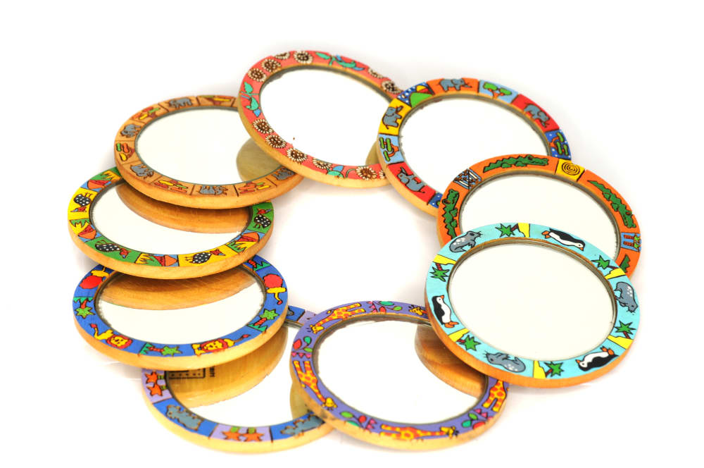
I was living in Johannesburg, South Africa in the 1990s; tourist numbers had increased dramatically and the production of art for the west was an important outlet for artistic creativity. I jumped on the bandwagon, and isibuko was born; handbag mirrors held in small hessian pouches.
‘Isibuko’ is Zulu for mirror. I look back on that time with such pride, and I still feel immense love for the sound of that name. This was innovation, this was thinking outside the box, lateral thinking and l was in the right place at the right time.
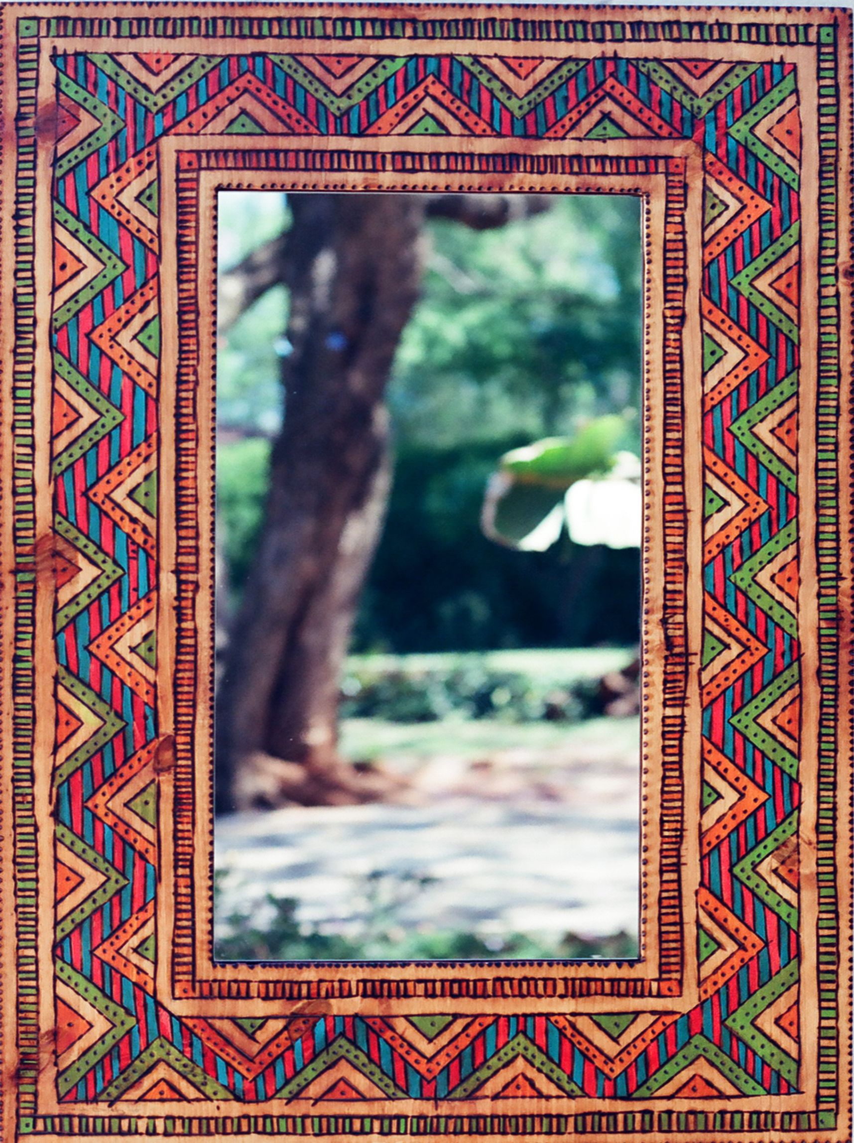
Bright colours, geometric shapes and the smell of burning wood are part of my psyche. I was born in Africa, born into the smell of wood burning fires and bright colours. I spent a major part of my early years in the African bush living on the tribal lands of indigenous peoples where I was surrounded by African kraals decorated with geometric shapes and symbols. This is also where I first saw wooden utensils with small details picked out by charring the wood with red hot pokers.
Art is huge across Africa, and wood is used extensively. I chose pine as it’s plentiful and inexpensive. A pale soft wood, it’s ideal for charring with a red-hot poker and painting.
Hessian is also the smell of home. When I was young everything was stored in brown hessian, (including water can you believe?) but in the ‘90s hessian was available in all colours of the rainbow, perfect for my little mirrors.
The outer wooden frames were machine made in their hundreds and no problem to produce. The mirrors, however, were different. Each had to be hand cut requiring considerable effort, and the rejects were plentiful. They rarely looked perfect, but this added to the finished article's charm. The patterns on the wood were charred using a soldering iron, and I used old poster paints and lacquer for the colour.
Of course, my graphic design skills came into play with the label design, packaging and display stands. The hardest part of the whole adventure was the marketing - my skills were zero. For me, marketing and selling were like walking into a solid brick wall, so I found an agent to help with this. She did a grand job and the mirrors flew off the shelves.
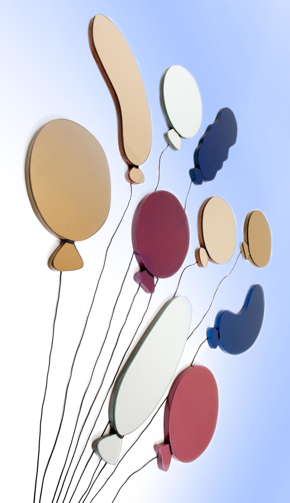
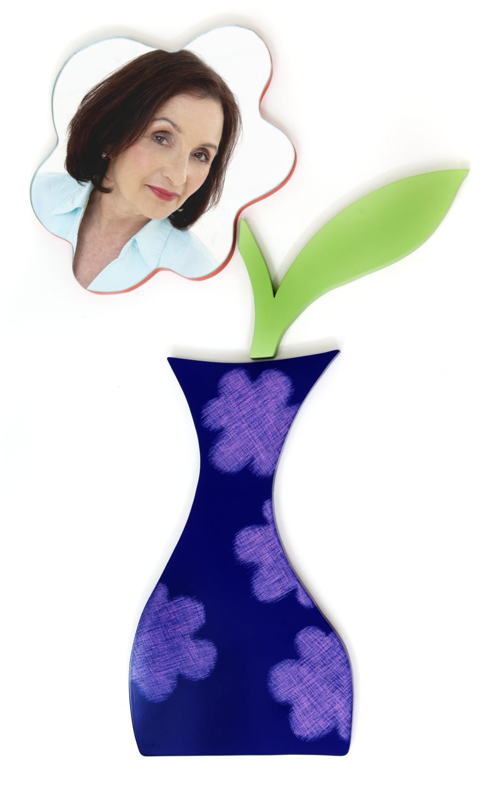
Throughout the ‘90s, isibuko grew as a successful business; I introduced dressing table mirrors to the range and later created several big wall mirrors too.
Until... the computer age arrived. Exciting new things could be done. Computerised images could be charred onto my wooden frames, now known as laser burning. The original quaintness of my creations changed with the ever-changing new world of computers and the progress of time. To make them more viable, pine and hand-charring were out; the material was cut and the images were burnt on by laser.
Isibuko was born at the right time and in the right place, but by the year 2000 things had shifted. It was time to say goodbye to South Africa and time to say goodbye to isibuko.


Can you tell us about a personal highlight from your career?
Personal highlights are short and sweet and few and far between. So please may I mention all 4 of mine? One highlight led to another and then to another - all creative.
The first one was being selected to join the course at CSM. I was so proud. At that time, I would have described myself as being a hick from Africa, and CSM was the very best art college in all of England. I had been working in London for a few years before I went along for my interview with only a handful of photographs and a foundation year in art and design tucked under my belt. I must have wowed them - who knows? I was in!
My next personal highlight was when my design idea was chosen to publicise our Degree Show in 1981. This again was an extraordinary happening. I hadn't exactly breezed through my training. It took some unlocking of doors in my brain to produce any good design material. I'm a typical introvert, who detests being the centre of attention. I couldn't even cope with a big wedding and had to settle for the registry office. I have always been, uncomfortably conscious of myself as an object of the observation of others. And this quality can lead to being marginalised and misunderstood. You learn to just shut up, to save yourself any feelings of embarrassment. It is true to say that in my experience, confident outspoken extroverts have always ruled the day. CSM taught me to get to grips with this personality trait. I had to if I was to succeed. So, I was as proud as punch, not just for my idea, but for selling the concept to both my tutors and to the 40 other talented students. I really had broken through a personal barrier.
Number 3 was getting a first-class honours degree at the end of my time at CSM, which was huge for me. I think I received the highest grade out of all the students in my year.
And lastly, in 1997, when isibuko won an award in South Africa. It was selected, amongst thousands of other entries from all over the country, as a Business of the Year Finalist.

You're now retired and your main form of creating is painting. Can you tell us about your style and your influences?
I returned to England in 2000, and it was back to employed work for me. It wasn't an easy time adjusting, there was no popping back into graphic design as things had moved on since my day. I retrained as a nurse at Southampton University and worked until 2016 when I retired. Retirement has meant I have been able to get back to the real me, back to my creativity, back to being an artist.
Being a white-skinned girl from southern Africa, born and brought up in Zimbabwe, I have a history in 2 countries and 2 cultures because, although I am by birth a Zimbabwean most of my adult life has been spent in England.
I was in Zimbabwe during my young impressionable years soaking up all things African, so I would say my influences are from that continent, and my likes and dislikes were influenced by where I was brought up. Images of Africa are the first things that come to my mind; hot, intense bright colours, loud people, lightning, thunder, burning sun, dry earth, strong smells, snakes, cicadas and wild animals.
Perhaps because I had not been exposed to much European art as a youngster, I love naive art - sincere, unsophisticated, unaffected art. I delight in the imagery of self-taught 'unfiltered' images.
I believe simplicity has great power. I found this incredible quote from the composer Frederic Chopin who said "Simplicity is the final achievement. After one has played a vast quantity of notes and more notes, it is simplicity that emerges as the crowning reward of art".
That thinking applies to good design too.
It took three years of design education to understand the virtues of 'simplicity.' The most ridiculous thing was that simplicity excited me anyway because it is how I would describe African art. I just hadn't put two and two together until it got to the end of my training. Good design is not only about aesthetic beauty but also about removing non-essential unimportant elements so that a message is emphasized.
I value my thinking and don't want my special brain to change, to be clouded by other peoples' images and ideas. I need to be the me that I want to be and believe in my ideas, so it is not and never has never been big on my agenda to visit art galleries, soaking up other people's art and ideas in case it messes with my style of thinking.
Saying that the works by Paul Gauguin from his time in Tahiti are some of my very favourites. I love the shapes and people he painted, the flatness and simplicity of his brushstroke and his bold use of colour. He was part of the artistic movement Synthetism, where rather than painting a "naturalistic representation of observed reality", the subject matter was synthesised into simple lines, colour and form. Rather like most of my work.


How has your work changed since your time at CSM? Is there anything that has remained the same?
Sources of inspiration are everywhere, it’s how I portray them, which is cool, I think. This brilliance of thought comes from my training at CSM. I was given a skill that goes with me everywhere and is in everything I create.
Its' a big privilege to be able to live off the thing you want to do most. I have not always had that luxury. In 2000, life demanded that I step away from my art for a few years. Luckily in 2016, I was able to return to my practice, and this wooden artwork was in celebration of that. It was inspired by woodpigeons in my garden.
These birds have always featured in my life, common to both Zimbabwe and England and the constancy of their cooing sound throughout my life in both countries is something very special to me. This painted MDF board wall art symbolises me flying away into freedom. It is one pigeon's movements as it leaves the ground to fly away. I have buried my nursing badges into the back of one of them - gone forever.
This next piece of art which is also made of painted MDF board was inspired by my years of making design mock-ups in the 70s and 80s. It is a copy of a vintage box from the 1950s owned by my Mum. I found it amongst her things when she died. It brings back happy memories of her baking cakes when I was young.
Today I am back enjoying portrait painting, both people and dogs. This is something I have always done. Certain faces inspire me and I get this urge to paint them. My design training at CSM hasn't changed that in any way. I try to reach into those faces to capture their inner soul, to bring them to life - one moment in time captured forever. In years to come when the people and the dogs have long gone, their images will remain to tell a story, to show us they were real once, and here.
These portraits are my latest and I hope everyone will love them. They have been painted in acrylic on canvas.

