
Students reimagine Alexander McQueen in window installations
- Written byJ Tilley
- Published date 18 March 2022
Share story
First-year BA (Hons) Fashion Visual Merchandising and Branding students were tasked with reimagining the Alexander McQueen brand in a series of window installations as part of their 'Fashion Branding for the Physical Environment' unit. The students came together in groups to communicate McQueen's brand identity, values and personality, whilst reflect current retail trends within the window spaces. The groups displayed incredibly diverse outcomes, each highlighting various recognisable qualities from the McQueen brand, all underpinned with a sustainable approach to concept, design and craft.
We joined the students for a tour of their displays within the workspaces of LCF's John Princes Street, interviewing a member of each group to discuss their concepts, their particular favourite elements and why they chose to study the course at LCF.
Group 1 - Lulu Tweedie
Tell us about your concept?
Our window display is based off the 2011 spring collection by Alexander McQueen, which largely focuses on nature. Looking further into nature, we focused on oceanic fields - we've included a lot of coral, blue tones, and very just underwater elements that you wouldn't normally find on land. There is quite a naturalistic feel to our display as the top mimics the movement of waves, there are coral reefs, and the dress has got a lot of movement to it, just like the ocean does.
What is your favourite element?
Definitely the dress. It took a lot of hard work and effort to make it and it has a lot of layers to it. I would also say the colours we used - I like the way it all kind of fits together nicely. And the way it brings it all together definitely reflects the contrast that Alexander McQueen uses.
Why did you decide to study the course?
I love the balance between creativity and also like the business side. When I started, I wasn't sure if I wanted to go more towards the creative side or the business side, so it's nice, equal balance - you can pick and choose where you want to go.
Group 2 - Holly McGrane
Tell us about your concept?
We chose the full 2012 collection by Alexander McQueen and our intentions were to replicate a flower blooming. However, when we first looked at the dark colours and the bold silhouette, we took to the style of a crow flying. The whole concept is based on a crow taking flight, hence why there are wings. We decided to create a swarm flying around the mannequin to create a nice effect behind the window. We wanted to incorporate nature into it, to tie in with the sustainability aspect.
Why did you decide to study the course?
I've always been quite creative and I've always been very into fashion, but I knew I didn't want to design clothing and I wanted to be go down more of the interior design route. When I found this course, it was the perfect set up - I can still be creative while also looking at the business side of it which will give me more opportunities when I go out into the fashion industry.

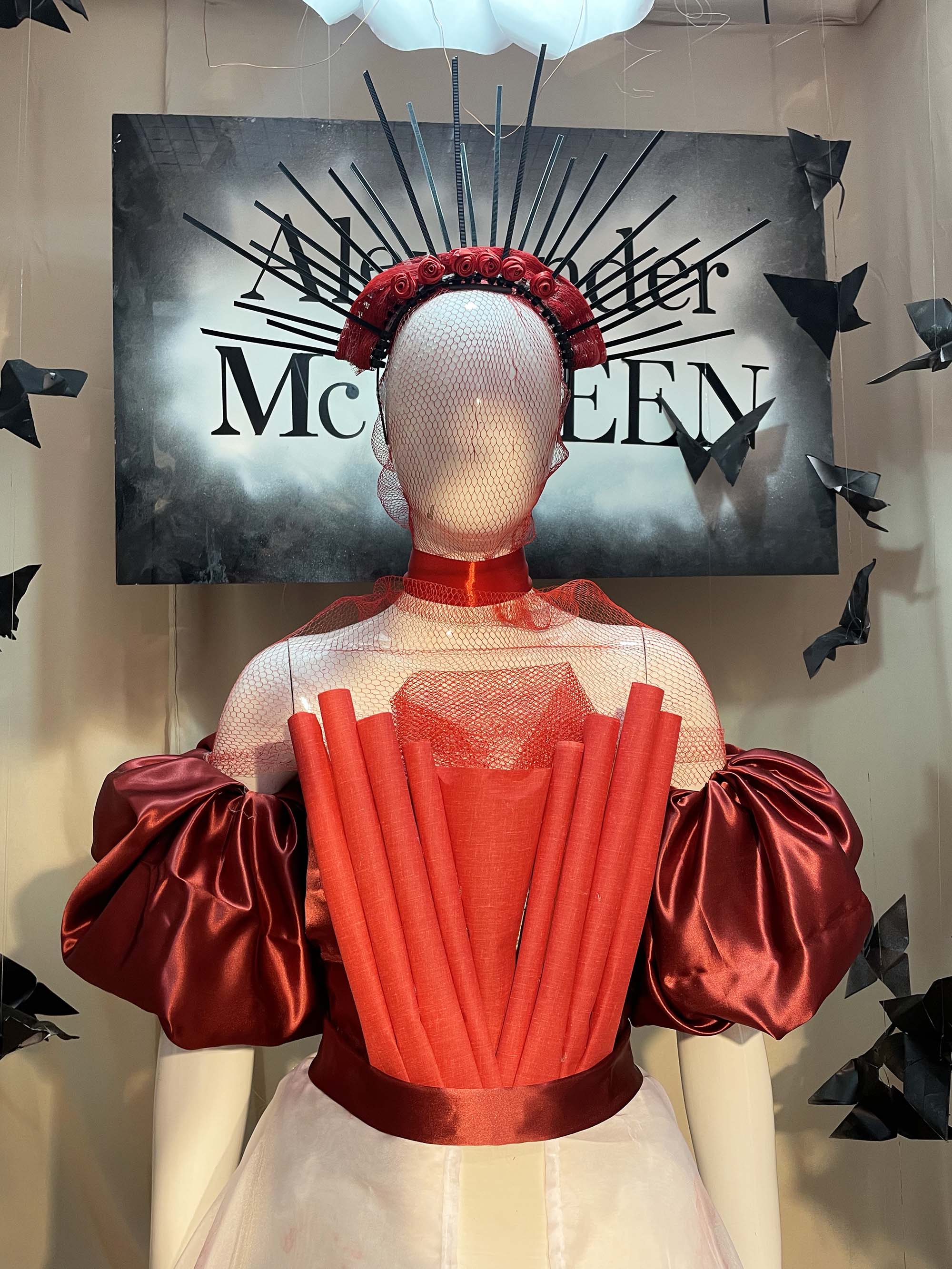
Group 5 - Julia Mogazov and Nattinan (Naomi) Itthithawon
Tell us about your concept?
Julia: For this project, we were inspired by Alexander McQueen's AW21 collection which was about the healing powers of nature. Therefore, many elements of our design take inspiration from nature. For example, flowers and butterflies are hanging around all over. After research, we found that many opposites were used, for example, the fragility that roses represent in contrast with the strength of nature - that's why we decided to build a fence with roses, which might seem like a contradiction, although this is intentional as we wanted to represent the two opposites. As well as the opposites within roses and nature, there is contrast between innovation and tradition, which is ultimately what the McQueen brand is all about in the end - classical shape, but interpreted in a more innovative way.
What sustainable elements have you considered?
Julia: One of the main aspects of this project was to use sustainable materials and props. Almost everything within our display is made of recycled materials such as paper. For the dress, we used upcycled fabrics from curtains and a duvet cover. We also produced the crown made of cable ties, and the red net, which is recycled from fruit packaging that you find in the supermarket.
Why did you decide to study the course?
Naomi: I chose the course because I wanted to do something in fashion, but I'm not good with designing clothing. I love interior design and my Mum also used to do interior design so I thought, why not?

Group 6 - Anqi Bian
Tell us about your concept?
The McQueen collection that we chose to focus on, expresses anti establishment and disrespectful characteristics of the brand. We chose to focus on English history and found that in the 16th century, Elizabeth I succeeded Mary I at that time and England was in a religious division. We wanted to tell this story through our display, It seemed as though the Golden era was a a prosperous era, but because of the religious division, it led to a lot of darkness as hate ran through England. This is our concept.
What is your favourite element?
I really like the decoration in the globe, because we wanted to use the world to express the danger that came with a religious division, and it replicates a broken mirror. So we used tin foil and the fragments reflect to make a projection effect through the cages.

Group 10 - Jessica Hewitt-Haynes
Tell us about your concept?
Our window display is based on the Alexander McQueen SS08 collection. It was a tribute to Isabella Blow, who was a dear friend to Alexander McQueen, so we decided that the collection was named 'Madame Blue'. We went with almost an entire blue theme apart from the wings and feathers which are black. The collection was based on quite extreme glamour and Alexander McQueen is also famously known for always incorporating nature into all of his collections - we really ran with that theme and that's why we have the massive wings in the back, with the leaves making a blue rainforest.
What sustainable elements did you consider?
Almost everything in our display is just reused materials. The dress is blue roll and dust sheets as my Dad is a builder, so he always has them things. We did buy the feathers, and we bought three sheets of card but everything else was all here in the studio and we just used the wire cutter to create the shapes and then we just sprayed them.

- More about BA (Hons) Fashion Visual Merchandising and Branding
- View more work from the Fashion Business School
- Explore LCF undergraduate and postgraduate courses
- What’s on at LCF: open days and events
- More LCF Stories