
One of Camberwell’s popular Printmaking workshops, Letterpress is a technique of relief printing using a printing press and enables students to work with typography in a variety of wood and metal type. Each year, Letterpress technician James Edgar does project inductions with students who are keen to use this process in their work, asking them to explore and experiment in the workshop outside of the traditional technique or art of Letterpress. Students carry out several print tests of their experiments which are then exhibited in the Letterpress Workshop towards the end of term.

This quote from Museum of Modern Art curator, Laura Hopman, is a key reference for James when planning these indications:
“Language is synaesthetic, it is a medium and it is also a transmedium. It is a sound, an object, a place, an activity, a symbol like a mandala. It can be used like paint.”
And he explains the methodology behind the workshops as follows:
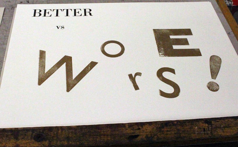
“For me, typography can be viewed as the technique of arranging type for a specific purpose. This could be how letters have been arranged into words that form the lines of text in a novel, or how letters have been arranged to emphasise the meaning of a word. Within the workshops I invite students to work in pairs and will take one set of words from a list I provide for them. They will then investigate ways to visually communicate this pair of words through a selection of shapes, ‘glyphs’ and colours available within the Letterpress Worskshop. I ask them to consider how the rules, decorations, glyphs and ‘furniture’ can be set to emphasise particular qualities or contrasts present within these words: how do they sound? What do they look like upside down? What if you only used lowercase? How would it feel if it was printed fluorescent orange? Some examples of word pairings used in the exercise are: absurd vs normal; beautiful vs ugly; wet vs dry; hard vs soft and light vs dark.”
We photographed a first Year BA Graphic Design students’ induction:


Students experimented with blending colours directly on to the type


Students also experimented printing onto wet and dry surfaces to see what effects could be made


Experimenting with materials rather than the type blocks, this print is a pineapple
Related links: