
Luke Wade is an MA Printmaking Graduate who won the annual residency at Oficina Bartolomeu dos Santos (OBS) the printmaking studio of the eminent Portuguese printmaker Bartolomeu dos Santos in Tavira, Portugal, last summer.
The residency is awarded to graduating students of MA Visual Arts: Printmaking at Camberwell. When Bartolomeu dos Santos retired from his role as Head of Printmaking at the Slade School of Art he inaugurated a print prize in his name; the fully equipped studio offers facilities primarily for intaglio, for which Bartolomeu was so famous. Luke took over our blog to tell us about his residency experience. We’ve split his takeover into two parts, here’s part one:
Before you begin to read, I probably ought to clarify this was to be a series of blog posts posted up as the Residency progressed, but due to a lack of mobile internet and my unwillingness to seek out WiFi, I chose instead to keep a journal, which you see here in edited form.
My arrival in Tavira with a suitcase packed full of miscellaneous sized metal plates, inks and intaglio tools was, much like everything I do in life, a little later than planned. Portuguese public transport out in the provinces isn’t as regular as a lifelong Londonite comes to expect, so a coach, a plane, a bus, a train, and a charming walk through the cobbled streets and narrow pavements of a town later, I found myself facing a large flight of new-looking steps. ‘Escadinhas Bartolomeu dos Santos’ the tiled sign on the wall told me. Sounds about right.

Oficina Bartolomeu dos Santos (OBS) printmaking studio, Tavira, Portugal
So up I went to the door, knocked on the funny closed fist knocker and was greeted by a woman with red hair and a London accent. I gave her a rather sweaty hug and she introduced herself to me as Rachel Ramirez, artist and (as I later discovered) a past technician of Camberwell’s Printmaking department. She told me she was just about to go, figuring I’d been held up and having not received any word, was in the process of writing me a note, to which she’d got as far as writing LUKE in capitals at the top of the page before I’d knocked. Good timing.
Stepping into the cool, comparative dark of the studio was deeply gratifying, and after I’d seen off three glasses of water in a matter of gulps, I felt a lot more human, finally able to take the place in. The studio has been designed by an architect, there is no doubt about it; the lofty apex ceiling, the window placement, downward angled frosted acrylic sheets, which provide the workbench wall run the entire left hand side of the studio, with diffuse natural light. The cleverly positioned lighting, the central staircase with the balcony to the left and the bedroom to the right; it is a place elegantly functional, designed to be cool (as needs must when the weather was topping 40 degrees Celsius), and easily livable, with a tiny little kitchenette tucked off to the right. In the middle of the space there are three large tables, ample room to work and spread prints out on. At the back there is a glass box full of acid trays and some ominous plastic bottles, immediately adjacent are two massive granite sinks: one for process and general cleaning, and the other for soaking paper. Looking back at the front of the studio, there is a large aquatint box and area to the right, next to a Victorian looking guillotine covered in Portuguese warning notes.

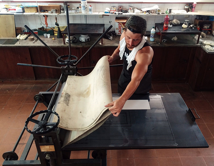
One of the presses in OBS printmaking studio
The three presses that inhabit the space were particularly impressive specimens to an etching fetishist like myself. There is a large, almost piratic-looking, contraption which I quickly deduced from all the stones scattered about the place is a very old litho press. It looks as impressive as a museum piece, and in truth about as functional. There is a compact Rochat press, sans blankets which Rachel finds for me in the cupboard. But the main press, the one I’m going to be learning, tuning and using is a beautiful Spanish star-wheeled press, reasonably large, easily big enough to handle the 76 x 56 Somerset I’d had shipped over from John Purcell (for the frankly excellent flat rate of twenty quid via UPS).
I’d been told to bring everything I might possibly need, so was pleased to find that the workshop was fantastically well appointed. There was all the intaglio inks and extenders you could wish for, all the Portuguese equivalents of the chemicals and solvents I was used to using, plenty of tissue, rags and all that vital printmaking miscellany that you don’t really have cause to think about when you’ve come from the lavishly stocked and maintained Camberwell printmaking environment. But this time, I had it all to myself. Delicious.

Luke’s plates arriving in the post
And so much space! The idea of all this work-space real estate at my disposal was incredible; when I was used to coming into the workshop when it was busy and trying to find a place to work without treading too flagrantly on other people’s toes. Now, I could have an entire table for cutting paper…an entire table, just for paper! Madness! It’s the artistic equivalent of having an entire room in your stately home for playing cards or some other arbitrary and disproportionately small activity; “This is the room where I dry my hair.” Okay, so that sounds a little over the top, but there is genuinely something wonderful about having an entire building at your disposal, let alone a fully-equipped printmaking studio AND living space. Here I could walk out of the bedroom, straight onto the roof terrace and get a lovely morning dose of sun, then downstairs and sling a plate in the nitric acid bath. I was so excited.
That evening I went and, much to the disappointment of anyone authentically Portuguese, found myself eating chicken al fresco at what turned out to be an Irish pub on the river. In my defence it was 17:00, I’d eaten nothing all day and was starting to get all heady and woozy, so I wasn’t in the position to be particularly choosy. However, sitting there was when my my first moment of inspiration struck. The place mats were particularly weird: they were bright green and made of finely extruded squiggles of silicone. It was fairly randomly distributed, but the size and recurring loops meant that you could perceive the hint of a pattern in the surface. My first thought was, I can totally print this…
I decided to print the silicone place mat I had seen at the restaurant on my first day, through the same interest in collographs. After establishing an appropriate pressure with the press, I added layers of colour, black and Prussian blue, with accents of red that I hoped gave a painterly suggestion of landscape, maybe even violence when read with the drawing-like impressions of the mat itself. I intended to cut up and collage the mat for a second run but never got around to it.

The place mat inspired print
In terms of the work I ended up producing during the residency, my attitude was that I have been given a place for two weeks to experiment, so that is exactly what I am going to do. Short of a few ideas that I had taken with me and an abundance of metal plates, my work was entirely made on site. This brought with it a certain anxiety that I felt in the morning after my first night. “I have so much to do in this place, so much time and so much potential” – it was more than a little daunting. But just getting down to business, grounding some plates and testing the acid was more than enough to return me to the printmaking swing of things that I had fallen out of since completing my degree. Due to the vague wording of my mobile network, Threem with regards to their data roaming territory expansion in September I had done away with the internet entirely, so my source materials were whatever I had on my computer or whatever I procured on site.
I had purchased a long strip of zinc that I intended to draw riot police across in a big long formation, against a white background, and set about drawing this up, taking proofs and testing the aquatint. The acid by all accounts was a bit stronger than I’d have ideally liked, so some watering down and careful testing was required. These are considerations you have the luxury of never needing to make in a fully-staffed studio, where the baths are regularly topped up, clearly marked and directly ventilated. This was really my first go at being a technician and with no technicians to guide me I had to trust my preexisting knowledge and gut instinct. The confusion surrounding the correct protocol of acid into water (or was it water into acid?) in order to avoid an explosive reaction did spring to mind, and I couldn’t help but invoke the spirit of Paul Atkins and Brian Hodgeson (Camberwell Printmaking technicians) for guidance. Decanting the nitric acid back from the trays to the pot was really a two-man job, so I was a little apprehensive whilst wielding an A1 tray full of sloshy acid. Despite my approbations about it, the acid bit cleanly and deeply, and gave a strong, if a little fast, aquatint to black.

Printing a strip of riot police

Riot Police, print by Luke Wade
I did a small sketch of a chorizo on a board that was really to loosen me up, but the drypoint failed as the plastic I’d brought reacted weirdly to the ink and went all matte and foggy, not resulting in a clean wipe and a generally poor print. Undeterred, I knocked this up again on a similarly sized bit of steel, instead of onto fresh metal. I’d drawn over a pre-existing plate surface, something I’d taken to doing at Camberwell because it not only provided interesting tonal results but made me far less precious with my drawing, and above all meant I got to use old, free steel laying about the place.
During my walks about Tavira I came across a building whilst looking out from the old fortifications in the centre of the city. This was a building with the most peculiar turret on top; really too narrow to actually hold anything useful apart from maybe some stairs up to the balcony and the ornate angled roof. On one face of this tower a sign spelled the word Residencial, which I later found out meant this place was for pensioners. It struck me because of how whimsical and frankly silly a structure it was, evoking the architecture of Dr Seuss stories and Wes Anderson films. I decided to make an etching of this onto a reclaimed plate, which in its early stage turned out very nicely. I’ll likely drop an aquatint onto it at a later date, give it some more depth, but I was enjoying the simplicity of plain hard ground drawing and bitten scuff marks.

Residencial building Luke came across while wondering the city

Plate drawing of the residencial building
In my course of looking at tools, I did find the Portuguese equivalents of workshop materials quite interesting. For instance, white spirit is petromax and is pink. Meths is called Alcool, and is blue rather than purple. I was particularly struck by a charming can of metal polish, the Portuguese Brasso Coracao, with a no less iconic bleeding heart than to the red and white sunburst of British fame. It seemed that there might have been a bit of a running joke about Brasso because all over the workshop there were little allusions to it, in the form of vintage fridge magnets or clippings. Either way, I decided to do a little multi-stage aquatint drawing of this thing, the finished article was very pleasing in a, I could hang this in my kitchen, sort of way. After doing etchings of firing squads and crucifixions over the past two years, I think I could afford myself a little room to make something exclusively pretty for once.

Portuguese Brasso Coracao print by Luke Wade
Related Links: