Typography
Last updated:
24 June 2026
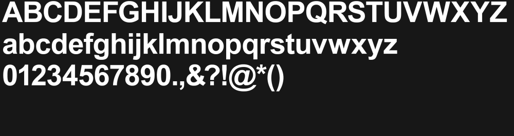
Primary typeface
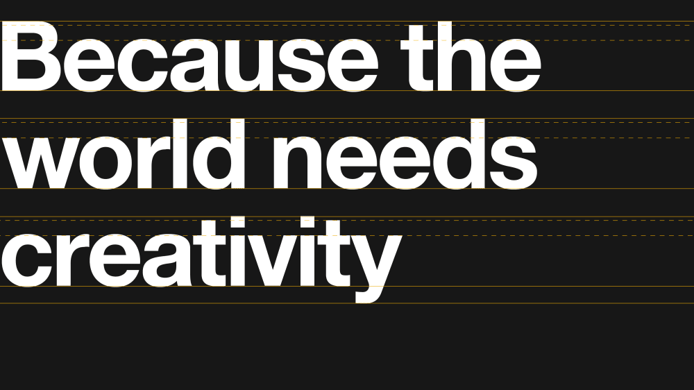
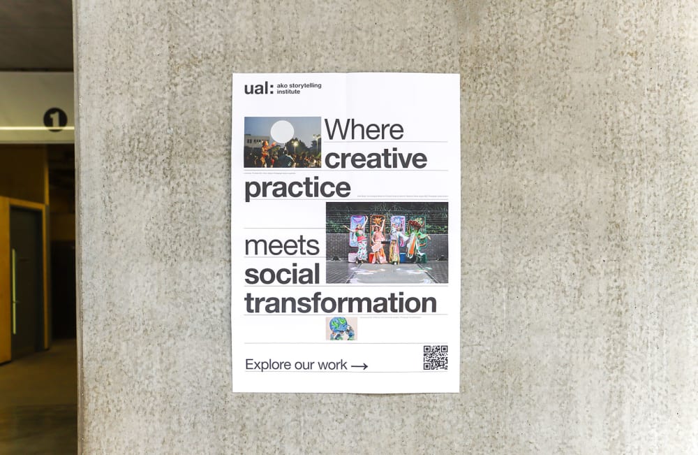
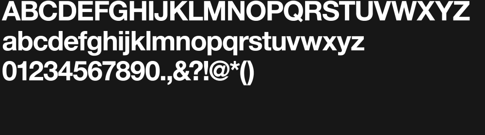
Our primary font family is Helvetica Neue LT Pro. Only use the 4 weights covered under our licence:
- Helvetica Neue LT Pro 55 Roman and 75 Roman Italic for headings and body copy.
- Helvetica Neue LT Pro 75 Bold and 76 Bold Italic for headings.
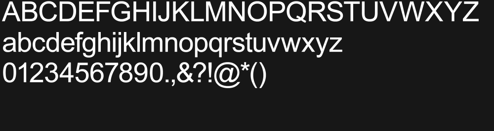
Secondary typeface
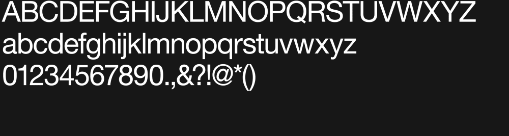
Our secondary typeface is Arial. Only use it when Helvetica Neue is not available.
Like Helvetica, we use two weights:
- Arial Regular for body copy.
- Arial Bold for headings.
Using our typefaces
- For accessibility reasons, limit use of italics in print where possible and never use italics online. Don’t use any font weights that aren’t listed in our brand guidelines.
- When creating webpages, use our University heading style. We set the line height of our headings online from 110% to 150% of the type size so there are no accessibility or legibility issues.