ual: Design System
Space
Consistent spacing helps to create a uniform feel across the UAL digital estate.
Overview
Space is the invisible part of our brand that creates impact. Used carefully, it helps users scan and navigate content. To keep things organised, we use a palette of space sizes called tokens.
These are some key things to be aware of when working with space:
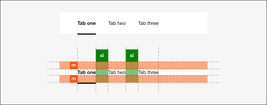
Work with built-in spacing: Our components and layouts have spacing built in. Some components allow you to change the size of spacing, relative to the component above. Consider different screen sizes and ensure components are not too distant or too close to each other.
Consider spatial relationships: Use space intentionally to group or separate content as appropriate.
Don't overdo it: Too much space will make pages feel unconnected or unfinished. Too little will make pages feel like a dense, impenetrable wall.
Fixed space tokens
This table demonstrates the fixed space tokens that you can use in your designs.
| Name | rem | px | Example |
|---|---|---|---|
| 3xs | 0.25 | 4 | |
| 2xs | 0.5 | 8 | |
| xs | 0.75 | 12 | |
| s | 1 | 16 | |
| m | 1.5 | 24 | |
| l | 2 | 32 | |
| xl | 2.5 | 40 | |
| 2xl | 3 | 48 | |
| 3xl | 4 | 64 | |
| 4xl | 5 | 80 | |
| 5xl | 6 | 96 |
.
Fluid space tokens
The grid employs viewport width (vw) units. The default grid is made up of 25 columns, each of which is 4vw wide.
Some existing components also make use of these tokens in their styling. Please use the static tokens documented here.
| Name | vw |
|---|---|
4vw | |
8vw |