Get good with this technique and it will help you kick start your response to a design brief and maybe even feature in your presentation to ‘clients’. Shernette introduces some top tips to make the most of this visual research tool with examples from her BA (Hons) Graphic Branding and Identity students.
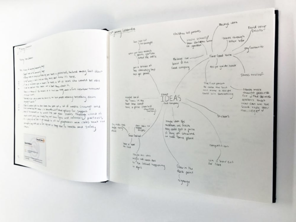
So you’ve created a spider gram (brainstorm) of proposed ideas in response to your brief. The next step ideally is to create a mood board- a crucial part of the design process.
Moodboards can be made traditionally (by hand) or digitally. However traditional mood boards in my opinion have a much better tactile quality, particularly if you plan to use samples of textured materials.
This is difficult to capture within a digital environment, so purchase a sheet of A2 white card or paper, start with a blank canvas and build layers of information. Before you get started, choose what format you’re going to use- portrait or landscape? This will affect the layout of your ideas.
Here’s some tips to consider when making mood boards:
Collate interesting relevant references and don’t stick things down straight away
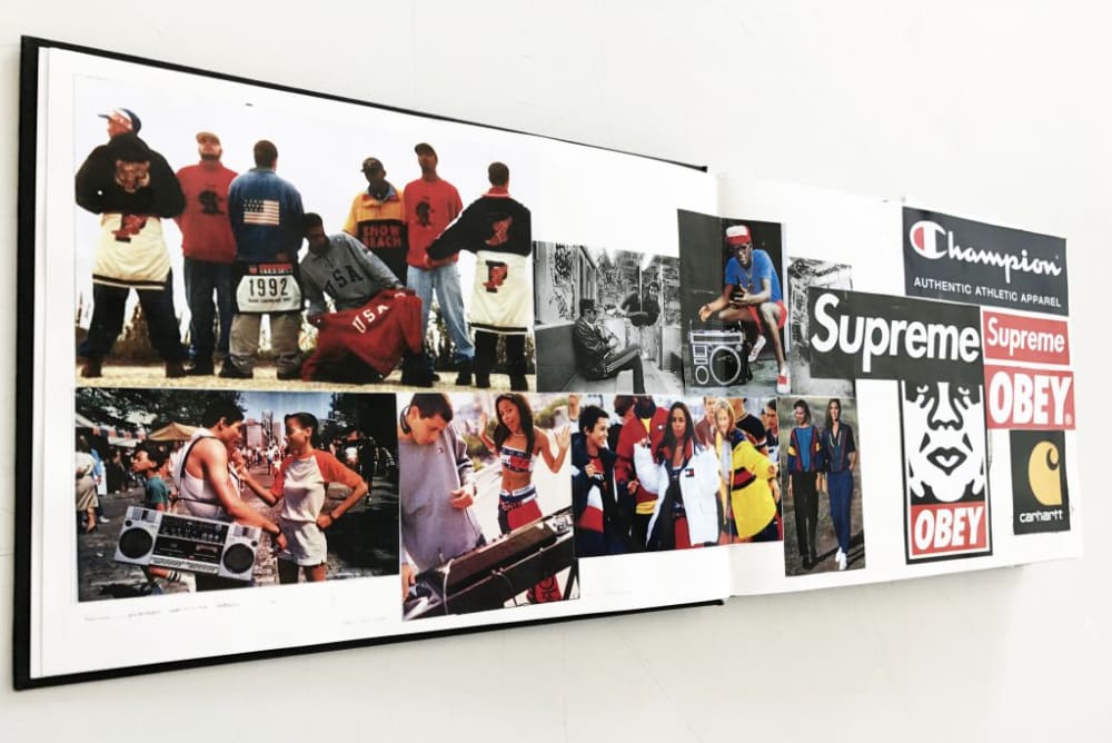
Collate lots of visual references- clues to your ideas that will really capture the essence of what you would like to create for your design. Print out or cut images, words, font styles, colour swatches from magazines. Consider the choices you are making. You can use blue tack to begin the process, however using a movable adhesive such as spray mount or photo mount allows you to re-position and swap images in to your layout. When using spray mount keep at least 6” away, spray each individual image with a light coating, then place in position, using a clean piece of paper place on top and rub it from one corner to avoid air bubbles when sticking it down.
You can purchase spraymount or photomount from stores like London Graphic Centre
Try to create a ‘tone of voice’
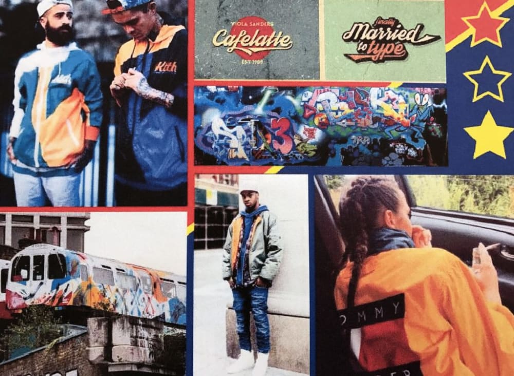
This mood board is for a new sports streetwear brand. The choice of images referenced and colour palette demonstrates the tone of voice and persona types for their fashion collection. The group wanted to introduce the collection as casual unisex wear for cool, young, relaxed streetwear- a hardwearing product, for people who lead an underground city lifestyle.
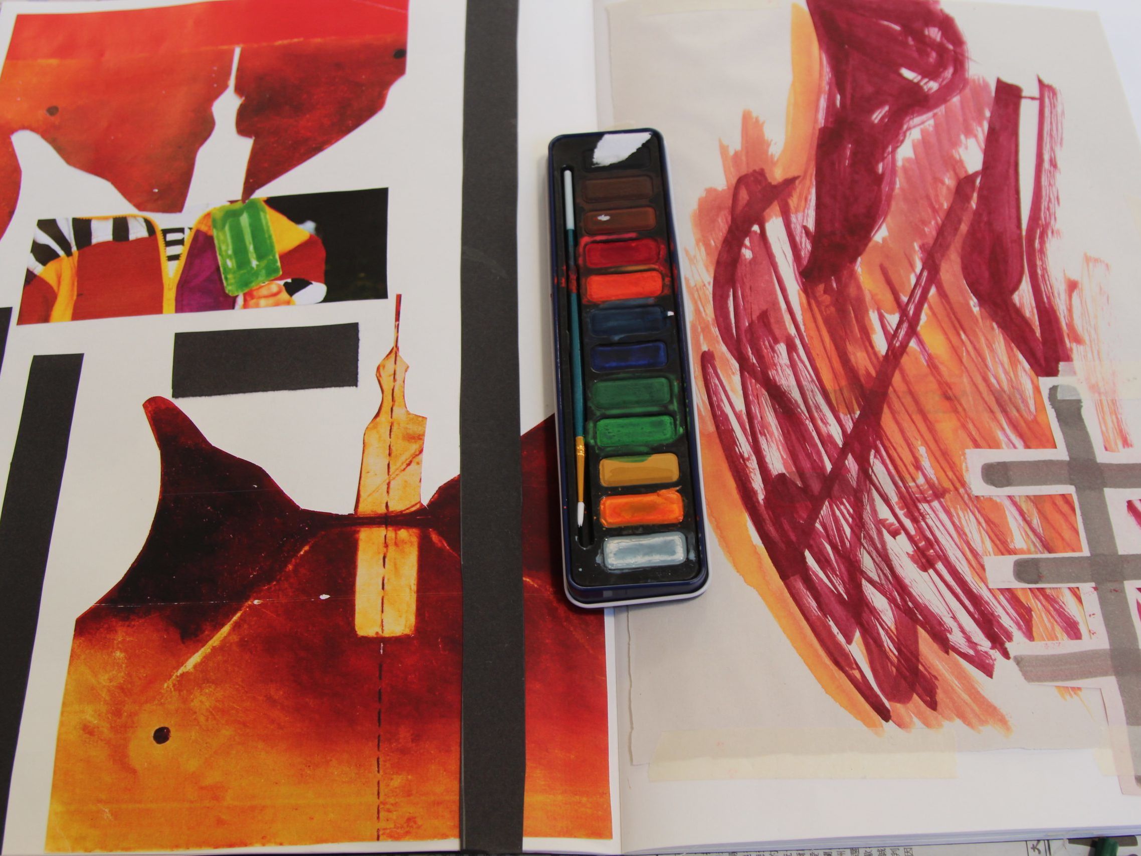
Consider materials; magazines, paper, textures
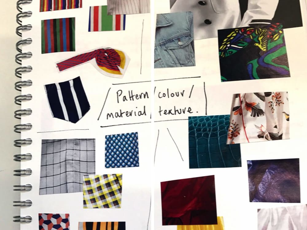
Here the various types of materials, textures and colours have been considered by sourcing images and cutting out small swatches to help choose styles that are relevant for the brand.
Decide upon a colour palette
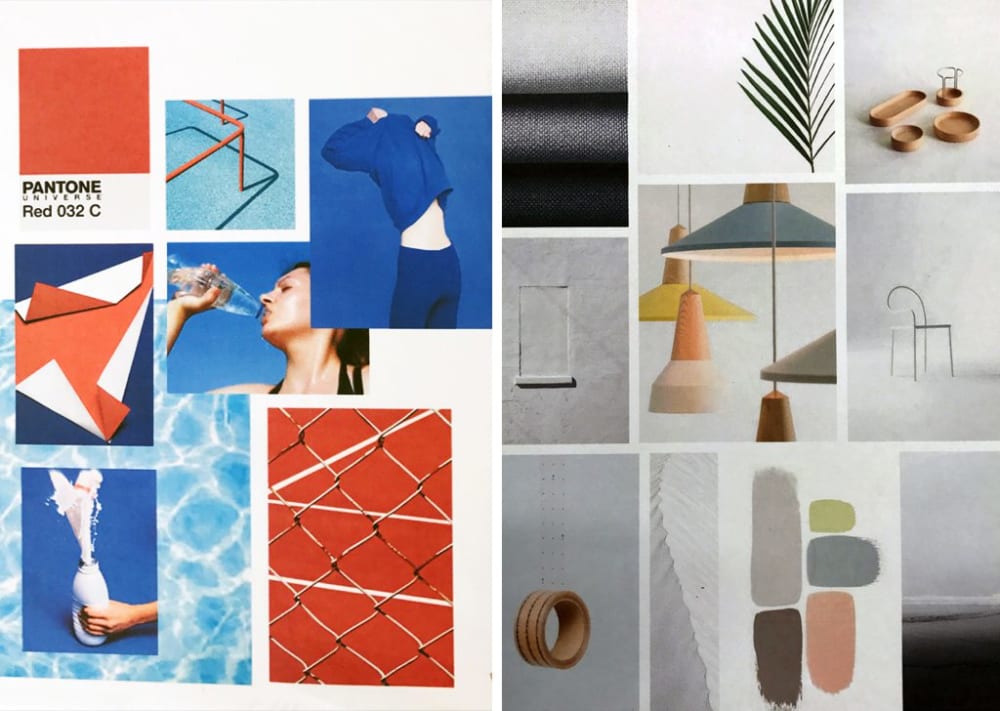
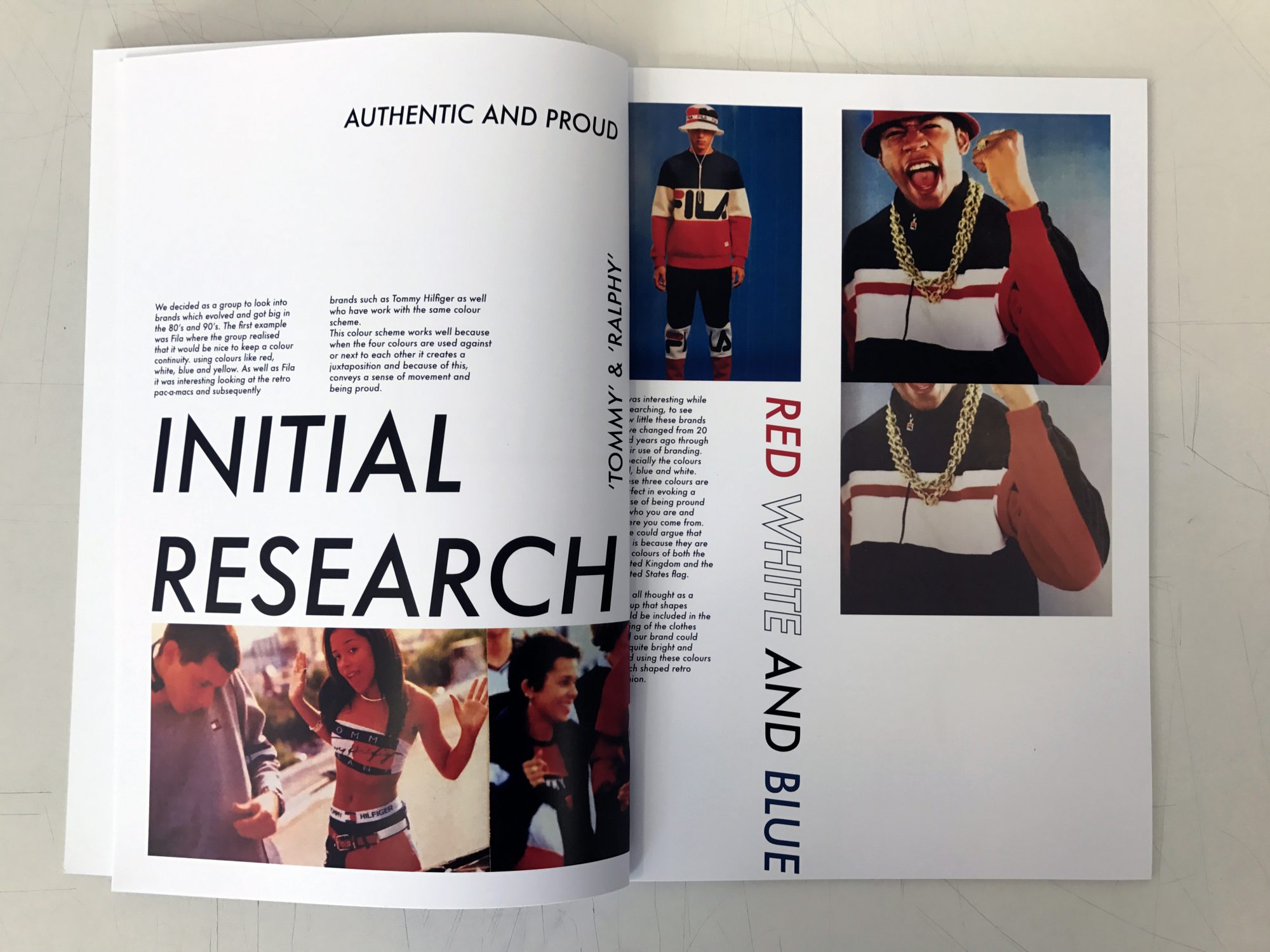
Choosing a colour palette can be difficult. A colour scheme can be used to portray the brand’s culture, identity, audience, lifestyle or purpose. Your chosen colours can tell a story about the brand, it’s vision, foundation. What do your chosen colours represent? How will they be perceived? In the left image above, shades of red and blue, alongside white, portray a strong classic British heritage. On the right, against the various shades of grey, pink and yellow these softer tones portray a gender-neutral, modern, minimalist approach for their style of brand.
Consider layout principles including scale of imagery
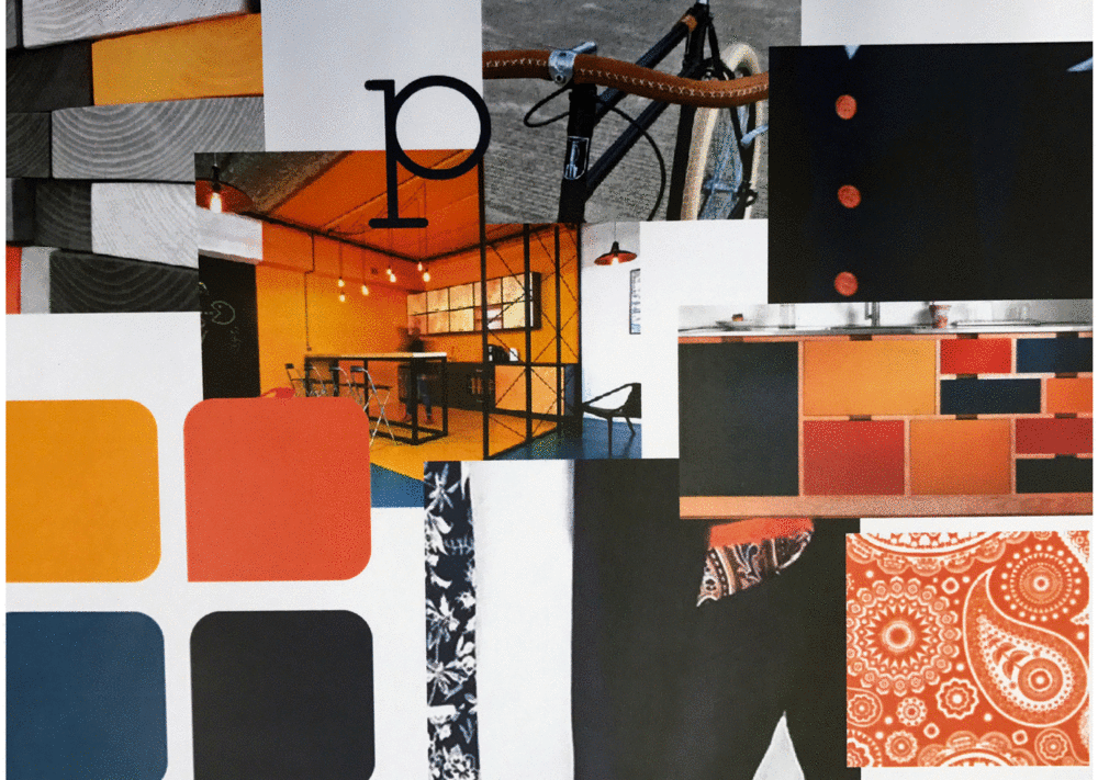
Consider how you communicate your ideas and vision for the brand, keep the flow of the mood-board well balanced. How will you use the white space? Some mood boards are minimal and others are chaotic. The layout is important; image size, cropping, proportion, perspective, prominence, colours, textures, environments, personas. Think about which images should have more priority on the page. Place the images in a hierarchical way; this means arranging the images in relation to their importance. When presenting your mood board this also helps the audience clearly understand the thought process and direction taken. The mood boards above suggests that the theme concerns a tailoring brand with a modern twist. The colour palette of the proposed collection is very prominent, alongside the style of their fashion collection.
Include type or proposed font styles
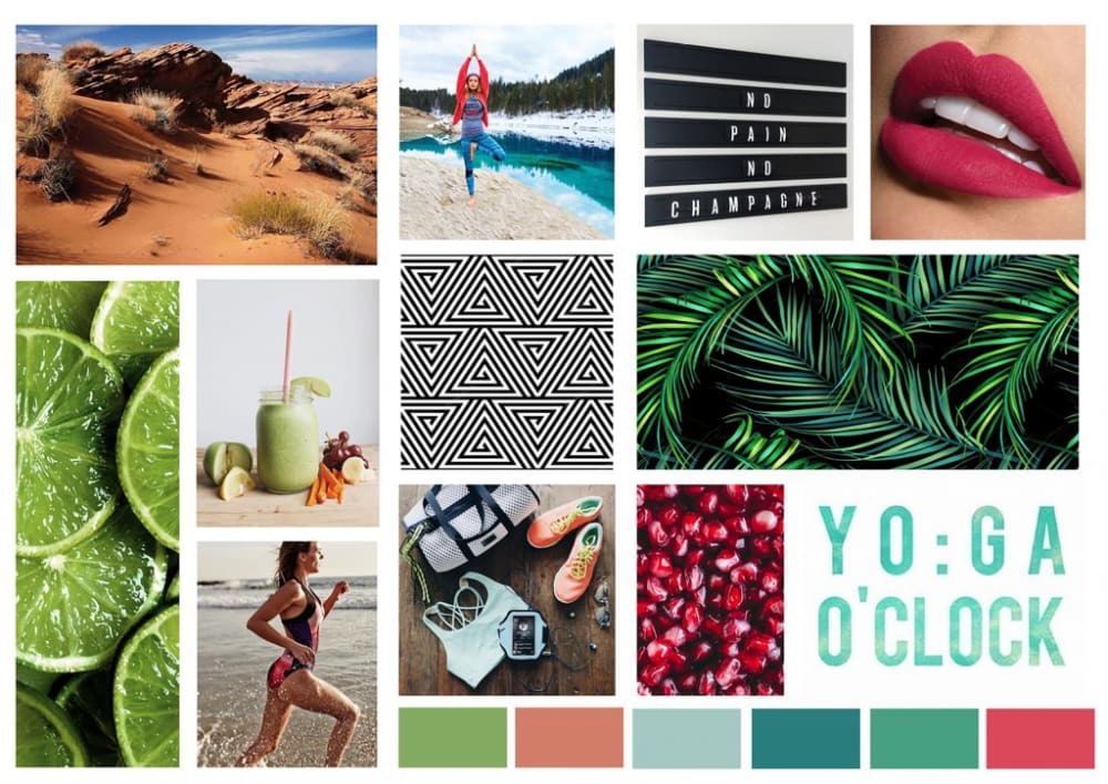
Mood boards can include type. Above the students have included images which have clear statements ‘No pain, no champagne’ to symbolise the idea of the audience being very active types who enjoy outdoor training, yoga and other fitness activities. The colour palette also signifies people who lead a healthy lifestyle.
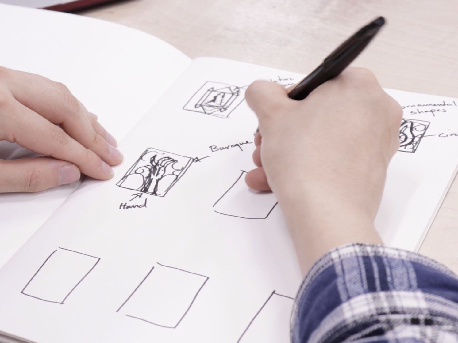
Creating a mood board should be fun and is a good way of getting your early ideas on paper in an interesting way. You can make more than one- try out different layouts and use your sketchbook to pin down research and ideas with notes about what interests you about the images you’ve selected.
