


Jump to
- Our name
- Our brand idea
- Messaging
- How we look
- Our logo
- Dual branding
- Our symbol
- Typography
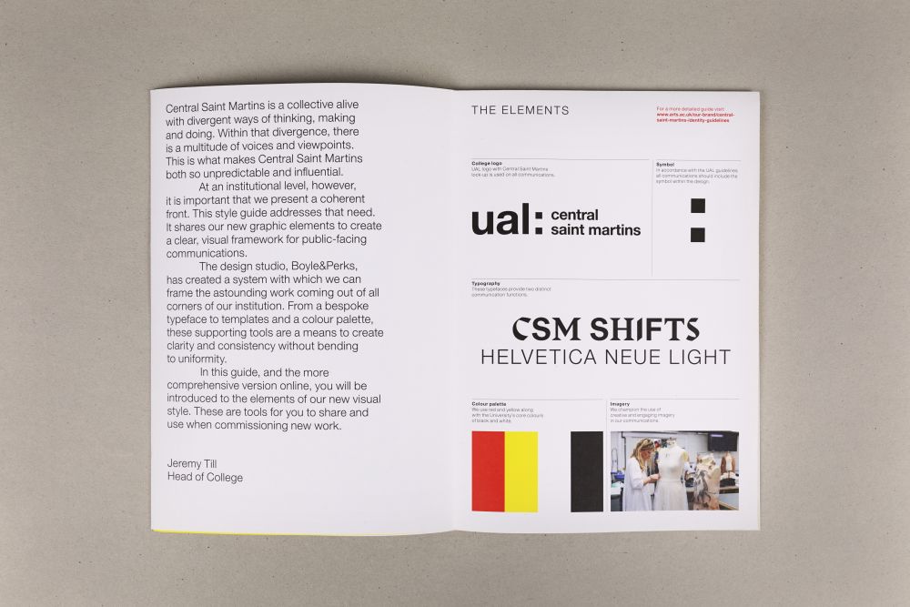
- Colour palette
- Imagery
- Best practice examples
- Download our branded templates
- Material sustainability
Find more guidance
Our name
Our name is Central Saint Martins.
Never use ‘the’ as a prefix in front of our name. Never shorten Saint to St.
Where possible, the College’s relationship to UAL should be made clear:
Example: Central Saint Martins, UAL, is part of a new exhibition….
When referring to our Colleges, we always use title case:
Example: UAL is made up of six unique Colleges and each College…
Abbreviations of the our name should only be used once you’ve established their context and meaning:
Example: Central Saint Martins (CSM) is the creative and inventive ambitions of our students, staff and partners. CSM is the diversity and global reach of our community.
When indicating possession, the apostrophe should go after the 's'
Example: Central Saint Martins' facilities are...
Our brand idea
Creative practice combines the ability to imagine new futures with the means to deliver them. As such, artists and designers are well-equipped to address our urgent global challenges – from tackling the climate and biodiversity emergencies to forging more equitable societies. Our students work with hope and uncertainty, using their compassion and vision to shape the world through creative action.
At Central Saint Martins, we believe that art, design and performance can generate real, productive change.
What we do
What we do is always connected to others. Our community goes beyond building, beyond disciplines and beyond borders. From local neighbours to global partners, Central Saint Martins collaborates with others to build knowledge and transform objects, systems and lives for the better.
Messaging
One-line descriptor:
We believe that art, performance and design can generate real, productive change.
Short paragraph:
Central Saint Martins is alive with different ways of thinking, making and doing. Across art, design and performance, our students create the ideas, materials and actions for a better future.
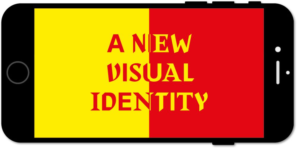
How we look
Central Saint Martins is a collective alive with divergent ways of thinking, making and doing. Within that divergence there is a multitude of voices and viewpoints. This is what makes Central Saint Martins both so unpredictable and influential. At an institutional level, however, it is important that we present a coherent front. This style guide addresses that need. It shares our new graphic elements to create a clear, visual framework for public-facing communications.
Two-tiered approach
Recognising that some projects will have different design requirements, we are introducing a tiered approach to maximise flexibility for the multiple applications that are needed across College communication.
Tier 1
Top-level style for primary communications coming directly from Central Saint Martins such as Open Day communications, Prospectus and Marketing print or PowerPoint presentations.

Tier 2
For all secondary concept-led communications like partnerships or projects that are not just from Central Saint Martins, such as Public programmes, Innovation & Business or external events.

Our logo
Our logo is an important element of our visual identity. It connects us to the University and unifies our brand across
communications. When using our logos, you should always use the master artwork and never recreate or change the logo design. To ensure you use our logos correctly, follow these tips:
- Our logo sits in the top left-hand corner wherever possible to act as a visual anchor
- It should be kept in proportion and positioned at an equal distance from the top/bottom and left-hand side of the page
- The logo should only be used in black or white, depending on the background colour. For certain rare applications the logo can be embossed, debossed, varnished or foiled
- The minimum size for the logo is 5mm in height. For more detailed information on positioning and sizes please visit the general logo guidance page
- When scaling our logo for placement within documents of a regular A size, please adhere to this guidance for the recommended minimum size. The below sizes are applicable for both portrait and landscape formats
![]()
![]()
Download:

The primary location for our logo is to be placed in the top left corner, however where this is not possible, the logo can also be placed in the bottom left corner.
Dual branding
If Central Saint Martins is working with an external company or organisation, on a sponsored event or collaboration for example, the following arrangement of logos should be used to demonstrate the relationship:

The logos should be equal in size and divided by a 0.5pt line where possible (in the most appropriate of our primary colours).
Please note, this dual-branding arrangement is reserved solely for partnerships with external companies or organisations, and should not be applied to any internal activities.
![]()
Our symbol
Our logo contains a valuable element — the colon that bridges the University and the Colleges. It also symbolises the connections that build the creative network unique to UAL (see ‘Our core idea’ for more information). This element should be used in our communications as an identifier for our work. For more detailed information on using our symbol, please visit the general symbol guidelines.
Option 1
The maximum height of the symbol should be that of the combined height of three logos from your design.

Option 2
The space between the symbol and the word is equivalent to one square from the symbol.

Option 3
There is also the option to be more playful and creative with the symbol if and when the brief is appropriate.

Typography
Headline typeface
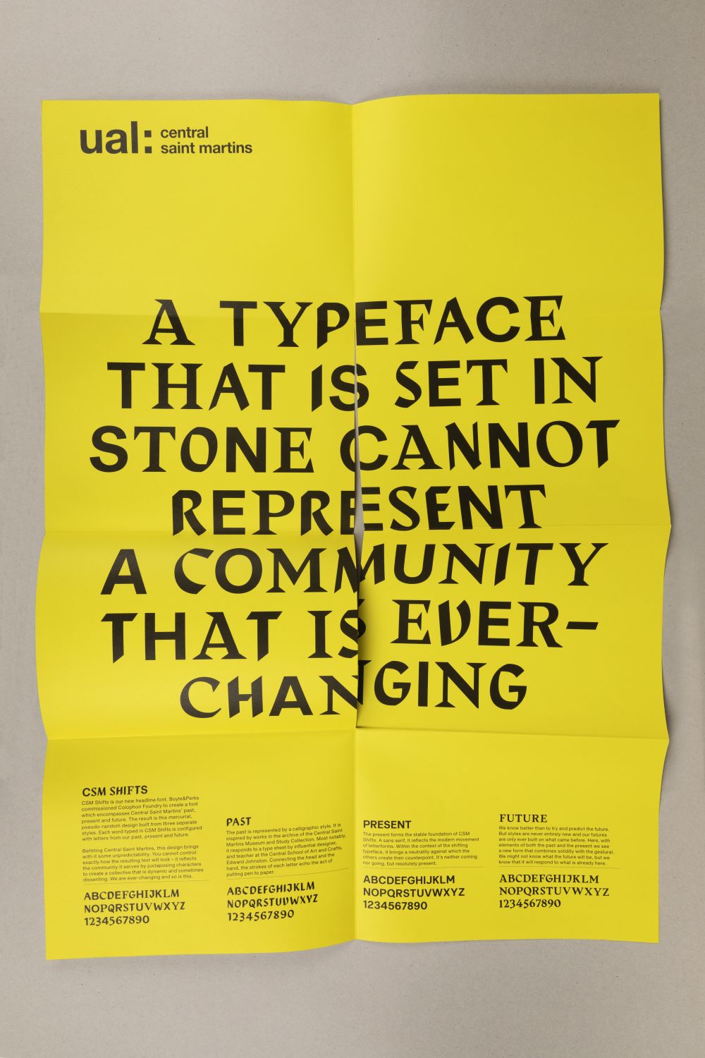
CSM Shifts is our new typeface and a fundamental element of our new identity. This mercurial, pseudo-random design is built from three distinct typefaces representing our past, present and future. Users cannot define exactly how the resulting text will look. The typeface uses a randomising code, meaning that it reflects the community is serves by juxtaposing characters to create a collective that is dynamic and sometimes dissenting.
Read the full story about CSM Shifts.

- CSM Shifts is a headline font only and only exists in upper case. Therefore strict guidance has been set on minimum usage sizes. It is to be used sparingly for reasons of both impact and usability
- Recommended sizes and associated spacing is provided to aid in unifying typographic use across all media. They have been considered carefully to ensure clarity, consistency and legibility. The minimum print size is 36pt and the minimum screen size is 50px

Primary typeface
The primary font family is Helvetica Neue as it is one of the integral components for all UAL communications. Our primary typeface weight is Helvetica Neue 45 Light. We predominantly use this in upper case for headlines with a generous open tracking. Other weights of Helvetica Neue in lower case can be used for subheadings and body copy.

Tier 1
Keeping things consistent and simple makes communication quicker and easier. So, wherever possible, our system uses a maximum of three type sizes. Here are typographic guidelines that can be used for all communications, including (but not limited to):
- Student recruitment
- External communications
- Marketing
- Publications
- Short Courses

*Size two: Descriptor or subheadings set in Helvetica Neue Light upper case / Size one: Headlines or titles should be set in CSM Shifts / Size three:
For additional information, use Helvetica Neue in an appropriate weight.
Tier 2
Keeping things consistent and simple makes communication quicker and easier. So wherever possible our system only utilises up to three sizes. Typography guide for wider communications which may not come directly from the College, where more freedom is required to allow for conceptually-led work, for example:
- Public programmes
- External events
- Innovation & Business
- Partnerships

*Size one: Headlines or titles should be set in Helvetica Neue Light upper case / Size two: Descriptor or subheadings set in Helvetica Neue Light upper case / Size three: For additional information, use Helvetica Neue sentence case in an appropriate weight.
Colour palette
Colour is an important part of our identity and supports how audiences navigate our communications. Our colour palette uses red and yellow along with the University’s core colours of black and white. For the wider colour palette please visit the UAL colour palette.

Red
CMYK: 00-100-100-00
RGB: 237-28-36
#ED1C24
Normal text: Use with white or black text
Large text: Use with white, black or yellow text

Yellow
CMYK: 00-00-100-00
RGB: 255-242-00
#FFF200
Normal text: Use only with black text
Large text: Use with black or yellow text

White
CMYK: 00-00-00-00
RGB: 255-255-255
#FFFFFF
Normal text: Use with black or red text
Large text: Use with black or red text

Black
CMYK: 00-00-00-100
RGB: 00-00-00
#000000
Normal text: Use with white, red or yellow text
Large text: Use with white, red or yellow text
Imagery
We champion the use of creative and engaging imagery to help us communicate specific messages, as well as our values and personality. You can explore our recommended imagery styles below. For detailed information on imagery please visit the UAL imagery guidance page.
Searching for imagery to support your materials and communications? Use the Image Library, our bank of images that celebrate the work of our students, the diversity of our community and our specialist facilities. Any member of UAL staff can register for an Image Library account. Once the team have granted you access, you'll be able to download images, upload your own. If you need guidance and support please get in touch imagelibrary@arts.ac.uk.
Photography
1. Our environment and creative process
When capturing students/staff working and the creative process, try to capture candid, active scenes and find compositions which have clear focal points without other elements detracting from the subject. Creative process shots should be colourful, atmospheric and inspiring. Images should be in reportage style and capture unexpected angles or new ways of looking at something.


2. Student work
When capturing student work always ensure:
- The background and foreground is clear and uncluttered
- Aim for best representation of the piece, use professional photography where possible
- Shoot from a direct ‘straight on’ angle where possible
- Student work can be cut out to highlight it and remove any distracting context


Image making
We use multiple techniques to create concept-led imagery. Always ensure that the process is appropriate to the brief. These can be concept-led photography, commissioned illustration/ artwork, type as image or Duotone photography.


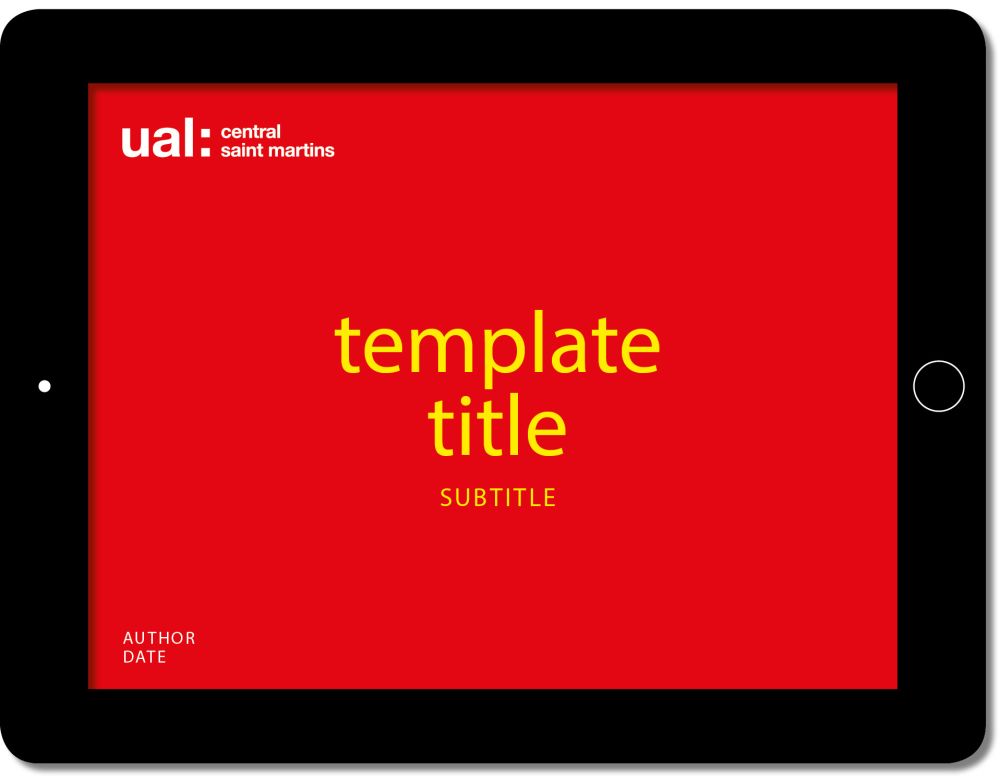
Download our branded templates
Presentations
Download:
- Central Saint Martins PowerPoint presentation template (PPT 2.1MB)
- Central Saint Martins Keynote presentation template (ZIP 11MB)
- If you need the CSM shifts presentation please contact Brand Manager, Colin Buttimer (c.buttimer@csm.arts.ac.uk). The presentation template is available in PowePoint and Keynote. The template includes: title slides in multiple colourways, section divider slides; various text slide options; a thank you slide and sign-off slide. CSM Shifts should only be used as a title font when exporting the presentation to PDF format.
Cover slides are available with both CSM Shifts and Helvetica as the title font.
Report
Download:
- Central Saint Martins Word standard template long (DOCX 52KB)
- Central Saint Martins Word standard template short (DOCX 55KB)
Letterhead
Note: the link below will redirect you to our internal Canvas platform (Log in required).
Compliment slip
Download:
Video templates
Download:
Please make sure you follow the general video guidance as well when creating a video.
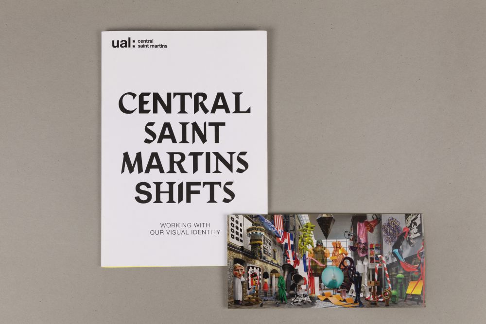
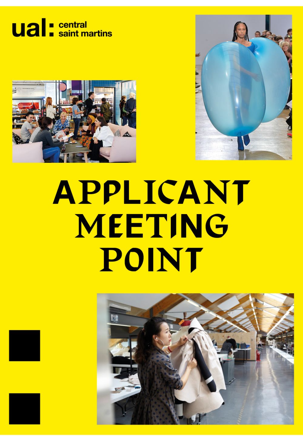
Best practice examples

Material sustainability
As artists and designers, our role is to imagine and create a world in which we can all live better with less. Our approach to the assets we produce in our communications work should reflect this. Especially for printed work, please consider the environmental impact of production and integrate recycled and environmentally-benign materials into your specifications.
Recycled papers
When it comes to paper, recycled paper is the greenest option. It uses less energy, water, and produces lower carbon emissions than the manufacturing of non-recycled paper and at the same time reduces the amount of waste to landfill – as paper can be recycled 4 to 5 times. With advances in technology and processes, recycled paper is now as white and has the same print performance as non-recycled paper, as well as coming in a range of colours. Some widely available recycled papers:
- ArjoWiggins —Cocoon and Nautilus
- Denmaur Paper — Revive range
- Fenner Paper — ColorSet
- Fedrigoni — Woodstock
- GF Smith — Extract
Revive is a popular range of 100% recycled papers, manufactured from FSC® recycled 100% post consumer
waste. The papers we use should always have an FSC (The Forest Stewardship Council) certification. This means they are made with, or contain, pulp that comes from FSC well-managed forests, and follows a certified chain of custody that tracks the timber through every stage in the supply chain from the forest to the final user. These certifications fall into the following categories:
- FSC 100%: All the forest-based timber or fibre in an FSC 100% product comes from an FSC-certified forest.
- FSC recycled: All timber or fibre in an FSC recycled product must be pre-consumer or post-consumer reclaimed.
- FSC mix: The timber or fibre in an FSC mix product is a mixture of some/all of the following:
- Virgin timber/fibre from an FSC-certified forest
- Reclaimed/recycled timber/fibre
- FSC Controlled Wood